Steemit Home Page Redesign Part 3
Steemit Home Page Redesign Part III
Revised Iterations, Feedback, Features and Pain Points.
Once again its your Steemit Community Neighborhood Yeti, coming in with the new scoop for Steemit Home Page Redesign Part III.
1st Pitch
In the first pitch we addressed pain points and other misleading on boarding things for new users and how they get lost. We iterated, commented, notes were taken and written down and we started this ongoing phase of iterations.
2nd Pitch
In the second pitch more concerns gravitated towards the logged in user, as a returning user and how to best make the page more usable for me once I’ve logged in. Many pain points surrounded the conflict between my “landing home page” vs “my blog page”. Trying to dive deeper here into more usable feature sets that gravitate to user intuitiveness and ease of use as well as allow the platform to be more aware of what I want, when I want and how I want to see it.
In this last phase of efforts, comments, pain points, features presented etc, we are most definitely tightening the screws on a solid approach on how best to capture a new user and how best to keep the users we already have. Here are the lists we came up with from Home Page Redesign Part II.
Construction Zone! - How should we build this? Here was the take-away.
Comments on Iteration 2
- Add better tabs that relate to users. The tabs are outdated and provide little to no use as it is curated to whales, big users, and doesn’t relate to me.
- Some tabs to add - on boarding or new users, curated content with my favorites selected
- Introduce a way to favorite a follower so I can see their content in my feed easily or isolated.
- Persona: I favorite a user @aggroed and user @themarkymark. If I select the tab Favorites, the content shown are the favorites I’ve selected.
- Works great for scalability when we decide we have 1000 friends but really want to stay up to date on 20 of them. How easy is it to find their content? Top 10 like myspace
- I managed through a bit of personal brainstorming come up with this.
- Persona: I favorite a user @aggroed and user @themarkymark. If I select the tab Favorites, the content shown are the favorites I’ve selected.
"Basically I have a “My Top 20” Tag. This tag takes both the top 20 favorite steemians, and the top 20 tags that you like and places both in a feed that defaults to Steemians, or Tags. On that Feed selection you can then tab between Favorite Steemians and Favorite Tags, and the Tabs are smart enough to arrange content that has both favorite steemians and favorite tags into a list where those are curated at the top under the Favorite Steemians tag."
- Adding a favorite user section
- Adding a favorite user article feed
- Adding a foreign language filter for localization. This would be ideal and could use the industry standard. ( going to translate.google.com will allow you to type in the website and the website will be translated into that language. I think thats an easy fix for now)
- Surface the “ my feed “ as the default on both the home page logged in and to the “my blog” section, not defaulted.
- Create a “Tag widget” that is smart. Allow me to select tags I’m interested in by both users I like and content I like.
- Merge promoted tag into the feed tag. Doesn’t have as much value.
- Add more visibility to sign up / login
These were the new items in review from the last post.
Comments from so many Steemians that deserve credit here again, thanks for your assistance. It’s you that use the UI and you are the voice that allows me to help shape this community, and empower my creative energies to work hard and into the nights on rebuilding these pitch proposals.
THANK YOU
@aggroed, @themarkymark, @velimir, @fredrikaa, @fulltimegeek, @brandonp, @geofftk, @fourfourfun, @dlew, @venalbe, @grizgal, @shawnvanderveer, @dedicatedguy, @datascience, @mitneb, @edicted, @jlordc, @arcange, @spiritualmax, @makerhacks, @isnochys, @dlew, @mikesthoughts, @rock220, @daan, @davidshaw, @rawdawg, @yogajill, @mcblessing1, @patrice, @princessmewmew, @kerlund74, @yabapmatt, @ma1neevent, @poeticsnake @shadowspub, @folken, @whatsup, @kubbyelizabeth, @freedomexists
Your comments, criticism, pain points, and praise help drive successful change.
Thank you. For anyone I left out, thank you as well. don’t forget to leave your comments below, and upvote if you liked the design work and the direction.
Now lets show off the adjustments to the new build below.
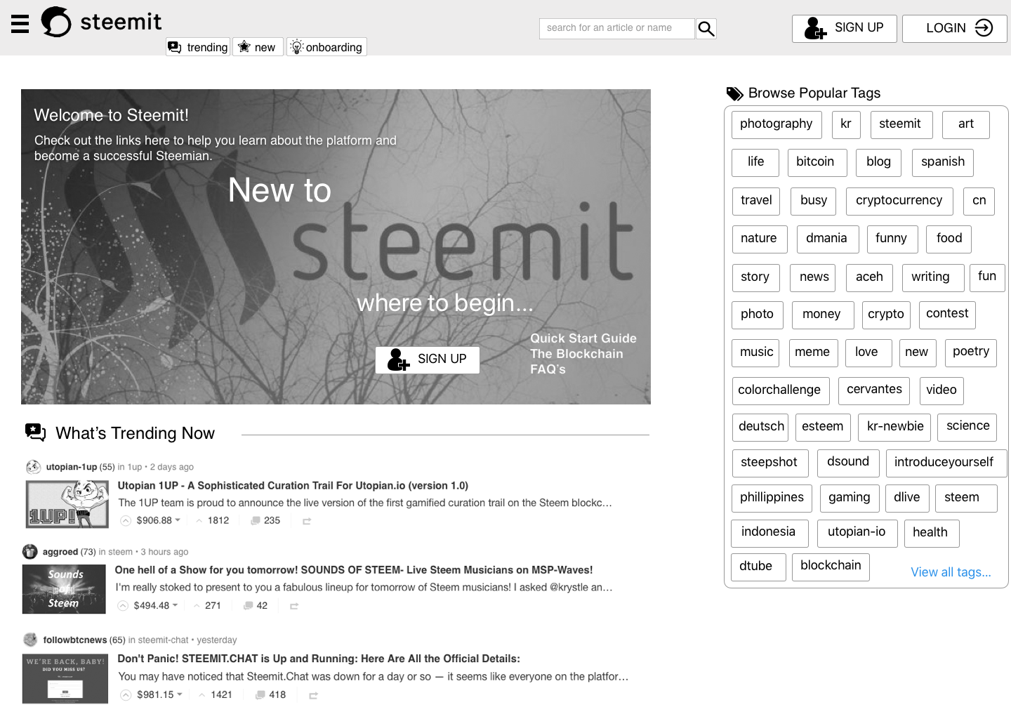
Logged Out - New User Home
Persona: I am a new user accessing Steemit.com for the first time.
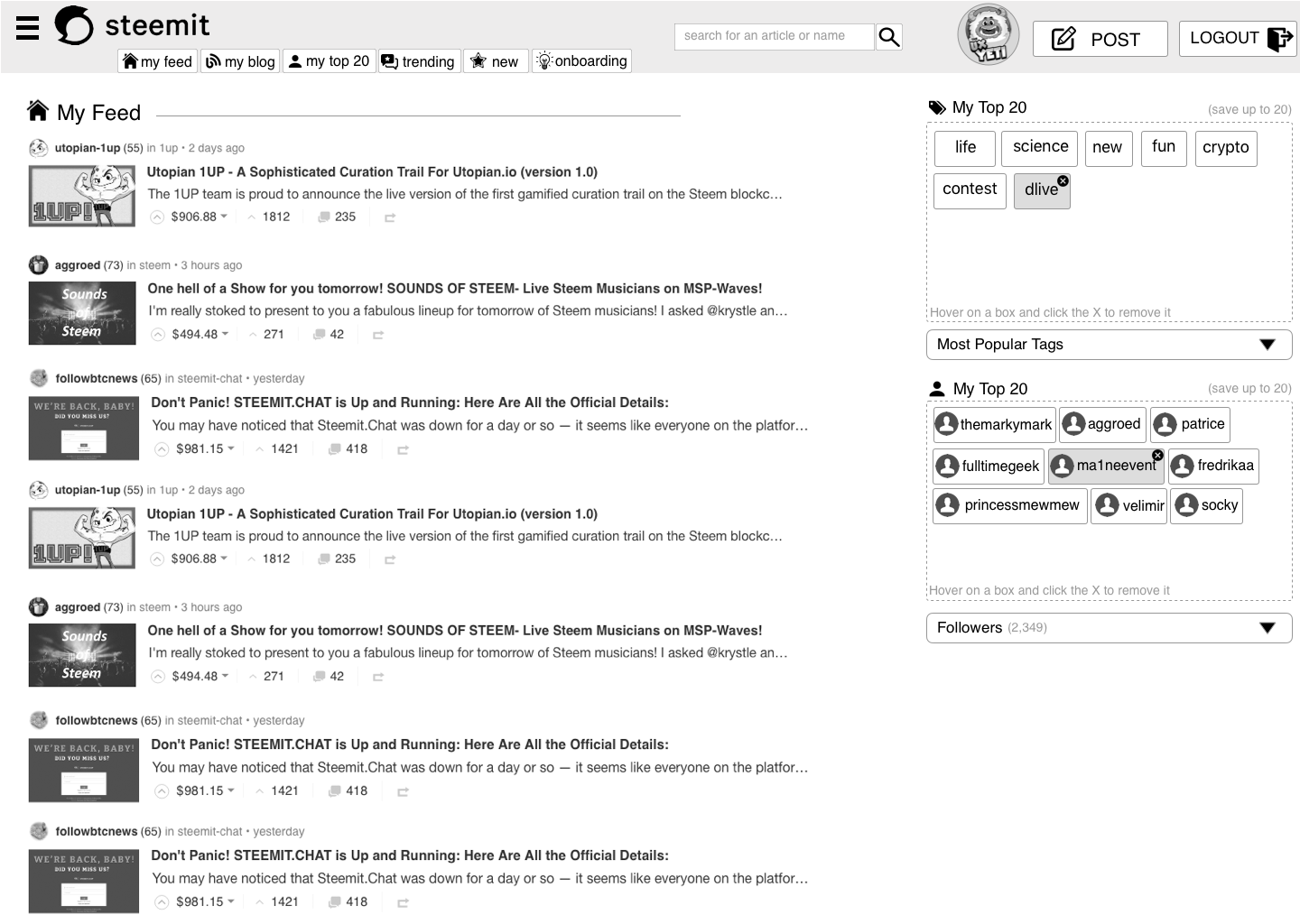
Logged In - Returning User Home Page - (Not my blog)
Persona: I am a returning user accessing the home page.
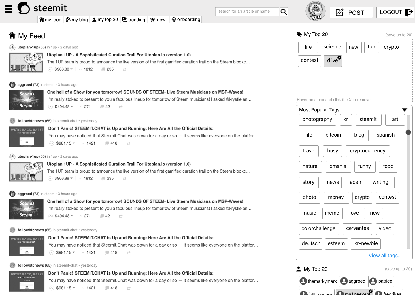
Logged In - Returning User Home Page - (Not my blog) Expanded Drop Down Favorite Tags
Persona: I am a returning user accessing the home page and want to add or delete Top 20 Tags
Logged In - Returning User Home Page - (Not my blog) Expanded Drop Down Favorite Steemians
Persona: I am a returning user accessing the home page and want to add or delete Top 20 Steemians
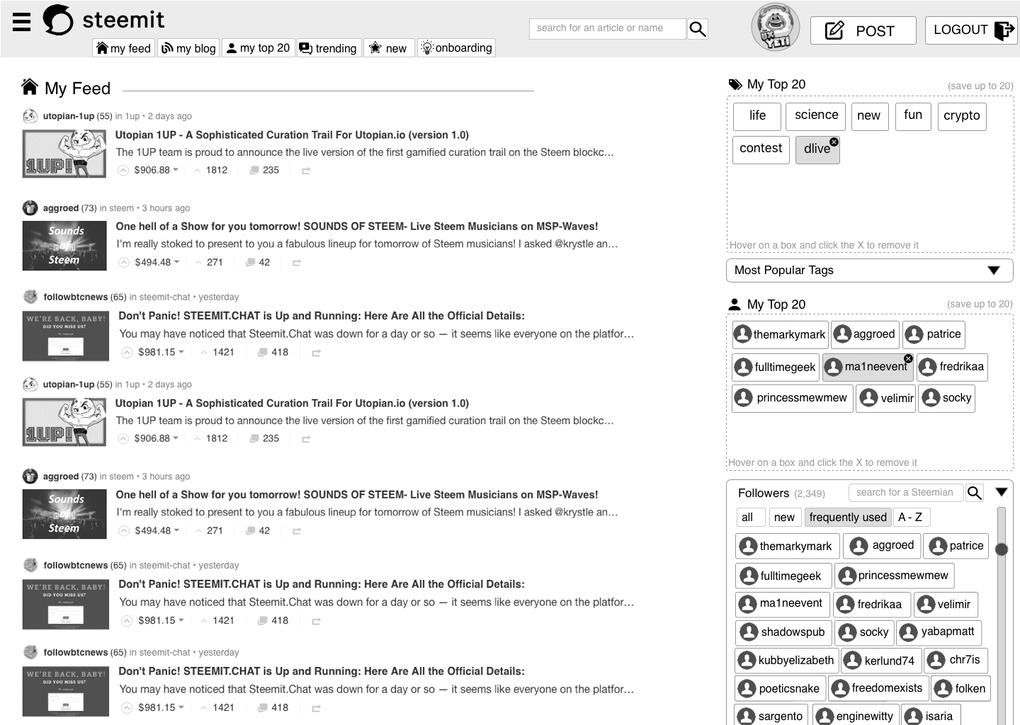
Note: The TOP 20 Tab works in 2 ways.
1. It allows users to favorite Tags and use them as a tab to see in a content feed specific to tags they like
2. It allows users to favorite Steemians and use them as a tab to see in a content feed specific to steemians they like. It also allows a user to follow a combination of favorite tags and steemians as a combo that serves up in the feed first as well.
After this version edits, praise, pain points we will start to visit the more exciting pages. I’m personally excited to dive into the “MY BLOG” page and the “POST Layout” items on feed pages. There has been much discussion about 3rd party plugins for analytics and personalization for “MY BLOG” when I’m looking at my page, vs looking at my home page. Stay tuned for Version IV “MY BLOG”. Assuming theres not crazy edits here lol.
If you'd like to revisit this series you can see both Parts 1 and 2 below.
Part 1 of this Redesign Series can be found here
Part 2 of this Redesign Series can be found here
If you liked what you read, Please don't forget to Upvote, Resteem, and follow me. There's much more great design work to come.

@theUXyeti - This is me! Hilarious, funny, ex reality tv guy, loves app and web UI, competitive card player, scuba instructor, dart thrower, MTG player, WSOP player, gamer, hearthstone mechanic exploiter, sports handicapper, Geek of all trades.
How to find me
Steemit: www.steemit.com/@theUXyeti
Discord: TheUXyeti or TheUXyeti#5698
Dtube Channel:
I really like the idea of the new design!
Please lets make it happen, it would be very cool and also get alot of new steemians on the platform.
More changes to get steemit adopted sounds like a great opportunity. Both for athors and currators. Also many creative people which don't know yet about steem will be here and gives a potential lots of new great users/articles!
I really look forward for it to happen, great work!
Cheeersss
New changes coming. Lean ui and better improvements coming. Just behind on my work week bc of the holiday i hope to have redesign IV OUT BY FRIDAY!
Would be very nice @theuxyeti!
I really like it! When do we see this in production? :)
It's a work in progress. Still a work in progress, but assuming I get to a great final design i know there are whales and other production people communicating with me to get the final designs to the right hands :)
Awesome! Great work!
I love the top 20 friend idea because I have the same issue with wanting to check some first and the go deeper without manually clicking links!
Resteeming now!
Please i am Oberoyil i am new here and don't know what to do i have posted 49 posts but i don't have like and vote i see your post when you say you can help someone get to trending please write me on email [email protected]
I’ve never had a trending post. No idea how to get there. Sorry
Yea i can't decide whether it'd be easier to have a refined widget of what i current am proposing or if i remove that and use a simple "star" system. So create a Tab at the top that says "Favorites" or Followers with a "star" icon. Then create a Tab at the top that says "Tags" as well. Then create a mechanic that allows you to star a tag in the tag list and star a follower when you access their profile. This way when you go to each tab it would display content that is dynamic to the starred tags and to the starred followers. To turn them off you could unstar them in the post feed at the post level or unstar them in their profile view. Same with tags on the home page logged in, or on your "my blog" page.
Im leaning towards scrapping the whole top 20 idea, and just allowing a user to clutter up either tab as much as they choose and eliminating the widget for lean ux and easy usability... Thanks for your comment btw, and the resteem very nice of you. I added you and tried to reach out on discord but couldnt get through.
I like it bro.....
Good to hear. It’s being revised today. Stay tuned.
can we think of something similar to medium ???
It’s always of value to research our competition. It was said to review reddit as well. I’ll add medium to my notes as well. Thanks for your insight.
Great work. I like the "favorite 20" and favorite tag spring options. Also, it's probably just me, but it frustrates me that those settings and buttons and whatnot are on the right rather than left. I haven't really looked at the previous iterations in case thought was given to that already. Great work!
yea after reading the reviews and comments, i think making a dumber approach might be the right course of action. literally have a tag list that you can "star" tags to turn them on/off and have a "star" on a profile of someone you want to follow without the widget. Much easier, less to maintain, and streamlined.
I wasn't trying to suggest a star-type list -- I actually think the 'bucket' style is kind of great. It would be cool if you could actually just drag a hashtag from a post your reading, and drop it in the bucket that you want to place preference on in your feed. I don't know if that's something that's feasible -- but that's kind of how I was envisioning it when I was looking at the images in the post.
Drag and Drop is a common interaction. Unsure if its supported by steemit. but i liked that idea based on the way drag/drop works in dtube. #dtube. I thought at least we could copy similar functionality. but now that I'm stepping back on it, i realize that a simple star mentality might be easier to implement with similar reward for sorting tabs. thanks for your responses.
Reminds me a ton of Reddit, which makes sense as Steemit was presented as a Reddit replacement when I first signed up. Maybe instead of top 20 tags, add most recent/frequently trafficked tags? Kind of a quick way to access your most visited tags instead of having to digg through the list in cases where you are browsing back and forth between tags...
Yea this has been an ongoing topic and perhaps the execution is still lagging for a solution. I think the tags should definitely be different based on how they sort content. Strongly considering a group of different tags at the top that are then used by users as a test and we can then remove what doesnt get used. Gret observation .
I feel like the Steemit Inc designers should pitch in more... their design and marketing teams aren't the most active ones... sigh.
ahah. yea. im a sr dir in ux these days. so im just happy to share my skill set with the community. free designwork right lol
I love the "my top 20" tab. Still, I think steemit needs to make the content of special interest easier available then just by keywords. A few months ago I also wrote about having a tab that is called "underrated".
https://steemit.com/utopian-io/@drmake/underrated-yet-another-list-on-steemit
Agreed, machine learning out there like facebook serving up ads to me. Agreed, there should be a tag that is based on tags or people i like. thats what were trying to do. create a tag that is based on subject matter or people. great read
Hi there @theuxyeti,Steem defo needs a revamp.The ideas for how it should look and perform are spot on in my opinion.Def needs more tabs so we can go straight to a certain thing,rather than taking the long route.I cant wait to see the finale up n running.Good work man
agreed Personalization is lacking on steemit. just trying to get a few good iterations in this ongoing build for users to comment and interact on. definitely something that makes me happy to work towards.