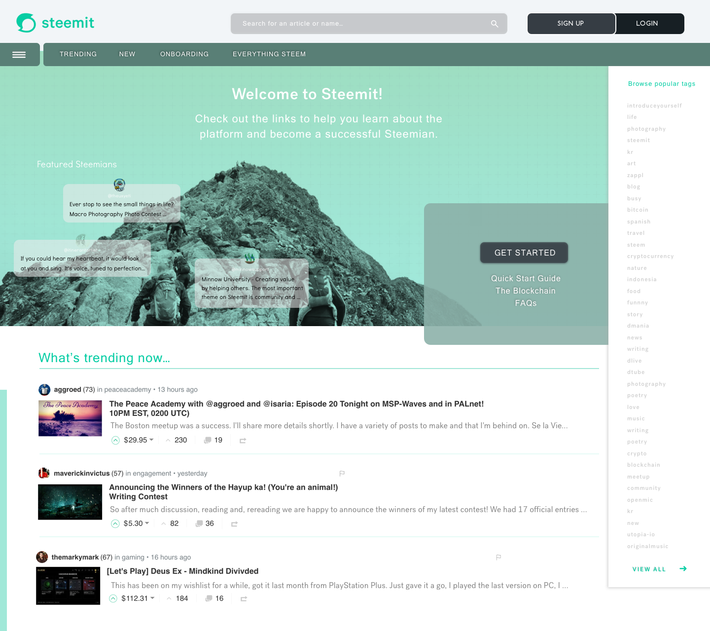
Steemit Home Page Redesign Bagian
View first pass in New UI for Home Page Steemit - New User!
Construction zone! - Polish the UI from Conceptual to Design
Logged Out - New User House
Persona: I'm a new user who accesses Steemit.com for the first time.
Engineered Design UX
I want a modern look and feel with the ease of adoption to the platform
I want users to easily identify with the platform
I want users to easily understand where to start and explore and view new content
I want to create a new engagement with curated content to give people a sense of familiarity with who wants to engage with content that interests them.
I want to improve the functionality of search tools to help assist new users in searching for content.
I want to create a form for platform personalization. The platform should have an easy way to resonate with new users to improve interaction and engagement.
Log In - Returning User Home
Persona: I am a returning user and see additional personalization that suits my interests.
Engineered Design UX
I want to create a powerful personal dashboard because the homepage is enclosed around the dynamic top navigation by user choice.
I want to add a way for user favorites and tags, and then allow sorting methods in the top navigation.
I want to display my "feed" and "my blog" at the home level.
I want to allow a way to "save later" content and then access it easily from the homepage with a custom tab.
I want an improved search tool that easily finds users or topics.
Conclusion:
New user
I want to create a new user home page that allows users to engage with the platform more easily. This is a tough struggle for me and other users who are trying to adopt statues in UI dorms from what is currently available. Many Rage Quits, many users fail, many people are slowly falling away from the platform so it's an easy way to improve user retention, and the overall engagement is the goal.
User Return
I wanted to create a personalized experience for a returning user without all the infinite combinations and features. Lets create a solid back-end methodology that allows a user to simply select and enable them at the top. Allow users to select content they like to save for later vs. saving as a bookmark or tab that last gets lost or never seen. Surface the "my feed, and my blog" to the top level for improved engagement.
This Home Page will be updated based on feedback from the community and additional improvements in my redesign series to come.
I will move to the next "My Blog" page.
Focus on
How to become a favorite follower
How to see my analysis of Voting Power, Vote Value, Rep, Band Width, Incoming Rewards
What my profile page looks like when I see it.
Like what my profile page looks like when other users see it
Inserting Notifications and where
Statistics about other users in the content feed
How to display content on "my blog" and how to sort content as incoming users.
Additional Pages in Works!
Fill in My Feed Entries - how to improve that look, How to better display the analysis, alt views: Create vs. layout list Grid View
My wallet - Complete redesign
My Profile - As I see it
My Profile - As other users see me
THANK YOU
