Understanding The Logo Identity Before You Make It (ENG-IND)
What to consider before making a logo. (Source: https://creativemarket.com/blog/designing-a-brand-identity)
As an important part of the company and business, the logo has its own role in presenting the activities and nature of the business. Logo is like a part of the body that can express the heart.
From the side of promotion and marketing, the identity of the logo has a meaning that cannot be separated from the nature of the logo itself. Logo as part of art will not move away from element of basic art that become their "base foundation". Some like lines, colors, typography, shapes, space, and others.
"The successful designer of trademarks and logos needs to have basic intellectual and draftsmanship skills in addition to a sensitivity to the aesthetic elements of design." - John MurphyThe design of the logo is guided by the activities of the client, where their business came from, what their activities are, what they produce, or what their icon is. Indeed, in making the logo is easy for those who already know the basic of logo psychology. Can be concluded, if the logo you want to be more meaningful to clients and people, you must understand the basic of psychology in the design and its basic form.
\ONE.\ ESTETIC ELEMENTS that FORMING the LOGO
A good logo designer needs to have basic and basic skills in his skill in drawing a logo identity relation with design aesthetic elements. What are the aesthetic elements of the design? Some of the basic elements are:- Lines
- Shapes
- Colors
- Typography
Therefore, all we have to do is think of every part of our logo as an attribute, and then contemplate what each attribute may mean otherwise or in another sense we have to figure out how people will interpret our logo design. The more time we spend working on the meaning of this attribute, the more control we will have on what people understand when observe our logo. We can try to push ourselves further with put the two most important attributes in logo design, that is color and shape.
\TWO.\ THE ROLE OF COLOR
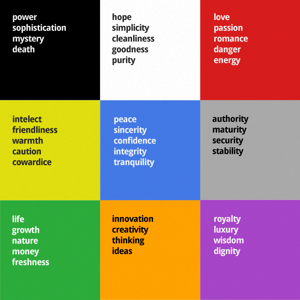
As the best part of the logo element, color becomes the key in the role of reinforcing the impression and purpose of the logo's identity. Colors basically have additional meaning, but they can not be set. Why I say here can not be arranged?
The answer is that throughout the world, people continue to give meaning to color for centuries, and the process is done continuously by connecting meanings with different color combinations or the same. Choosing the right colors for the logo, will make us show a professional impression.
Color table for logo identity (Source: https://blog.sribu.com/menguak-sisi-psikologi-dalam-desain-logo/)
Being more technical, we also need to know the output of our logo. Among the various color systems above, now widely used in the visual media printing industry is CMYK or Process Color System which divides its basic colors into Cyan, Magenta, Yellow and Black. While RGB Color System is used in the industry of visual media electronics.

Color reinforces the impression of the logo (Source: https://visual.ly/community/infographic/business/color-emotion-guide)
The colors we will choose determine different directions and impressions, depending on our client's field. Regardless of which color to choose, make sure that the logo will work properly in any background color.
\THREE.\ ROLE OF SHAPES (LINE AND CURVE)
Understanding the form according to Leksikon Grafika is:
"Kinds of form or shape something, like round elliptical, round rectangle and so forth. From the definition can be described that the form is a form of something, ordinary rectangular, triangular, round, elliptical, etc."However, from the psychological side, nothing is more crucial than form. The typical shape of a logo will continue to be remembered by our brains from time-to-time. Our brains are designed to remember the shape of the thing or something we have seen. For example, surely we always remember how the shape of the Nike logo? or McD? Without thinking, before you even talk, in an instant, it crossed your mind how the shape and color.
The basic shape of the logo will not be far from the line and the curve, whether it is an ellipse, whether it is a rectangle or a triangle. Shape the logo by using many lines, will make the logo looks more assertive, professional, and always visionary in looking into the future. If the logo uses curves or ellipses, the geometry will give the impression of more dynamic, moving and growing towards change, not rigid, and the impression becomes a free logo. Examples of dominant logos use geometry method emphasis:

Examples of logo geometry (Source: http://www.iamwire.com/2017/08/popular-logo-common/156930)
The role of geometry is very important in creating an effective logo. Each form will have its own communication to the audience. Some geometric shapes that will usually impact logo design and impact on the client's story telling story are rectangles, squares, spheres, and triangles. However this does not restrict the designer to be able to combine these forms.
In thinking of the appropriate form, we can use the following:
- Think about what company and in what sector, before we make the logo.
- Think of an emotional form, so it can have an impact on logos and companies.
- Think deeper into the logo details, give an accent to support the detail. (Example: Apples that bitten on Apple logo)
\FOUR.\ USE THE APPROPRIATE TYPOGRAPHY
Do you know if the word logo is derived from the rich Greek "logos" which literally means "word"? Can be concluded if we want to start designing the logo, we should be able to think to create a visual "word" that will be used client.The development of typography is currently experiencing rapid growth, where all the phases can be made easily. Like making hand drawn typography that now can easily made with drawing tablet. Now, the existence of fonts or typography on the web are thousands more.
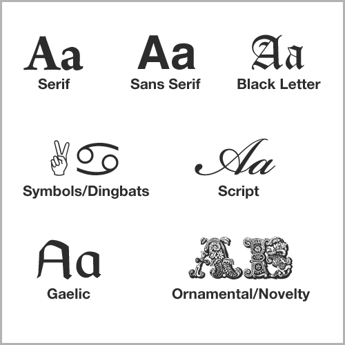
Contoh dari tipografi (Source: https://creativemarket.com/blog/what-is-typography)
We just choose, what type of typography that will match the identity of our clients. Some of these types are Roman, Egyptian, Sans Serif, Script, and Miscellaneous.
BAHASA INDONESIA
What to consider before making a logo. (Source: https://creativemarket.com/blog/designing-a-brand-identity)
Sebagai dari bagian yang penting dalam perusahaan dan usaha, logo memiliki peran tersendiri dalam mempresentasikan kegiatan dan sifat dari usaha tersebut. Logo itu ibarat bagian tubuh yang mampu mengutarakan isi hati.
Dari sisi promosi dan pemasaran, fungsi identitas logo mempunyai makna yang tak lepas dari hakikat logo itu sendiri. Logo sebagai bagian dari seni rupa tidak akan beralih jauh dari elemen-elemen seni rupa dasar yang menjadi "base foundation"-nya. Beberapanya seperti garis, warna, tipografi, bentuk, ruang, dan lain-lain.
"The successful designer of trademarks and logos needs to have basic intellectual and draftsmanship skills in addition to a sensitivity to the aesthetic elements of design." - John MurphyDesain dari logo berpedoman pada aktivitas klien, darimana usaha mereka, seperti apa kegiatannya, apa yang mereka produksi, atau apa ikon unggulan dari mereka. Memang dalam membuat logo itu mudah bagi yang sudah mengetahui dasar psikologi. Dapat disimpulkan jika logo kamu ingin lebih bermakna untuk klien dan orang-orang, kamu harus memahami dasar dari psikologi dalam desain dan bentuk dasarnya.
\SATU.\ Elemen Estetis Pembentuk Logo
Seorang perancang logo yang baik perlu memiliki dasar dan keterampilan dasar dalam kepandaiannya dalam menggambar hubungan isi identitas logo dengan elemen estetika desain. Apa saja elemen estetika desain itu? Beberapa dari elemen basic tersebut adalah:- Garis
- Bentuk
- Warna
- Tipografi
Oleh karena itu, yang harus kita lakukan adalah memikirkan setiap bagian dari logo kita sebagai atribut, dan kemudian merenungkan apa setiap atribut mungkin berarti lain atau dalam arti lain kita harus mencari tahu bagaimana orang akan menafsirkan desain logo kita. Semakin banyak waktu yang kita habiskan bekerja pada makna atribut ini, semakin banyak kontrol akan kita miliki pada apa yang orang mengerti ketika membaca logo kita. Kita bisa mencoba menekankan diri terhadap dua atribut paling penting dalam desain logo yaitu warna dan bentuk.
\DUA.\ PERAN WARNA
Sebagai bagian terbaik dari elemen logo, warna menjadi kunci dalam peran mempertegas dan memperkuat kesan dan tujuan dari identitas logo tersebut. Warna pada dasarnya memiliki arti tambahan, tetapi mereka tidak dapat diatur. Mengapa saya bilang disini tidak dapat diatur?
Jawabannya adalah karena di seluruh dunia, orang-orang terus memberikan makna terhadap warna selama berabad-abad, dan prosesnya dilakukan secara terus menerus dengan menghubungkan arti dengan kombinasi warna yang berbeda ataupun sama. Memilih warna yang tepat untuk logo, akan membuat kita menunjukkan kesan profesional.
Tabel warna untuk identitas logo (Sumber: https://blog.sribu.com/menguak-sisi-psikologi-dalam-desain-logo/)
Menjadi lebih teknis, kita juga harus mengetahui output dari logo kita. Diantara bermacam sistem warna diatas, kini yang banyak dipergunakan dalam industri media visual cetak adalah CMYK atau Process Color System yang membagi warna dasarnya menjadi Cyan, Magenta, Yellow dan Black. Sedangkan RGB Color System dipergunakan dalam industri media visual elektronika.
Warna mempertegas kesan logo (Sumber: https://visual.ly/community/infographic/business/color-emotion-guide)
Warna yang akan kita pilih menentukan arah dan kesan yang berbeda, tergantung dengan bidang klien kita. Apapun warna yang akan dipilih, pastikan bahwa logo akan bekerja dengan baik dalam warna background apapun.
\TIGA.\ PERAN BENTUK (LINE AND CURVE)
Pengertian bentuk menurut Leksikon Grafika adalah:
"Macam rupa atau wujud sesuatu, seperti bundar elips, bulat segi empat dan lain sebagainya. Dari definisi tersebut dapat diuraikan bahwa bentuk merupakan wujud rupa sesuatu, biasa berupa segi empat, segi tiga, bundar, elips dsb."Namun, dari sisi psikologis, tidak ada yang lebih krusial daripada bentuk. Bentuk yang khas dari sebuah logo akan terus diingat oleh otak kita. Otak kita didesain untuk dapat mengingat bentuk dari benda atau sesuatu yang telah kita lihat. Contohnya, pasti kita selalu ingat bagaimana bentuk dari logo Nike? atau McD? Tanpa berpikir panjang, sebelum anda berbicara pasti sudah terlintas di benak anda bagaimana bentuk dan warnanya.
Bentuk dasar dari logo tidak akan jauh dari garis dan kurva, apakah itu elips, apakah itu segiempat atau segitiga. Bentuk logo dengan memakai banyak line, akan mebuat logo tampak lebih tegas, profesional, dan selalu visioner dalam melihat ke masa depan. Jika logo menggunakan curva atau elips, geometri tersebut akan memberi kesan lebih dinamis, bergerak dan tumbuh terhadap perubahan, tidak kaku, dan kesannya menjadi logo yang bebas. Contoh dari logo dengan dominan menggunakan penekanan metode geometri:
Contoh geometri logo (Sumber: http://www.iamwire.com/2017/08/popular-logo-common/156930)
Peranan geometri sangatlah penting dalam membuat logo yang efektif. Setiap bentuk akan mempunyai komunikasi tersendiri ke audiensnya. Beberapa bentuk geometri yang biasanya akan berdampak pada desain logo dan dampak pada story telling produk si klien adalah persegi panjang, persegi, bulat, dan segitiga. Namun ini tidak membatasi designer untuk dapat mengkombinasikan bentuk-bentuk tersebut.
Dalam memikirkan bentuk yang sesuai, kita dapat menggunakan hal berikut:
- Pikirkan perusahaan apa dan di bidang apa, sebelum kita membuat logonya.
- Pikirkan bentuk yang emosional, sehingga dapat berdampak terhadap logo dan perusahaan.
- Pikirkan detail logo lebih dalam, beri aksen pendukungnya. (Contoh: Apel yang diberi aksen digigit pada logo Apple)
\EMPAT.\ GUNAKAN TIPOGRAFI YANG SESUAI
Apakah anda tahu kalau kata logo adalah berasal dari kaya Yunani "logos" yang secara harfiah berarti "kata"? Dapat disimpulkan jika kita ingin mulai mendesain logo, kita harus dapat berpikir untuk menciptakan "kata" visual yang akan digunakan klien.Perkembangan tipografi saat ini mengalami pertumbuhan yang pesat, dimana semua fasenya dapat dibuat dengan mudah. Seperti membuat hand drawn typography yang kini dapat dengan mudahnya kita buat di tablet. Kini, font atau tipografi sudah ribuan lebih.
Contoh dari tipografi (Sumber: https://creativemarket.com/blog/what-is-typography)
Kita tinggal memilih, tipe tipografi yang bagaimana yang akan sesuai dengan identitas dari klien kita. Beberapa dari jenis tersebut adalah Roman, Egyptian, Sans Serif, Script, dan Miscellaneous.

Awesomely posted from our blog with SteemPress : http://visualmovements.co.id/2018/07/27/understanding-the-logo-identity-before-you-make-it-eng-ind/
Hello @dimensco, thank you for sharing this creative work! We just stopped by to say that you've been upvoted by the @creativecrypto magazine. The Creative Crypto is all about art on the blockchain and learning from creatives like you. Looking forward to crossing paths again soon. Steem on!