Round 2, Voting for 2018 Steem Silver Round!
Thanks to everyone for all the voting and excitement in round 1 of voting. We started with 27 awesome designs!
We had 7 designs that had over 20 votes in round 1 that will advance to Round 2
Round 2 will run a bit differently. There has been lots of discussion that voters don't necessarily reflect the likely buyers or past buyers for the round. Therefore we wanted to ensure that people that are genuinely interested in the project and will be buying the round are getting their voices heard. Since we are crowdfunding the project and every dollar raised will go directly against the cost of the coins we felt it was fair to have a mandatory donation to vote. You are essentially just making a small prepayment towards your future order of the round anyways.
This means you have to make a donation to @steemsilverround for your vote to count.
- Minimum donation amount is 1SBD. (1 vote each, regardless of donated amount)
- Votes are cast as new comment with your choice. (upvote of comments will not count).
- People that have already sent donations from the goodness of their hearts do not have to make an additional donation and as an added bonus they will be rewarded with a double-weighted vote.
Current donations received are as follows;
| User | Donation (SBD) |
|---|---|
| @tzcap | 1 |
| @thedamus | 13 |
| @silverfortune | 1 |
| @darkflame | 3 |
| @knowledge-seeker | 2 |
| @phelimint | 182.485 |
| @sevinwilson | 19.434 /15TEEM |
| @cyber.explorer | 2 |
| @raybrockman | 55 /95Steem |
| @silverstackeruk | 10.384 |
| @fat-elvis | 21.19 |
| @masterinvestor | 10steem |
| @coindevil | 2 |
| @ironshield | 1 |
| @blocktrades | 52.148 STEEM |
| @louloumos | 1 |
| @richq11 | 5 |
| @moderndayhippie | 2 |
| @meilo1995 | 1 |
| @goldrooster | 0.5 |
| @jimbobbill | 15.734 |
| @russelburry | 2.018STEEM |
| @owenwat | 3.091 |
| @jbcoin | 20 |
| @darkmrmystic | 1.443 |
| @kerrislravenhill | 1 |
| @silvergoldcomps | 2 |
| @ejr | 2 |
A few things to consider before voting
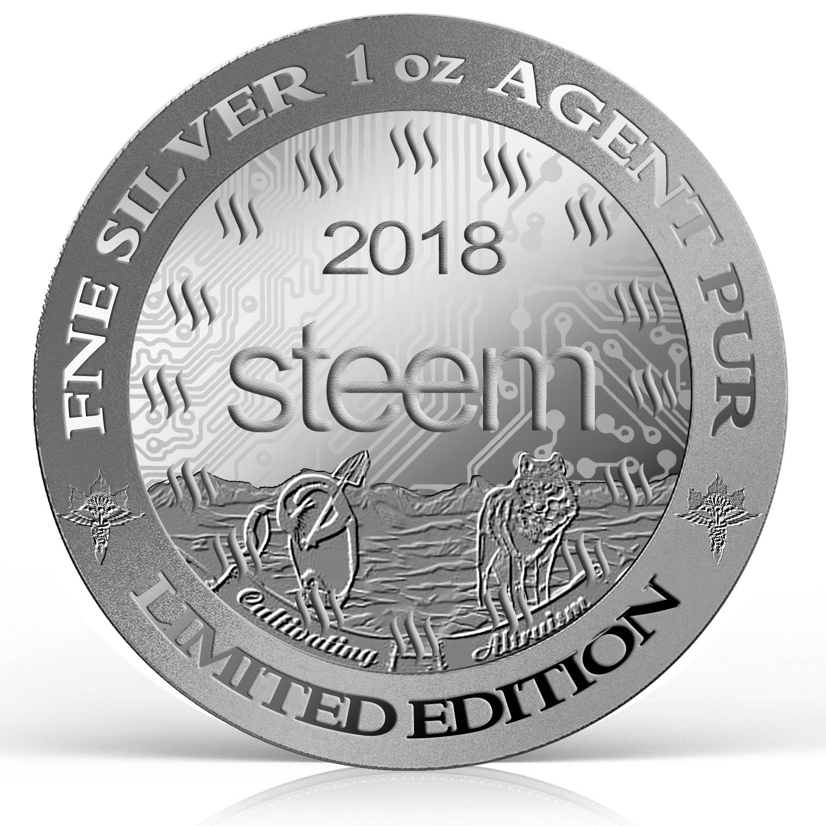
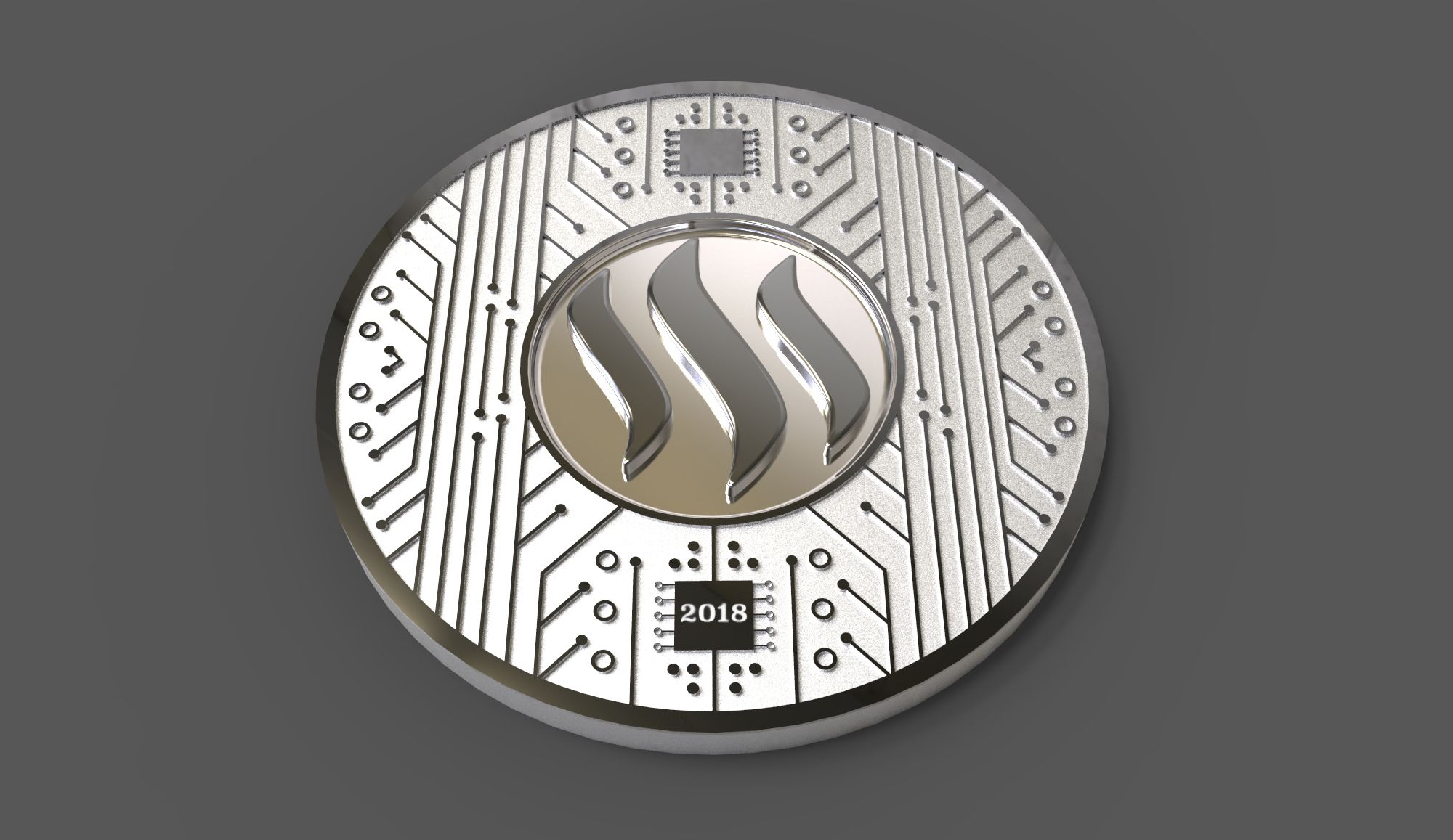
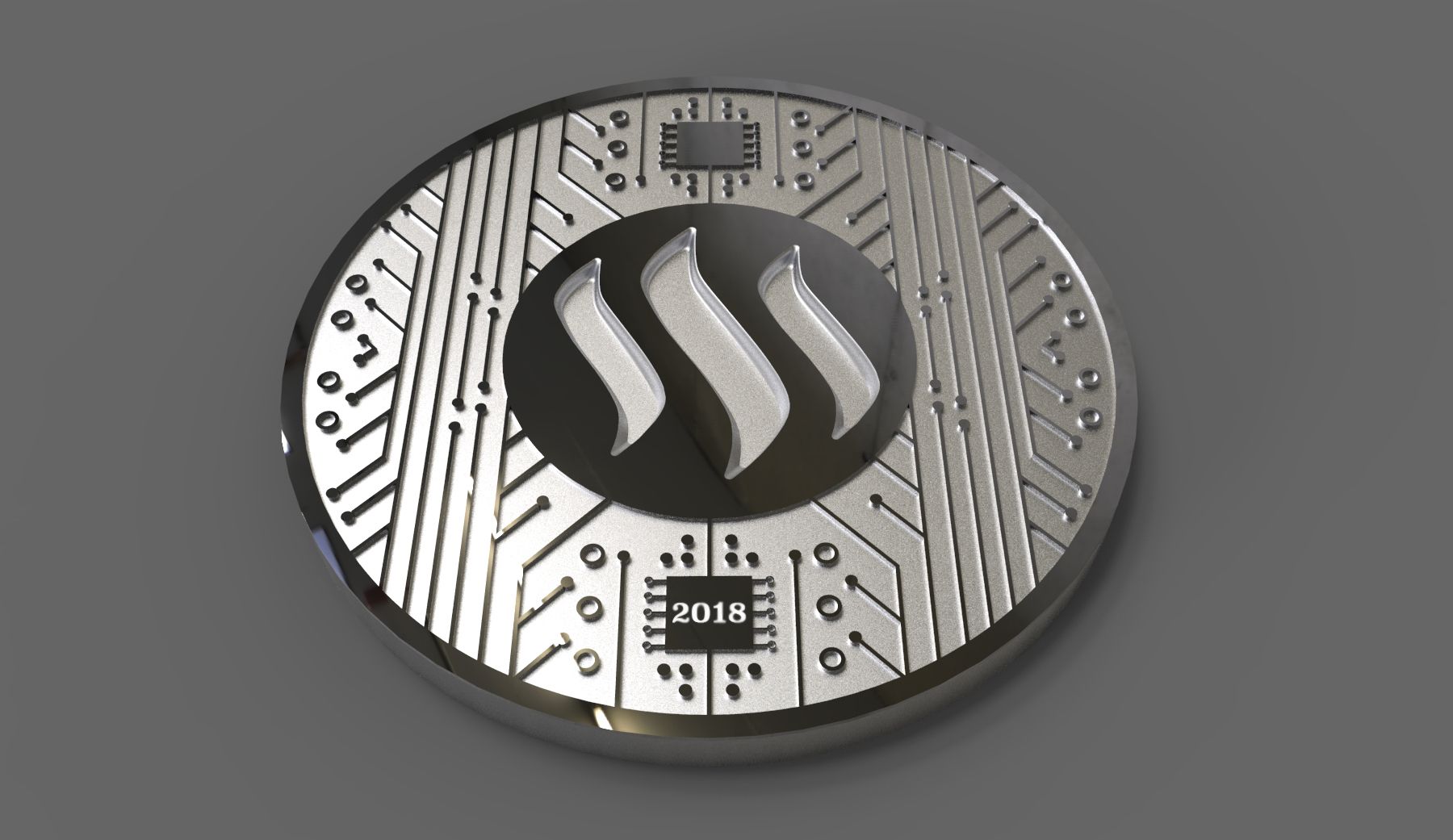
Please remember that the wining design will be be used to the reverse or tails side of the coins and the obverse will remain unchanged from last year and will be the design above, keep that in mind when you are voting.
Also please remember to consider the design carefully and what it means and stands for and not solely the image, I have including any accompanying story provided this time. The sketches will be cleaned up and balanced before heading to the mint. We will also have an opportunity to make final adjustments to the wining design. So if there are slight things you want changed but otherwise really like the design please keep that in mind as well.
On with the eligible designs, in no particular order
#1, by @bearone
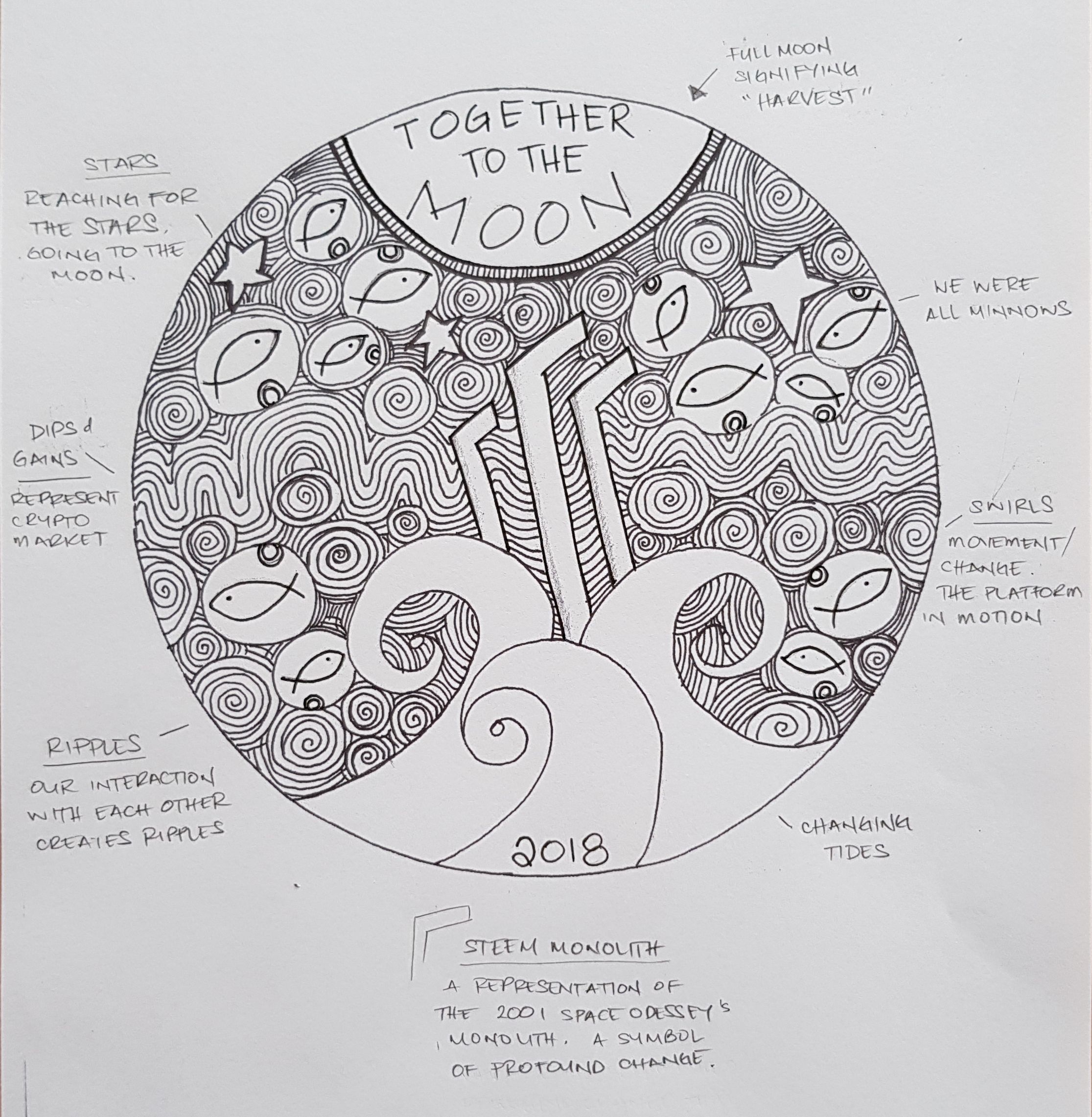
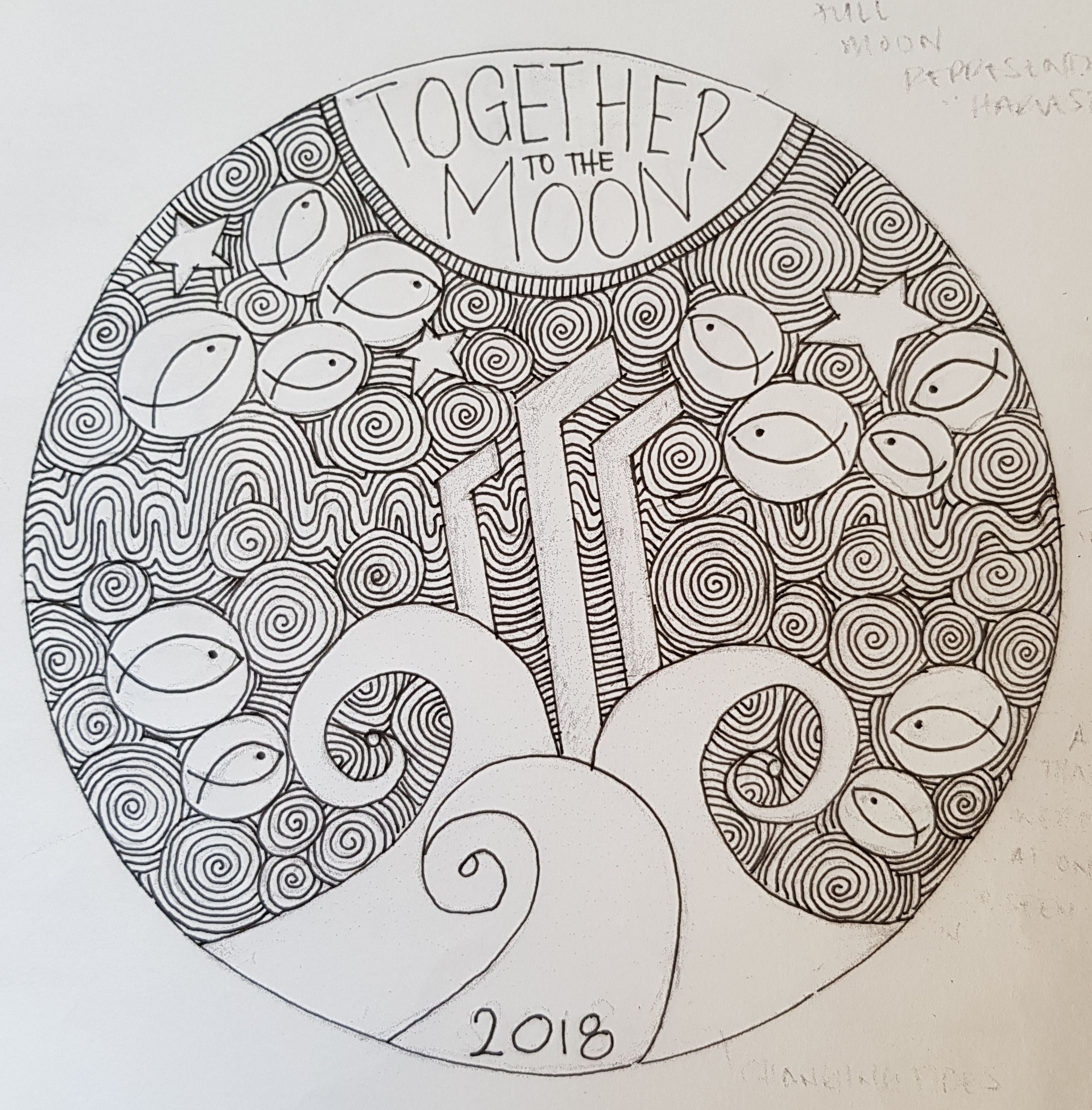
What in means in her own words;
Steemit to me is all about community and that is represented by the MINNOWS. Yup the minnows. No dolphins and whales this time, just the minnows.
I feel it's important that we remember what it's like to be a new fish swimming in new waters.
The SWIRLS represent the constant movement and changes on the platform.
This constant change was emphasised when I took a week off for The Move, when I got back this week I found so many new things going on within the communities I am a part of. I was only semi gone for a week.
The 'CHANGING TIDES' when you look at it, looks like it's propelling the "Steem" logo towards the full moon.
This is exactly how I feel about Steemit. It's just a matter of time before the tides change and people really embrace the next generation that we represent.
The RIPPLES represent our interaction with each other and how we have the ability to touch each other's lives.
I find this especially true in my time here. It has been my pleasure to have come across many beautiful souls and because of Steemit, we are able to touch other people's lives outside of the platform.
What we do here, now, makes a difference wether we realise it or not.
The long WAVES represent the dips and gains, the ups and downs, that we as a community go through.
The STARS...
"Reaching for the Stars. Going to the Moon."
Lastly. You would have noticed I revamped the STEEM logo.
Honestly? I was having issues getting the proportions right to make it look exactly like the logo so I sketched in a rough outline, which ended up sticking because it reminded me of the 2001 Space Odyssey Monolith.
Which in this design seems so appropriate, as the Monolith, in the movie, triggered a shift in evolution.
Steemit certainly is the next step to evolution.

#2 by @ideaman
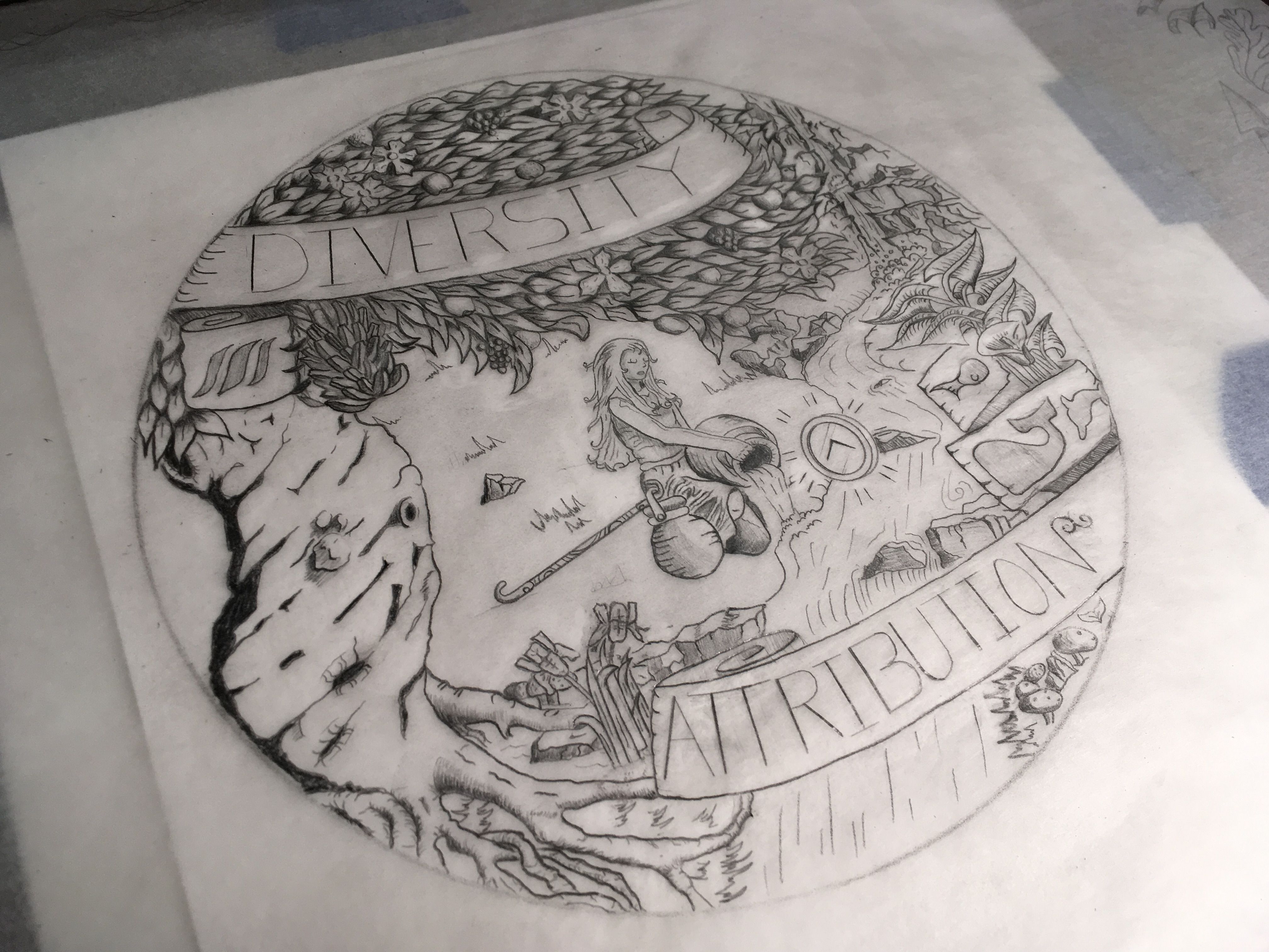
The design in his own words;
I noticed in the contest post that they were going to keep one side of the coin in the same format to give continuity to the coins as they are released every year. The steem logo is incorporated in this so I didn’t want to just use the logo as the centerpiece in the drawing.
So I decided to look to the white paper for ideas. Towards the end of the paper there is a section about blockchain based attribution: "Under blockchain-based social media, a creator or author would always be able to point to a public record and timestamp showing proof of their content origination."
So this was cool and something I wasn't really aware of and I thought a light ought to be shined onto it. I encourage you to read this section of the white paper if you haven't already. If we look up attribution in the dictionary it states "the action of ascribing a work or remark to a particular author, artist, or person."
I did my best to represent attribution by using the archetype of the water bearer. In this case the water that she pours into the stream represents the content. The stream represents the blockchain. You'll notice that she has two water vessels. The idea is that ideally we don't want to dump everything onto here only the things that are of quality. Which is also shown by the "magical" up-vote icon that floats above the stream.
The second component I wanted to celebrate was the diversity that I see on this platform. This is represented by the fruit and flowers in the tree (I really tried to get those bananas just right lol). Now horticulturally speaking this makes no sense but don't worry it's just a drawing. The gnarly tree represents the core team responsible for steem in the first place. which is why I patterned the tree off the basic shape of the steem logo turned sideways. This is why the stream/river falling down a tall waterfall because steem didn't invent the blockchain. The blockchain is sort of like a programming element like earth or water. The waterfall mountain is a tip of the hat to all the individuals that have made contributions to the development of the technology.
This design was also an attempt (possibly failure) to not rely so heavily on the nautical theme that seems to be present in the steem universe.
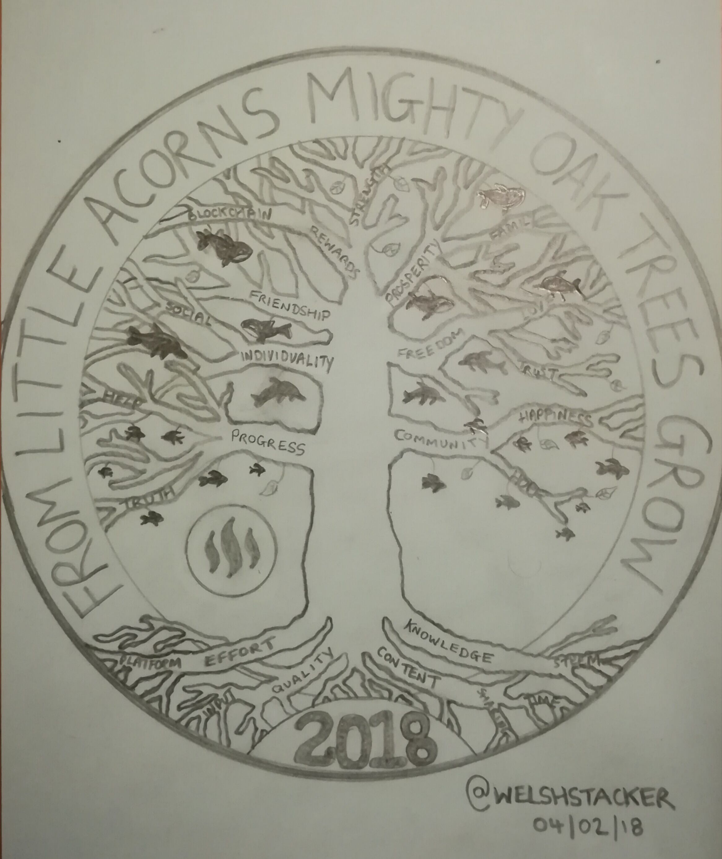
#3 by @welshstacker
The design in his own words;
So I've called the idea THE COMMINI-TREE (community) for obvious reasons, it's based on the tree of life pattern. So sit back, grab a cold beer and allow me to take you through my thought process... Hold tight, it's a mine field of random thoughts!!
So the tree is meant to represent growth, not only as an individual on Steemit but as the platform as a whole. It needs strong roots and will continue to grow bigger for as long as its foundations are strong!! Told you it was cheesy..
The design of the coin itself, I feel needs a chunky rim to it, very similar in size to last years one. It gives a good balance to the design inside and leave plenty of space for writing around the outside.
I have the words "from small acorns might oak trees grow" but I'm happy to change that. Could go fancy and change it to Latin or go for something completely different.
My design shows the root system with many fingers. Each finger could have a different word etched inside. Words like: quality, content, knowledge, effort, platform, steem, input, sharing and time.
These are the things I feel help create a good, strong foundation to most things and in particular steemit.
The tree design has many branches and these were to represent the things steemit has to offer. Each branch could have individual words etched on them.
Words to include: community, hope, progress, truth, individuality, freedom, friendship, prosperity, love, family, blockchain, strength and social to name a few.
I loved last year's design and would like to use the idea of minnow to dolphin to whale as part of this design. So my thought was, as you progress further up the tree, you move from minnow to dolphin in to whale. There can be a few leaves scattered amongst the branches too. There should be a lot of minnows around the lower branches and get slightly bigger the higher up. These could be mixed in with dolphins and overlap as you go up. There should be less dolphins than minnows and obviously less whales than dolphins sitting at the top. There should be no whales at the very top(leave a tiny space of free branches) as who knows what the future may bring.
I am also OK if you take the minnows/dolphins/whales away and just have leaves.

#4 by @ricko66
The design in his words;
As I take care some of the Steemit communities Thailand, Laos, and Morocco it gives me the idea about the way I see Steemit, a community-driven site and crypto and the way we are making people from all around the world communicate and become friends. I get some other ideas but I try to keep it simple. So here is my silver coin and two pictures of the design process.
First, the design represents nodes like style connecting different parts of the world, countries, cities, and individuals. Second, the reason why I put Africa in the middle of the coin is just to get all the continents visible and I feel like the earth cannot be modified. But logically the middle must be the USA as Steem comes from there. After working a few hours on the design I forgot to speak about my choices. Thank You.
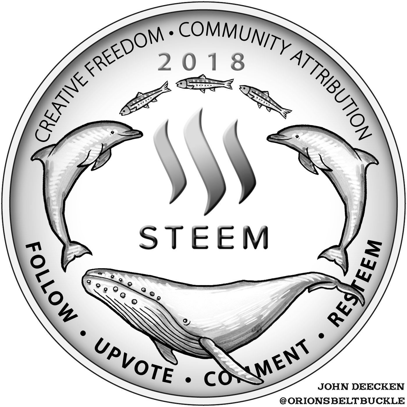
#5 by @orionsbeltbuckle
#6 by @mariae
#7 by @dandesign86
Votes will be counted in 7 days when this post pays out, and if there isn't a clear winner we will move to a final head to head round of voting!
I gotta’ split my vote — bearone (fucking gorgeous darling!) and Welshie — this design has serious potential!
Are we allowed to split because I am in the same boat? I cannot decided between @bearone and @welshstacker. Aggghh! This is making my brain hurt.
These are my top two as well!
My vote is very much for @bearone's
It is stylistic and gorgeous and full of meaning and symbolism!
If it had not been on the list, the eagerness to donate the 1 SBD, for the purpose of voting, would have been diminished. As it is I am of course in support of a new round, and more than willing to join in with SBD to vote.
Though some have been attracted to welsh's, It is way too busy(in my opinion), but more than that, I believe it will be a nightmare to translate onto a one ounce round size. If we ever make a 10 oz round....it can probably be worked into something ...and maybe even quite special.
I don't think the issue is cleaning it up and digitizing it... I think way too much is trying to be incorporated. Bearone's incorporates a lot...but in a manner that is elegant and pleasing to the eye.
Right ive made up my mind. I feel like a Eurovision judge ready to cast his vote. The vote from The Democratic Peoples Republic Of Russell Bury are as follows; Azerbajan nil point.
Ive over thought things and my favorite was number 7 but i agree that it would be an amazing obverse but on the reverse it just would not work, im gutted to say that but we have some superb designs that say more on a reverse.
Number 2 is incredible but the image needs to be on a bigger coin, i would def buy it on a 100g surface and stare at it like a nutter for hours, its gorgeous.
The first coin was a pool with fish (water) it would be cool to pick another element as the second coin, there is no (fire) themed design but there are a few (Earth) designs, number 6 looks very Canadian, not that thats a bad thing but you would expect to see a maple on the other side. Number 4 is as earth as it gets but a bit corporate rather than a rag tag group of steemian pioneers with a vision lol. That leaves the tree of life by @welshstacker (without fish) it could have a couple of steem logo leaves but that is my second favorite.
Drum roll.... Number 6 is a superb continuation from the first coin and would fit in, its a bit like its zoomed in to the first coin and i like it but.......
My vote goes to number 1, lets face it none of us have anything like it in our collections and stands out, i did not pay any notice to it in the first vote but fibonacci spirals get me every time and the clever steem logo snorkel thingys just..... anyway i told you i had over thought it but my vote is for 1........ or 3 and 7 and.....
Yes, I can't wait to see the new, 2018 Steem Silver Round. But, I a really anxious, to see the mintage numbers. My guess is that it will exceed 5,000.
well, I godda go with my own design #5.. I preferred my other design with the ring of swirls and the 5 dolphins, but I think that #5 would make for an attractive silver round as well. I like having the mottos and the general balance of the design I find pleasing. Technically wouldn't be too much hassle to translate to a working die.
You have collected your daily Power Up! This post received an upvote worth of 0.38$.
Learn how to Power Up Smart here!
Agree your design is a great option. The design is a bit crowded, but it's got Everything.. it's really great concept.
I have to vote welshy! I liked it since the first time I saw it @welshstacker! If I could vote twice @bearone your design would get it!!!
My biggest issue with #1 is "to the moon" is so prominent. Steemit is about community and helping others and not at all about day trading cryptocurrency, and that's where the term comes from. Yes, we want SBD and Steem to increase in value, but the real value is each other. I really like her Line Design work though, but there's portions that look very kindergartener.
#3 has the most potential, and is more in tune with the authenticity of Steemit. It really captures what this is all about in a beautiful portrait of connectivity and growth. However... And this is a big however It's all over the place and really needs to be cleaned up. As they say in my industry, it's a wonderful first concept but we're going to have to take it further and develop it.
Long story short my vote will be for number three.
@gomatthew did you take the time to read my explanation?
I know "to the moon" is a term we use in crypto trading, but that is not my meaning of it in my design.
And yeh hahah I had kindy throwbacks.
I love welshys too. Great choice!
I did, I really liked your breakdown of all the meaning behind everything. I just think to the moon has a negative connotation because of the douchey, crypto bro trading lingo. I love the reference of shooting for the moon and being amongst the Stars, that was very clever. I just feel to the moon has been ruined by the crypto Bros.
I like the phrase ‘to the moon’ even though it has been played more than ‘Stairway to Heaven.’ Lol
Trading cryptos doesn’t make you douchy... being a db does. But whatevs, you do make several other good points.
I trade crypto too .. come at me bro
😤💸
Come at you? For what?
Just callin’ ‘em like i sees ‘em and not calling you anything.
🤘😁
It was a bad joke... You know how dbags say come at me bro??
It was a bad joke ;)
Same.
And I never new that "to the moon" was a day trading or douchy phrase.
I always have seen it as and took it as:
Can you help clean it up @welshstacker could use some help! :-)
Absolutely.. if he wants the help, I'd be happy to assist.
You have complete carte blanche to go to town on it. Make me a masterpiece @gomatthew
@welshstacker could you scan it in or take some straight on pictures? My email is [email protected].
When Mrs welshstacker gets in from work ill get her to set up her scanner and send it over to you. Thank you
For me, "to the moon" I have taken as:
I am not a big crypto trader. I have barely traded. But to this newbie, it caries no negative connotation.
well.... everything is "to the moon"... it's a pump and dump saying to build hype. Some will moon longterm, most will not.
Love the upside down avatar. Haven't see that! upvote for that alone. ;p
I would buy #7, it’s cleaaaaan 💪🏼🙌🏼💯
My vote goes will go to #3 Welshstacker.
I know in the first round, a lot of people liked #7. I think this one would be good if you were to make the STAX coin and would look great as a front.
Now theres an idea, im trying to decide which i like the most and i do love design 7 but im wondering if it would just make a double sided steem logo round but it would be such a shame to waste an amazing design but as a front image for a stax coin would be very cool.
That's a good idea!
I vote #4 really dig this one