12 Astonishing Facts About Famous Logos You Didn’t Know
Every day we see emblems of famous companies, but we rarely give a second thought to their origins or meanings.
Here are 12 stories that will uncover little secrets of well-known logos, and there’s a bonus at the end of the article to bust a certain myth.
Apple
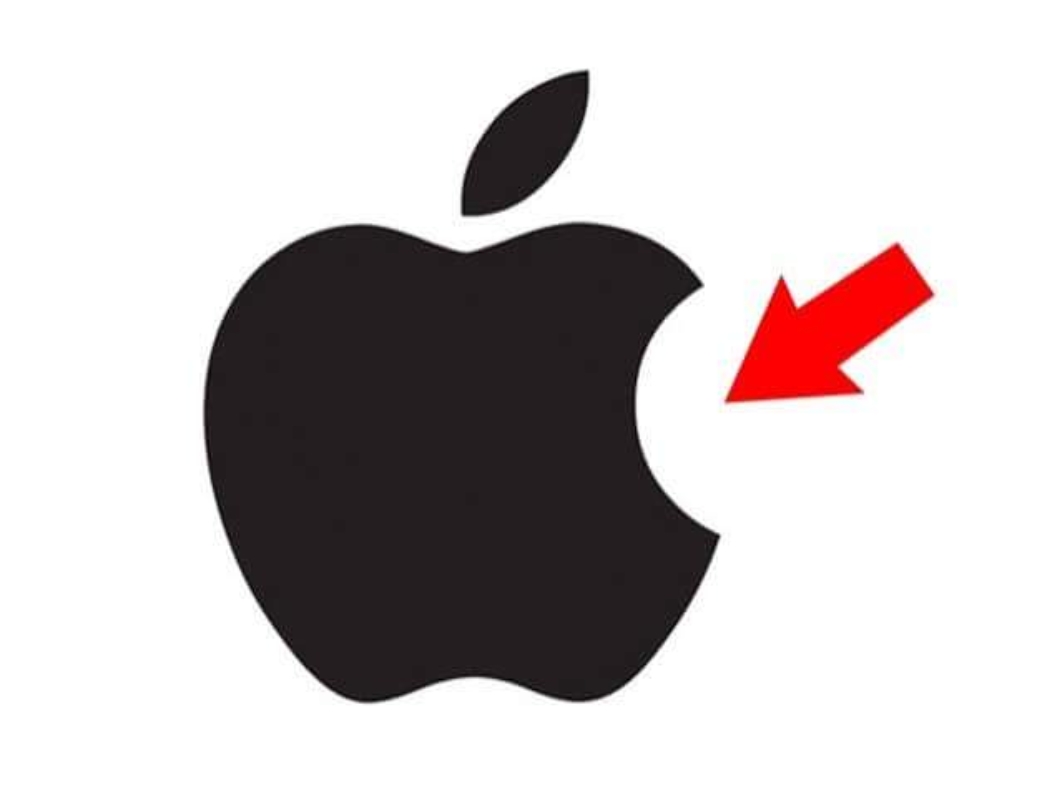
Legend has it that the Apple logo was dedicated to Alan Turing, who ended his life by biting into a poisoned apple. In fact, it’s all much simpler: designer Rob Janoff says he made the bitten apple to show its dimensions because a whole apple can be easily confused with any other round fruit.
Ferrari
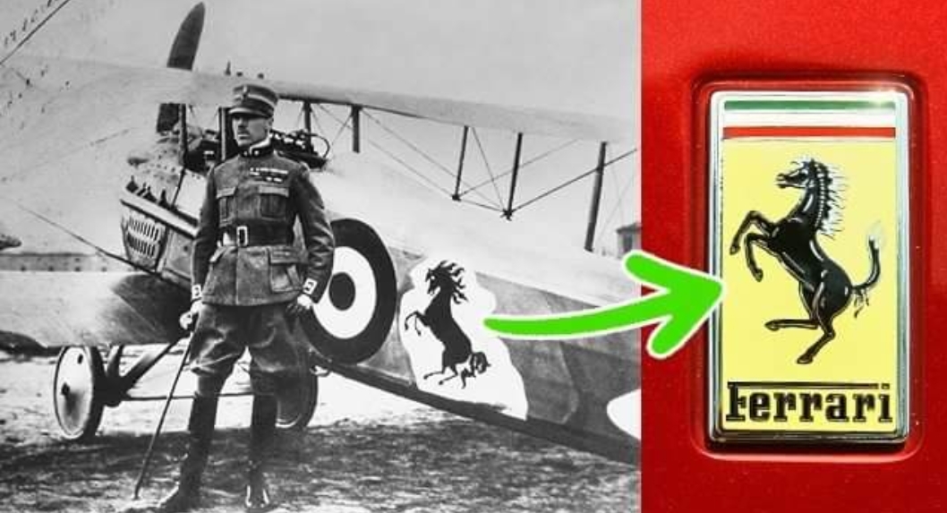
Many think that the Ferrari logo symbolizes horsepower, but that’s not true. In his biography, Enzo Ferrari mentions that the horse silhouette was initially painted on the plane of Italian ace pilot Francesco Baracca. The emblem was given to Enzo by Francesco’s mother after his victory in a race, and later it became the well-known symbol.
Wikipedia
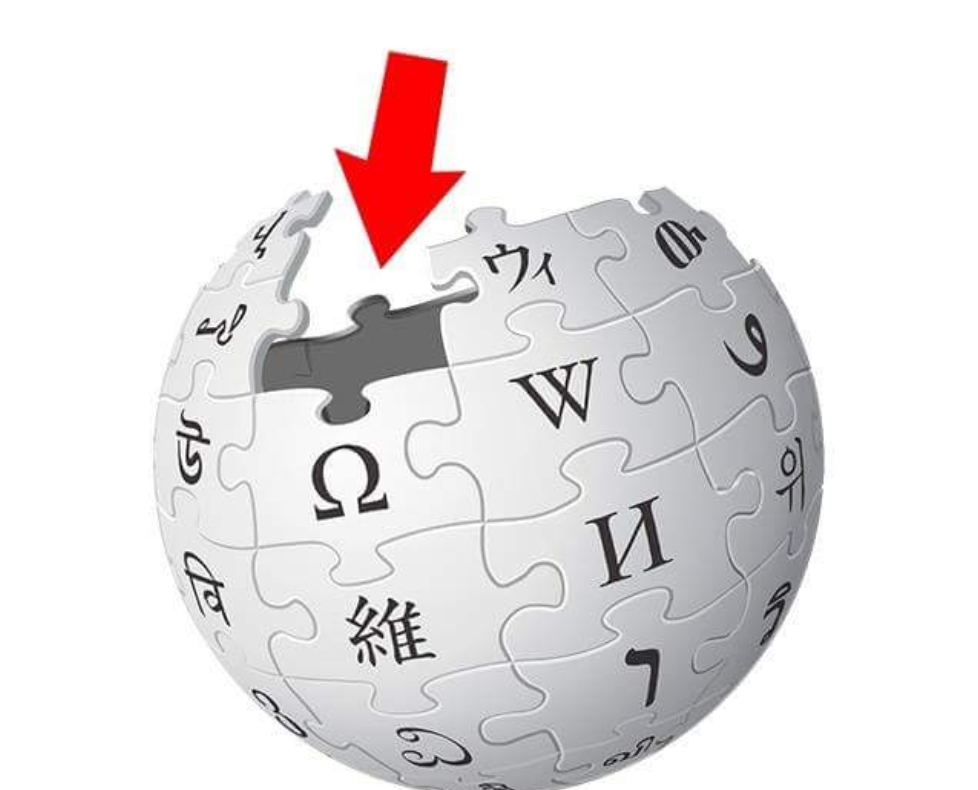
It’s not surprising that the worldwide encyclopedia’s emblem is Earth. The puzzle pieces it consists of are a symbol of multilingualism, so each is labeled with letters of different languages. Taken together, they make the word "wikipedia," while the missing pieces indicate that the encyclopedia isn’t finished and is constantly being updated.
Android
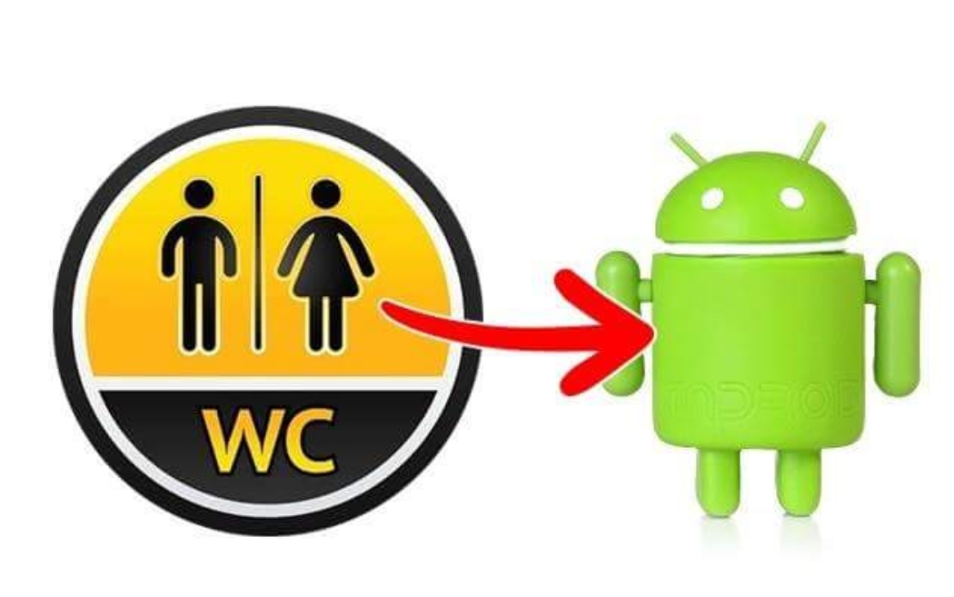
Graphic designer Irina Blok and her team were given the task of creating a logo that would include a robot and be easily recognized. Funny as it seems, the inspiration came from the symbols we usually see on the doors of public bathrooms.
McDonald’s
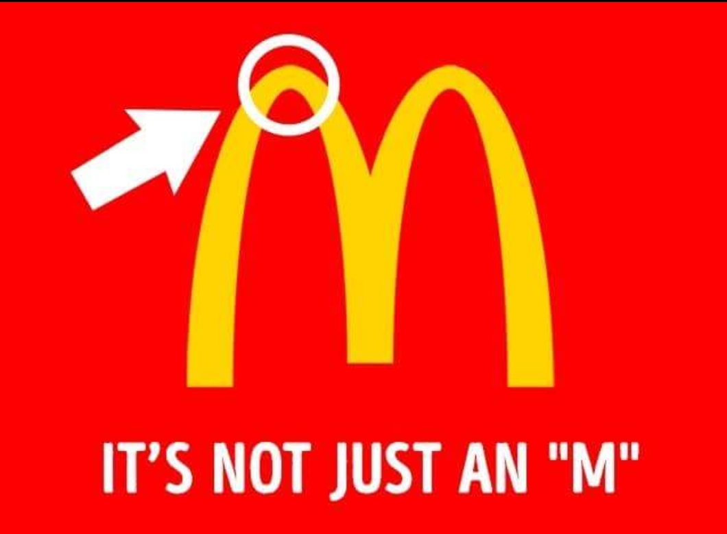
In 1962, McDonald’s hired psychologist Louis Cheskin. He suggested replacing the Speedee the Cook logo with golden arches making an "M." His thinking was that such a shape resembles female breasts, which subconsciously arouses appetite and reminds people of their happy childhood. It’s worth mentioning, though, that Cheskin didn’t invent these arches himself, and they were present in the restaurants since the 1950s.
Lacoste
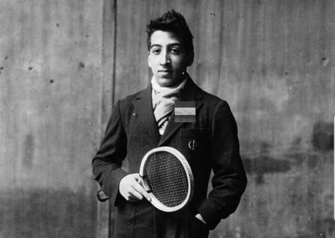
In 1923, René Lacoste was walking down the street with the captain of his team, Alan Moore, and noticed a crocodile skin suitcase in one of the shop windows. Lacoste and Moore made a bet that if René won the next game, Alan would buy him that suitcase. Lacoste lost, but a journalist heard of this story and wrote a piece about a tennis player who hadn’t won but "fought like a crocodile." That was how Lacoste got his nickname, and his company later received the emblem of this reptile.
BMW
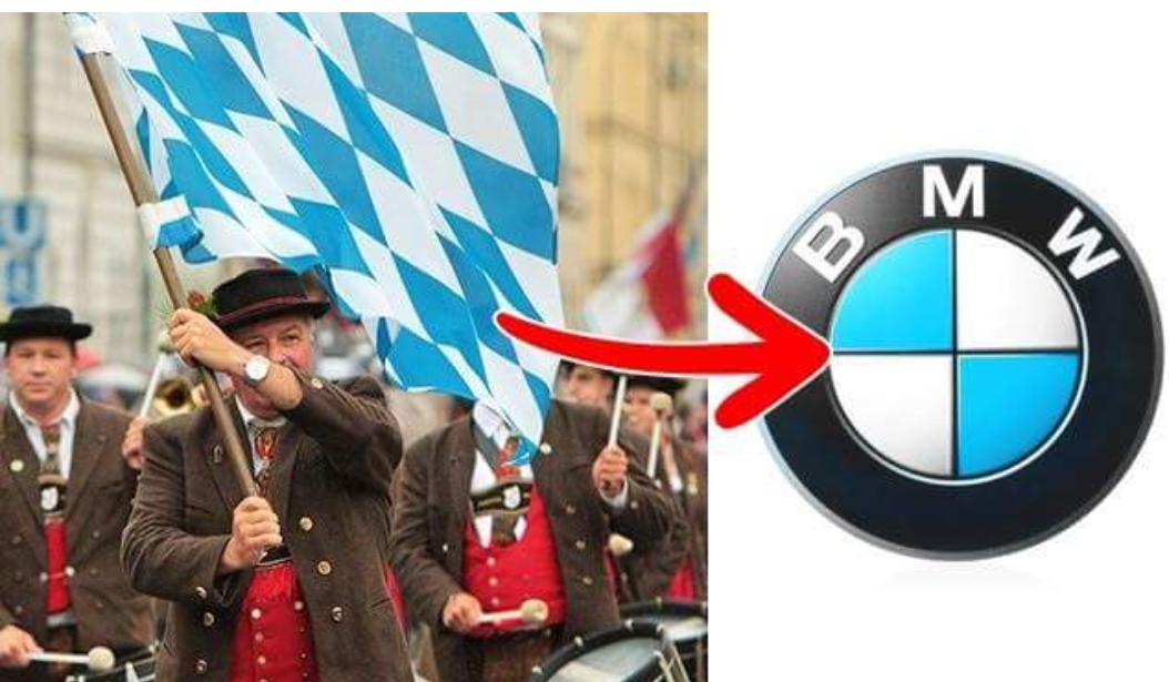
Rumor has it that the BMW logo symbolizes an airplane propeller, and even some company employees share this opinion. However, it’s all much simpler: the blue and white were chosen to represent the colors of Bavaria.
Uber
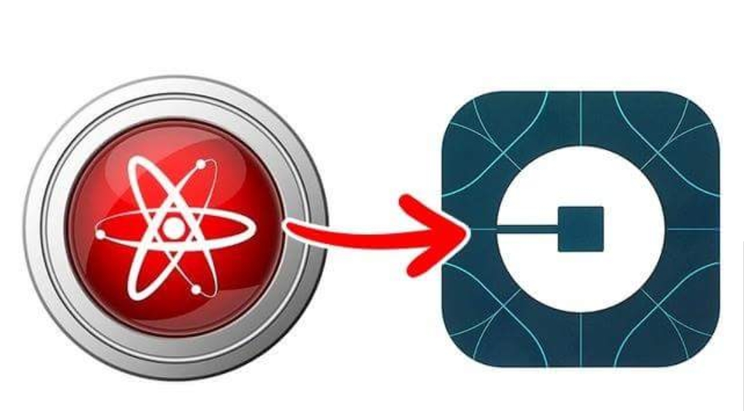
Uber has recently changed its logo from a "U" to something remotely like bits of information or atoms. The company states that the new logo represents their cars that can be found anywhere, just like bits or atoms.
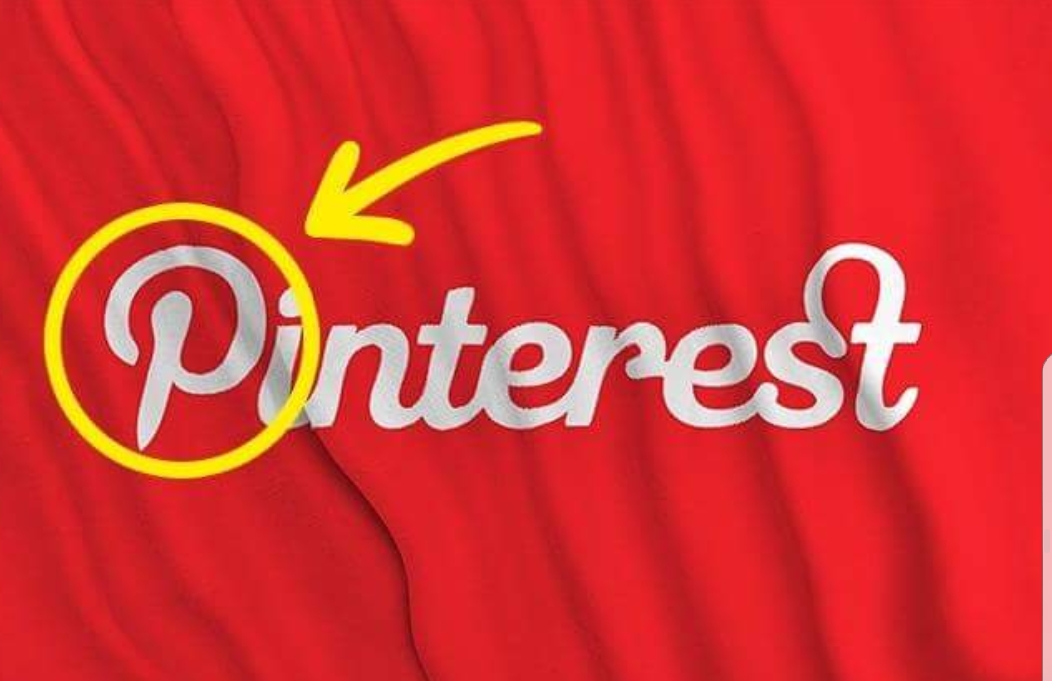
It seems pretty simple at first glance, yet if you look closely at the first letter, you’ll see that it resembles a pin we might use for papers or photographs. Pinterest literally "pins" pictures to walls, only it does so electronically.
Nike
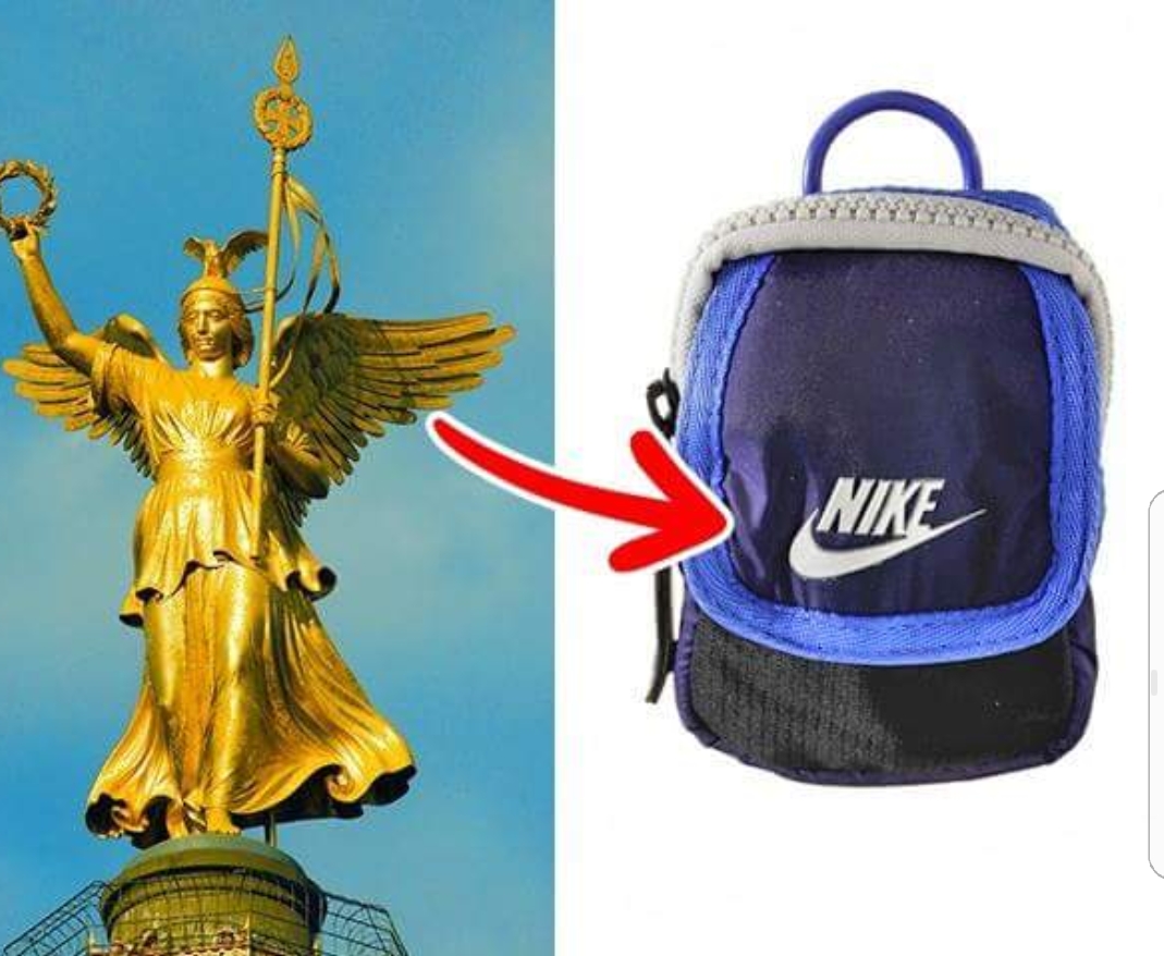
One of the most recognizable logos in the world is actually one of the cheapest ones. It cost just $35 — that’s how much Phil Knight, the owner of the company, paid student Carolyn Davidson for her work in 1971, and he wasn’t even happy with the result at first. He turned out to be wrong: the swoosh emblem became amazingly successful, and it’s no surprise that it’s so often associated with a wing of Nike, the goddess of victory.
Starbucks
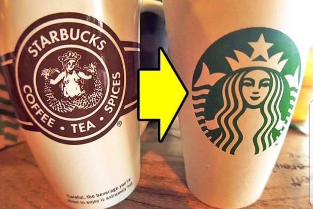
Few know about it, but the Starbucks logo is a mermaid holding 2 of her tail fins. This emblem was inspired by the myth of the fairy Melusine, a woman-fish with 2 tails who married a mortal man. In 1971, the whole picture of the mermaid could be seen on coffee cups, but later it was "censored."
Pepsi
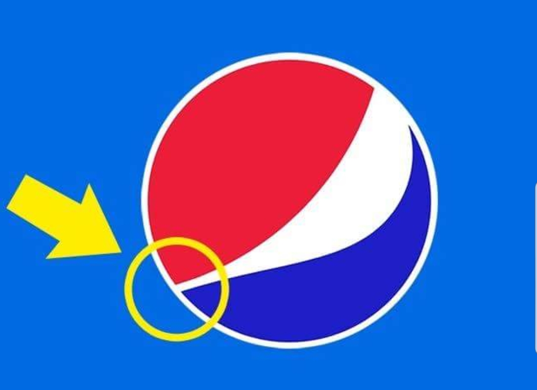
The Pepsi logo seems simple enough, yet it cost a lot more than you could imagine: $1 million. Designers developed it according to the proportions of the golden ratio that are presumed the most harmonious and pleasant for the human eye.
There’s also another version of why it looks like this...
But this is obviously just a joke. Though if not drunk in moderation, the effects of Pepsi would be rather like that.
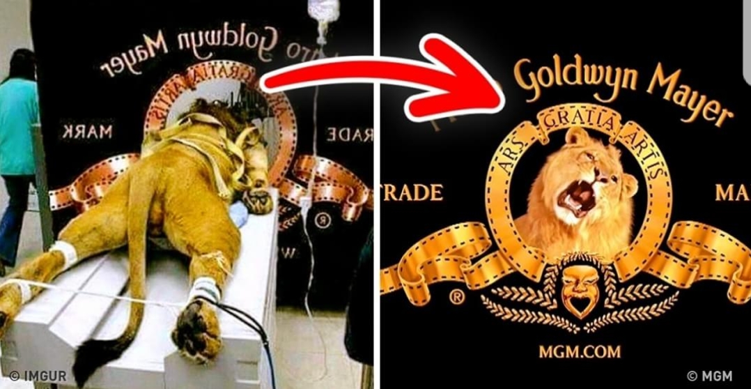
Bonus: The Metro Goldwyn Mayer lion
That’s definitely NOT how Metro Goldwyn Mayer made their famous roaring lion logo. When viewing the mascot of MGM Studios since 1917, few know that there have actually been 7 different lions used for this purpose. They were properly tamed and trained to roar on cue. As for the picture currently roaming the Web, it’s just a fake, of course. The lion on it is preparing for an MRI scan. Don’t believe it if you see it anywhere.
WOW
Hi! I am a robot. I just upvoted you! I found similar content that readers might be interested in:
https://brightside.me/wonder-curiosities/12-astonishing-facts-about-famous-logos-you-didnt-know-371210/