TIL: How to Hide the Thumbnail Image in your Steemit Post [The Easy Way]
Dear friends,
usually the first image of your post becomes the preview image, but sometimes it might be useful to hide the preview image in your post.
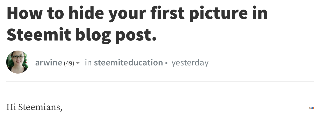
Yesterday @kenny-crane shared a post by @arwine on twitter, in which she tried to achieve this by nesting several div tags. You can find her post here.
Essentially it looks like this:
<div class="pull-right">
<div class="pull-right">
<div class="pull-right">
<div class="pull-right">


Place your image link here

</div>
</div>
</div>
</div>
What happens?
By using the div tags this way, you actually make it very small, because every
< div class="pull-left" > or < div class="pull-right" >
splits the screen in half and all the nested elements will be resized to fit this space by the Steemit CSS.
If you look closely at @arwine's post, you can still spot the preview image as a mini thumbnail at the bottom right of this screenshot.
My Solution
This let me think about an easier and more elegant way to get a better result.
Just upload your images to steemitimages and then add the following code right before the image link of your preview image:
https://steemitimages.com/1x1/
Your link should look like this:


How does it work?
Basically adding the above code in front of your image link, lets you change the size of every image. The first number means the maximum width the image is displayed in pixels and the second number means the maximum height.
For this reason the image is displayed at 1 by 1 pixels, meaning you will still see a small dot if you look closely. I also tried using the "0x0" value, but it didn't work.
Resizing
You can still use the same technique to resize your image, when it's too big.
For example, this is the thumbnail image, when you make the maximum width 200 pixel.
Adding https://steemitimages.com/200x0/
And this is the thumbnail image, when you make the maximum height 200 pixel.
Adding https://steemitimages.com/0x200/
As you can see, the aspect ratio of the images is fixed, so that the image still looks good. This is because only one of the numbers is interpreted as being responsible for the resize. Either it is the number, which is different from zero or the smaller number.
Hope this info helps you to design even more outstanding posts.
Do you know some more good design tips for Steemit posts?
Please share them in the comments!


I use this @shortcut :) to make images look uniform on my posts too. I put them all as 600x600 or something like that.
Great! That's a good practice to let your posts look professional.
This is really awesome, I am gonna try this for sure.
Cool ;-)
It is indeed cool !
Will sure use it in my next post ;)
Nice :-)
Amazing, this funktion will help making my blog better structured. Thx for sharing :)
Resteemed
You're welcome and I agree, that resizing images to the same size lets your post look more structured.
Great.. I will absolutely try this ...I think by resizing the image we do more effective work ...Thanks for sharing this 😇
Welcome! I‘m happy, if it’s useful.
wow this is really cool thing you just shared need to give it a try soon :D
essential design tutorial.
go ahead.
Disclaimer: I am just a bot trying to be helpful.
I like this post it is so useful