The guide for the rookie Illustrator V8. Color Theory!

Hello! Welcome to Guide # 8 about color theory, you will learn the difference between RGB and CMYK
How to handle the color palettes correctly, and many other things.


The theory of color is a group of basic rules in the mixture of colors to achieve the desired effect by combining them, is a sensation produced by the reflection of light in matter and transmitted by the eye to the brain. The matter captures the wavelengths that make up the light except those that correspond to the color we observe and that are reflected.
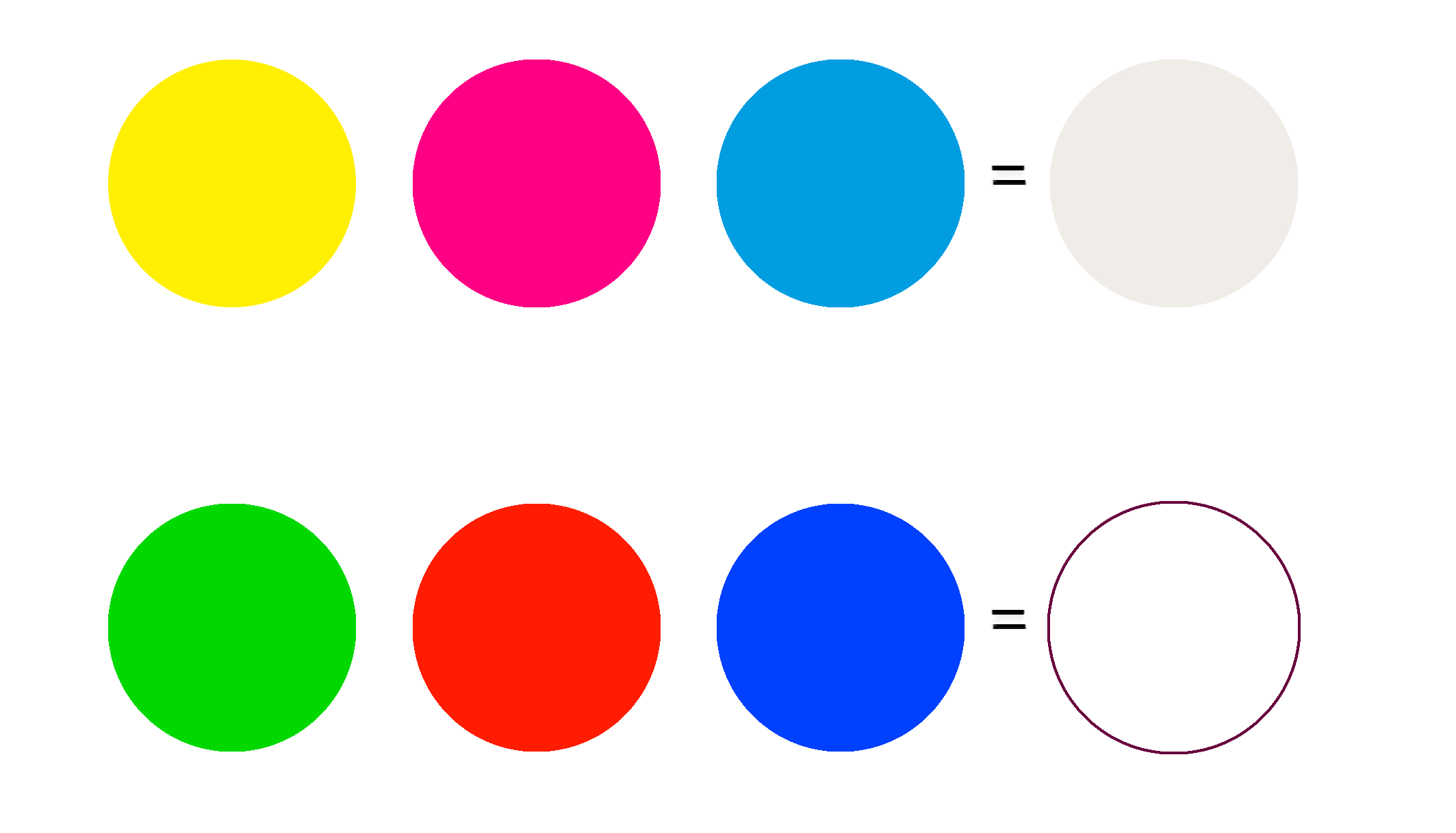

The primary colors are those scientifically established as the originals of the most extensive and satisfactory chromatic combinations.
Secondary colors are obtained by mixing the primary colors together in the same proportion.
Finally the tertiary colors are Red-Orange, Yellow-Orange, Yellow-Green, Blue-Green, Blue-Violet, Red-Violet
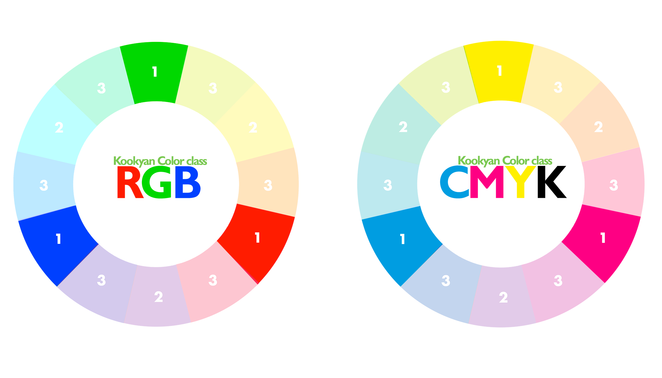
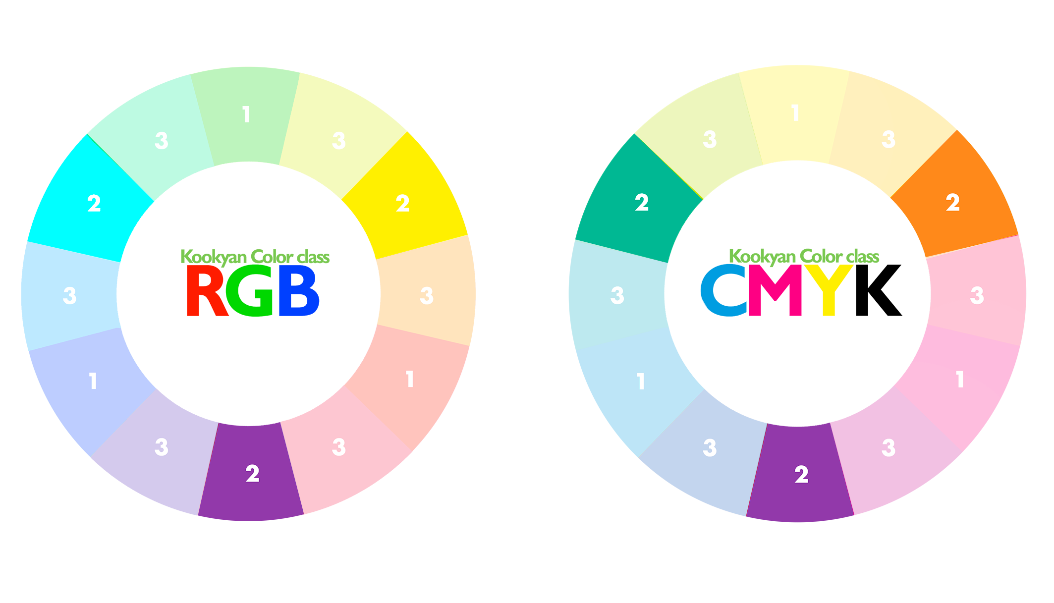
The qualities of color are: tone (specific name),
value (degree of brilliance or luminosity) and saturation (degree of purity).

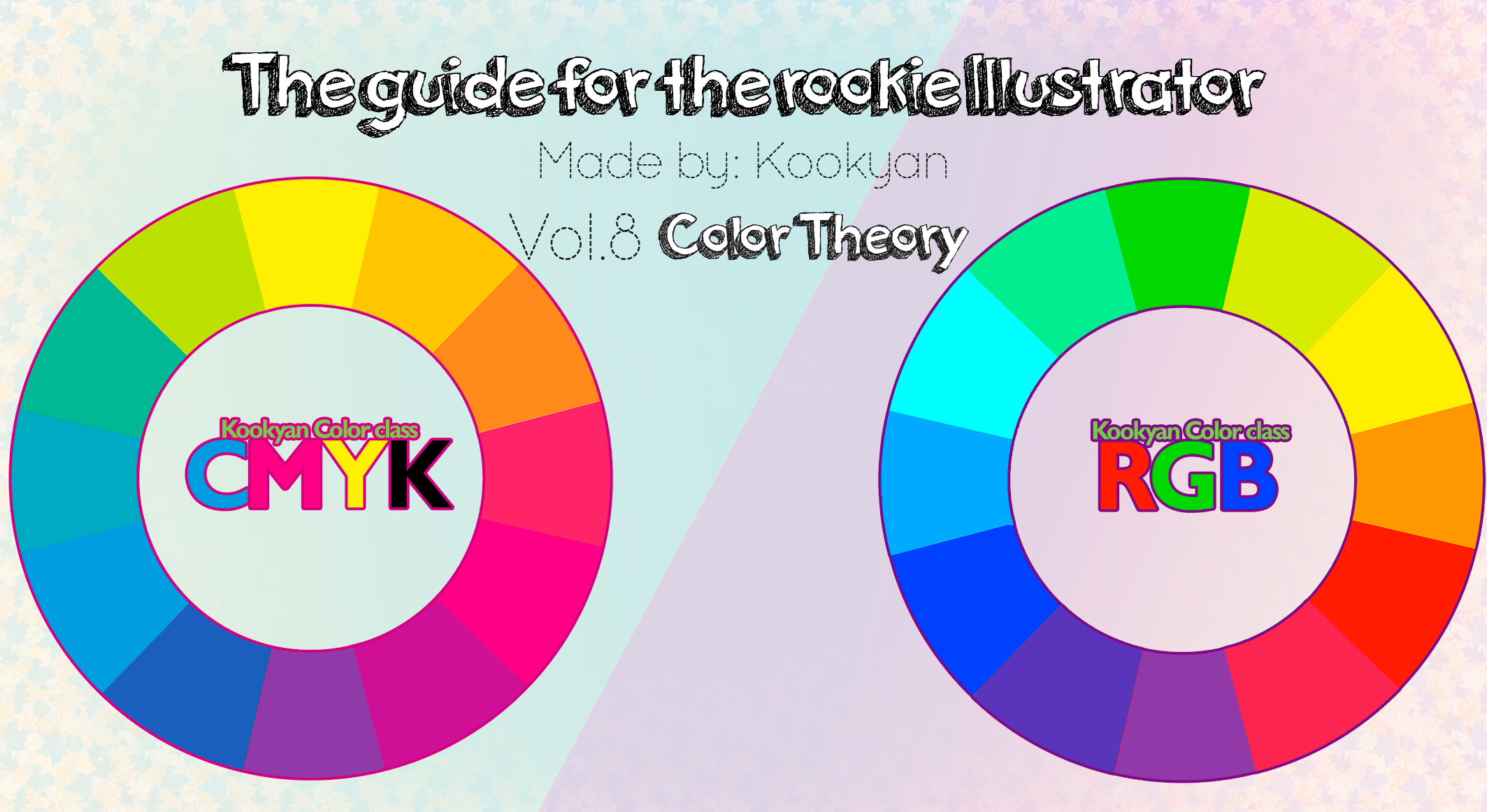
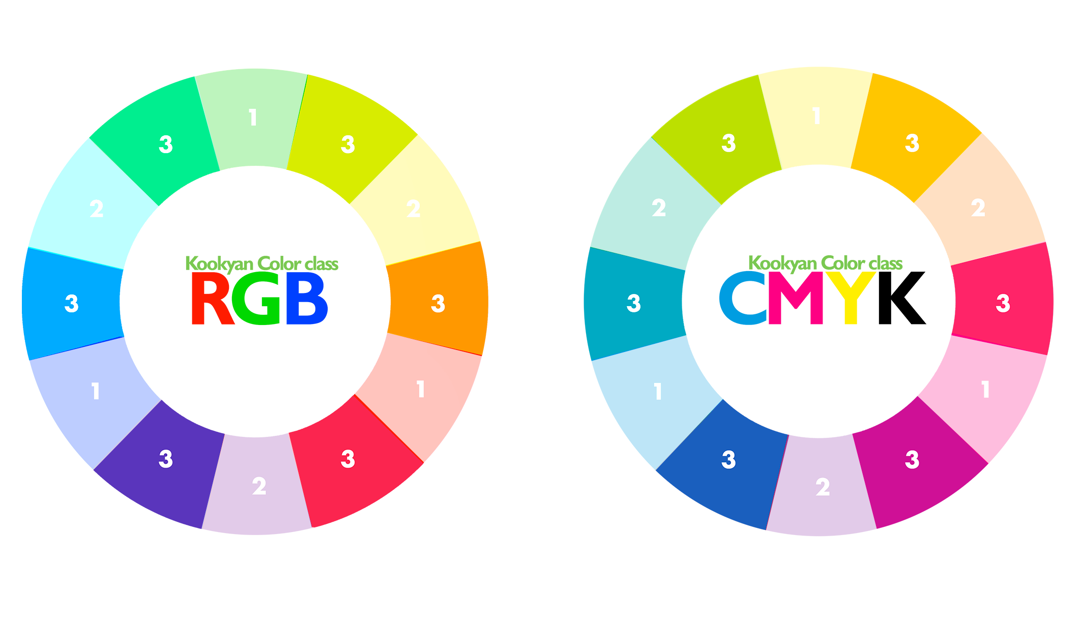
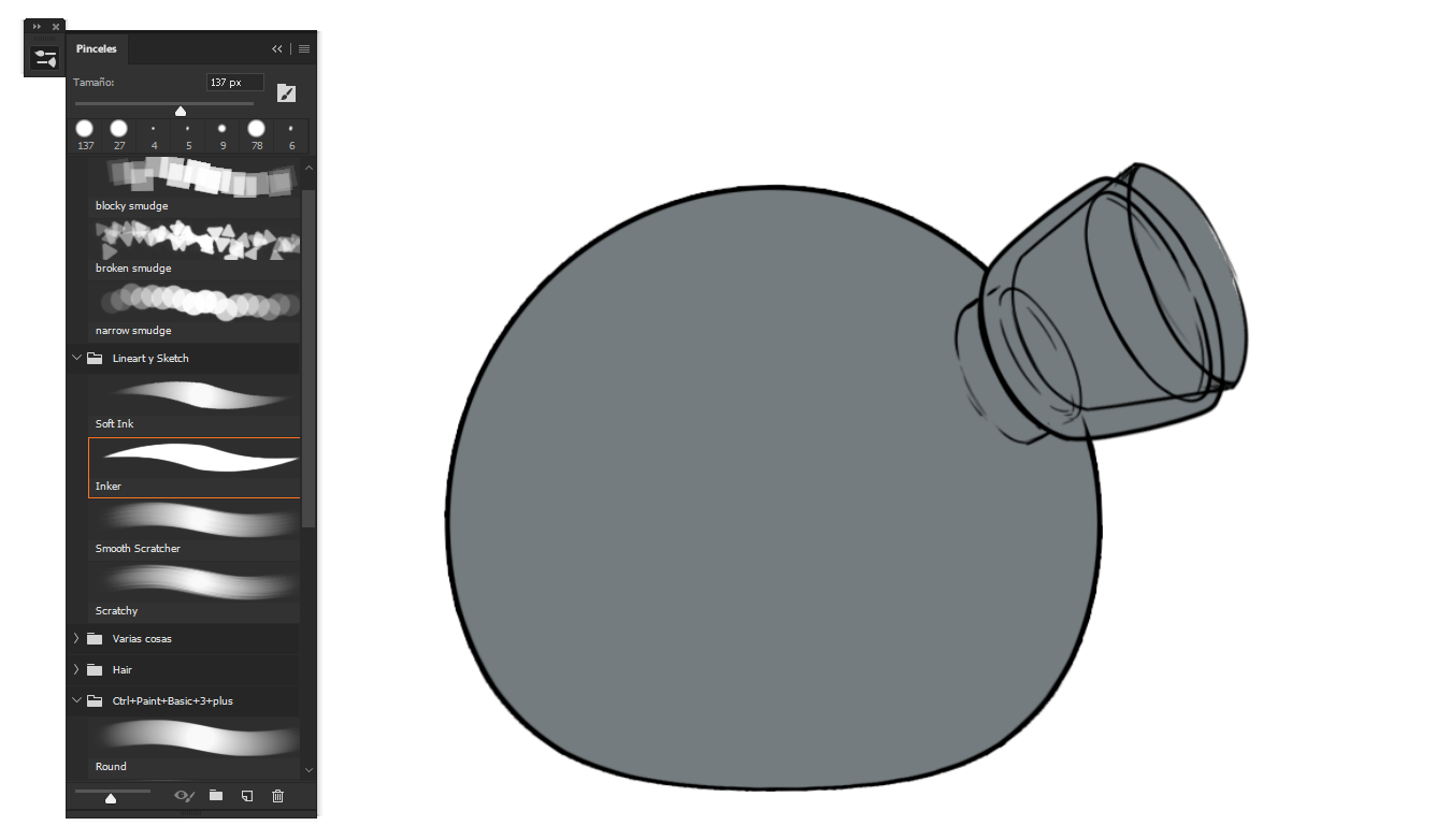
Since we know this, the first thing we are going to differentiate is the RGB CMYK
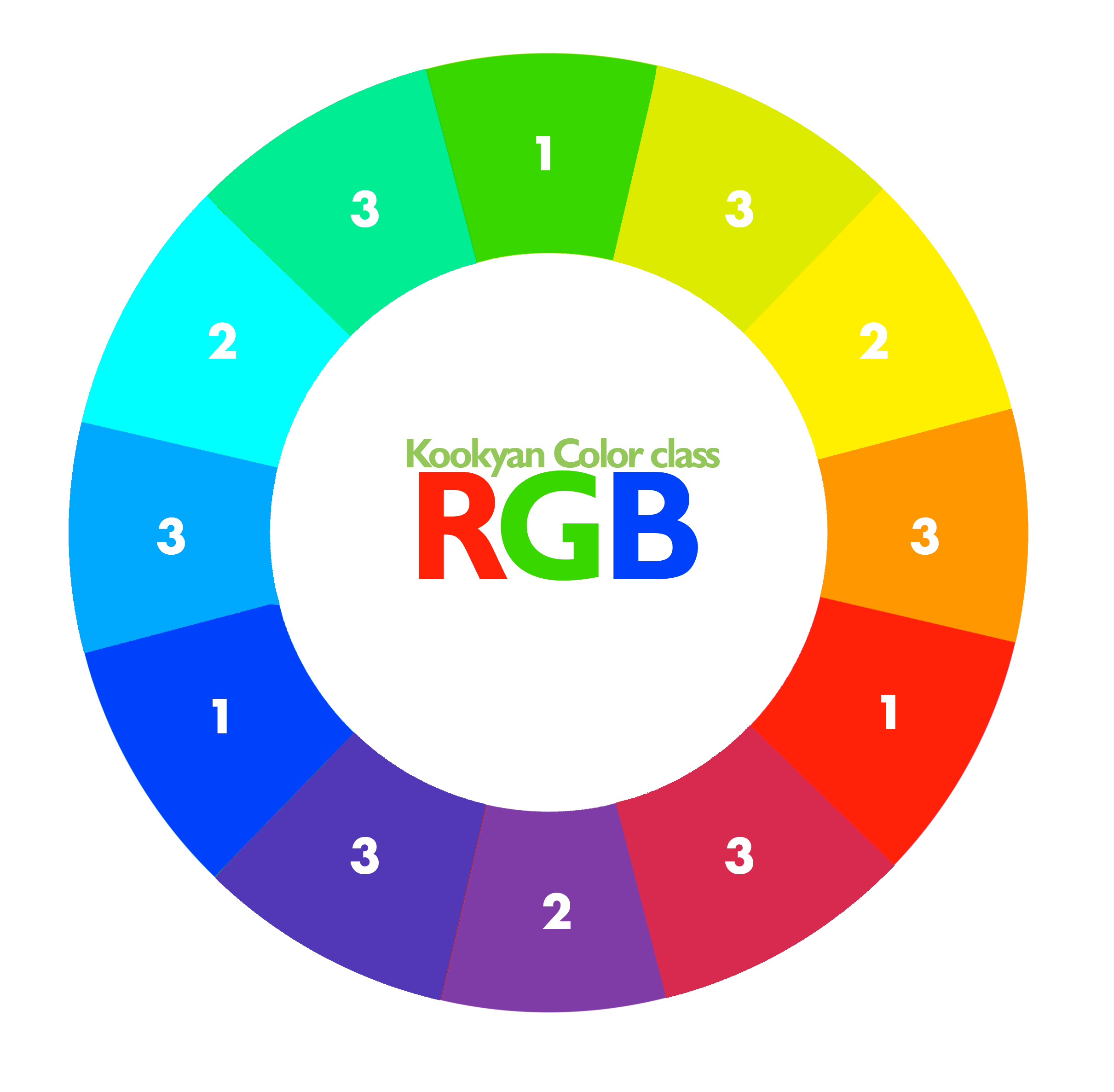
The RGB scheme (Red, Green and Blue) uses combinations of these colors to create millions of other strong colors and combinations,
and is the one usually used on television screens and computers.
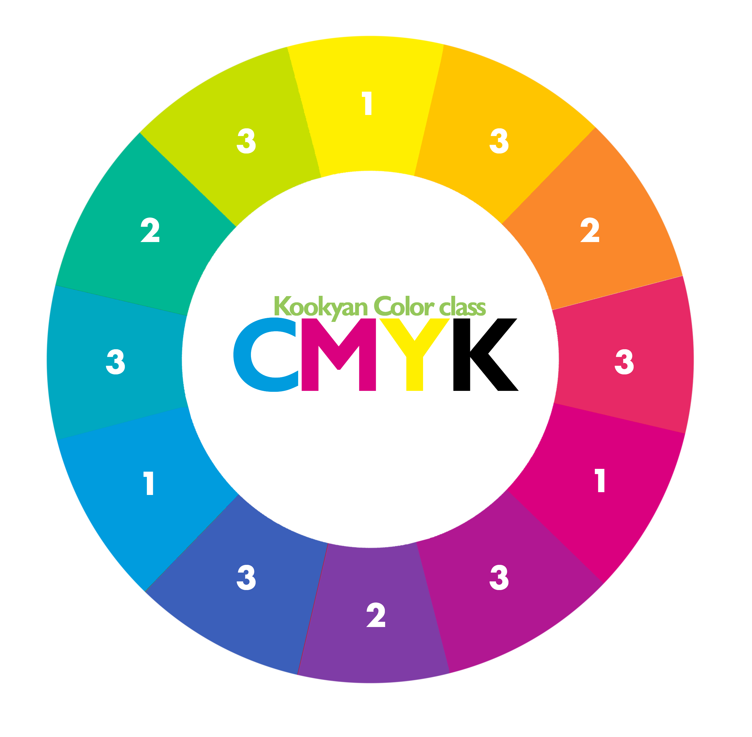
The CMYK scheme works in four colors, with the colors cyan, magenta, yellow and black. These four colors are mixed with different percentages to achieve any tone, represented 0% an addition of no color and 100% a full addition of the indicated color.

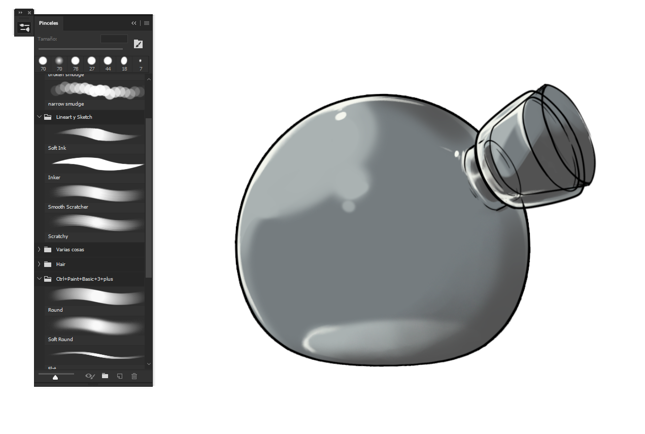
Both processes (CMYK and RGB) have their advantages and disadvantages. RGB can produce many more colors, although the conversion to CMYK is not, as we saw, accurate, so the loading of the files should be done in CMYK, something that most programs allow.

For its part, this system also has some defects, mainly the difficulty to recognize the blue color and some problems with dark reds, so the care when working with these two tones should be maximum.

THE TONE
We define tone as the quality that a color has. Tones are all the colors of the chromatic circle, primary, secondary and intermediate without mixing with white or black.

SATURATION
It is the color intensity or purity of a color. When a color belongs to the chromatic circle, it is said to be saturated, which has the maximum power of pigmentation, of coloration. But we do not always find pure colors, but they are often seen as composed by complex mixtures.

VALUE
It is understood as the ability of a color to reflect the white light that affects it. Refers to the lightness or darkness of a tone.

Types of lighting.
Warm light | Cold light |
|---|---|
 |  |
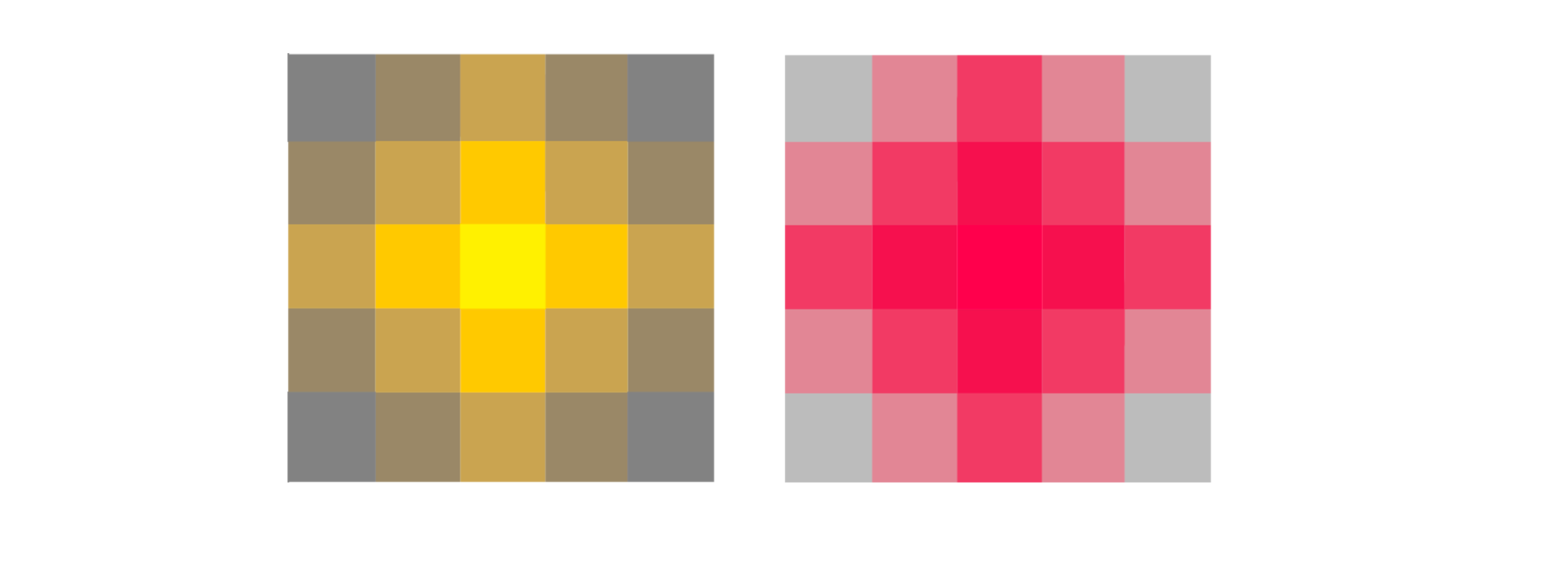
If you are coloring a job, and the light in your room or office is yellow, when you put a green you will see the same color two tones lighter, which will cause your color palette to disharmonize.


The color contrast is the difference between two or more colors that interact in a design so that they affect the way in which they are perceived
Contrast pure color.
In it saturated colors are juxtaposed, whose contrast increases the further away they are from each other in the chromatic circle. The effect they produce is quite striking.
Contrast of light and dark
Here colors of light and dark values are juxtaposed, the contrast of which is more important the greater the difference in light.

Contrast of complementary colors
In this contrast two opposite colors are juxtaposed in the chromatic circle. If these colors are saturated, the contrast will be maximum.

Saturation contrast
It is also called quality contrast and is where bright and dull colors are juxtaposed. The contrast will also depend on the disparity in the chromatic intensity of the colors that interact, which will be greater when combining a pure tone with one that does not have chroma.
Contrast of quantity
This contrast is in which you can see the juxtaposition of decompensated proportions of various colors, where there is much of one and little of another. The resource can be used to create visual effects or harmonize other contrasts of great intensity.


The psychology of color is a field of study that is aimed at analyzing the effect of color on human perception and behavior.

It is important to master this to be able to handle the perception that we want to give in an illustration or a design,
if we are going to put a promotional poster on a summer themed event we can not use cold colors associated with winter,
as automatically people would lose interest in the poster.
Mistery, Valor and Magic

Calm, Business, honesty and sadness .

Nature, Hope, Live and Healthy.

Warm, Hapyness, and Hospitality.

Meditation, Comfort, Appetite and Motivation.

Seriousness, stunned, dirt, protection.

Passion, War, love and Fear.

Ingenuity, Sweetness, Gluttony and Delicacy.

Peace, Empty equality and cleanliness.

Death, Elegance and Negative.


Mixing these tones helps to reinforce the scenes or the messages that we want to imply as in the following examples:
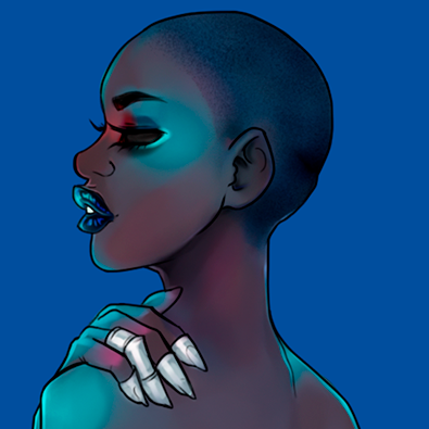
In this particular scene we can see two different versions
of color palettes of the Hunter X Hunter series of 1999 and the current series of 2011
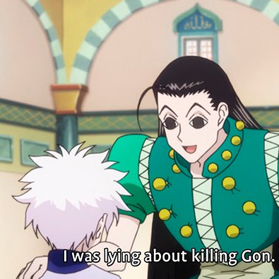 | 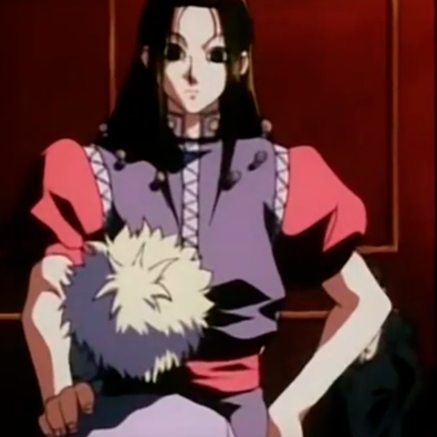 |
| If we see the image without context we think that it is an ordinary situation or little serious | Observing without context we know that it is a tense and dangerous environment for the white-haired boy |
| The mood of the characters is not perceived correctly | In this scene the red colors associated with the blood and the dark tones with the despair show us who the villain is |
| The color palette does not reinforce the situation of the scene | The color palette gives more power to the camera frames and tension to the scene |
| Color palette associated with happiness | Color palette associated with blood and despair |
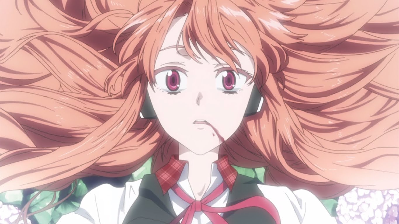
In the scene of Akame ga kill, they show us this death in Tones of saturated and white
And for an example of warm tones associated with comfort, we have the following scene from Steven Universe
where we have a frame with two characters that generate a shadow. But as we have a background of warm and saturated tones, that feeling of comfort leaves us.


These tips will be divided into two parts, tips for digital illustrators and for traditional. So do not worry we have a lot of advice to share.
Tip #1 Black is not a shadow.
Traditional:
When we color by hand we have a golden rule, white blurs and black stains.
When we want to make the shade of a color we must use the color contrast of the same, for example
If we are coloring a yellow flower, the color that we must use to generate a shadow is purple, since being colors that can not be mixed generate shadow without the need to blacken the work.
Digital:
if we are doing a comic, flat color, or some kind of cartoon, it is allowed to make shadows with black tones but they should be part of the lineart, when using black for the shadows we may end up staining the drawing or darkening it too much. (The same can happen with grayish tones).
Tip #2: Traditional: do not wax the paper!
Often those who color in traditional often pass the color pencil as if it were a pencil and end waxing the paper, this makes it difficult to place other colors in the area where you applied the first. That means it is very difficult to handle the shadow and the visual effects of the illustration on paper.
Personally I know 3 traditional coloring techniques, so I will talk about these three ways.
- Circular technique

- May technique

- Screening Technique

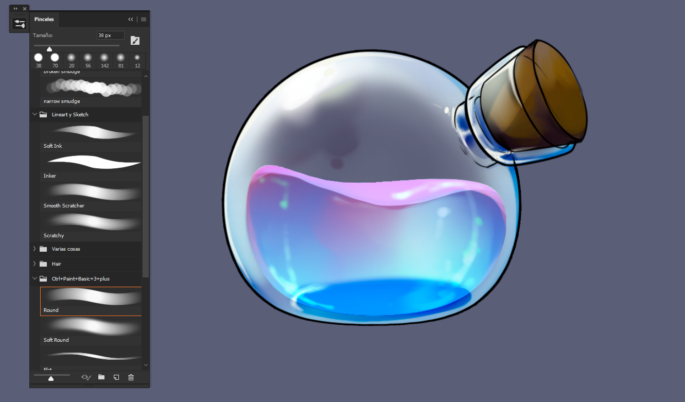
Tips #3: Layer and grayscale styles.
For digital artists this is a trick that greatly facilitates the process of shading and giving three-dimensionality to things.
First you must have a light gray background, and with other tones preferably in different layers you add the shadows and highlights of your work.
Then those shadows can be colored and/or use the styles of layers to fit it with your illustration.
This is all for now. See you in the next post!

 |  |  |  |  |  |  |
|---|
If you want an illustration, banner or any Design work Click this image and you will see my commission table.

I didn't know there is so much behind colors! I love your article. All the information is so very well written, detailed and understandable. My favorite colors are purple, pink and green and now I know what they mean :) Thank you for sharing and congratulations on curie vote! PS: I will save your article as I'm sure I'm going to use the information!
I am very happy that my guide will be of help to you, I hope it continues to be like this and thank you very much for the support!
Dear Artzonian, thanks for using the #ArtzOne hashtag. Your work is valuable to the @ArtzOne community. Quote of the week: Art, freedom and creativity will change society faster than politics. -Victor Pinchuk
Voted from whaleshares curation Show
Cheers ❤️
This is really nice. Great work.
upvoted from the whaleshares show!
Hi kookyan,
Visit curiesteem.com or join the Curie Discord community to learn more.
Great stuff!!!
This post was shared in the Curation Collective Discord community for curators, and upvoted and resteemed by the @c-squared community account after manual review.
Thank you very much @kookyan for such comprehensive tutorial, it is like math when it is not enough to repeat what you already know, even though I am drawing and painting for a long time but every time I have a pick at color wheel, and every time I have to think if that is warm of cold color. Of course once painting is ready it looks like easy and straightforward but the way to it always needs a confirmation if you are using the right thing because you do not want to lose your work and re-start from beginning.
I really appreciate you for taking time and presenting all tips and tricks in one post, I think many artists will find your post informative and helpful :)
I try not to sound repetitive when I answer comments, but I am very grateful for the support that everyone gives me and it is an honor for me that my advice is so useful to them.
Thank you very much for taking the time to read all my post and write me such a beautiful answer.
Super great your post .. I loved the way you structured the post very well explained .. Your post reminded me of my sister, she is a graphic designer and all the time she talks about things like this, many of the things you mentioned I already became well known .. No doubt a true quality post, continues to surprise us with your great work, A big hug @kookyan!
Thanks!! personally when I saw color theory classes, I really liked it.

It was my second favorite subject after methodology.
I am glad that the format change has a good acceptance.