Suggestion For Samsung Logo With Meaning and design process
Preliminary
Samsung in Korean means 'three star'. The name was chosen by Samsung founder Lee Byung-chull, in the hope that Samsung could one day grow strong and become immortal like a star in the sky.
Lee Byung-chull certainly does not choose the brand name. The selection of the number three also turned out to have the same meaning with the expectations of Lee Byung-chull.
The number three is a symbol in Korean, which represents something big and powerful. The expectations and meaning behind Samsung's brand are now proven by the company's success in recent years, especially in the smartphone industry.
(source http://tekno.liputan6.com/read/2179843/makna-di-balik-logo-samsung)
from the preliminary statement we can conclude that Samsung means three stars, but the Samsung logo now looks completely unrelated to the meaning of its name,
here is an example of samsung logo until 2017.
therefore, I would like to suggest a few changes to the Samsung logo in 2018.
here is the logo I recommend:
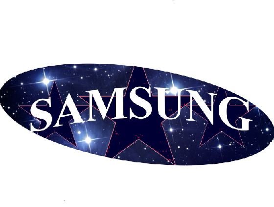
on the logo that I suggest can be seen there are three stars behind the writing of SAMSUNG, and it reflects the meaning of the name SAMSUNG itself, and the background logo also has a glowing star image meaningful Success is achieved by samsung, while the logo is only reversed form of logo basically.
then I will give an overview of the process of making the logo that I created using Photoshop CS3.

The first step, I was using a normal size paper and given a background of scattered stars, as in the picture below.

next I give a star photo and I dupliakt to be three stars.


after I adjusted the three stars then I made the writing of SAMSUNG.
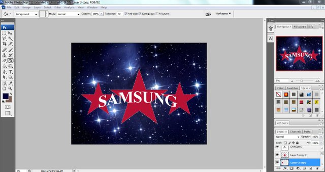
Then I adjust the color of the three stars, the logo that I made this I give the blue dongker in three stars, the blue color is the basic color of the samsung logo.
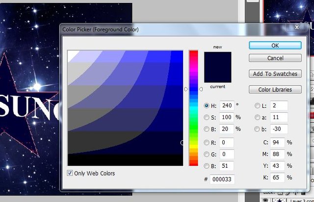
then I adjust the shape and size of the writing of SAMSUNG and I selected using Elliptical Marquee tool to create an oval shape, then I remove the part that is not in need.

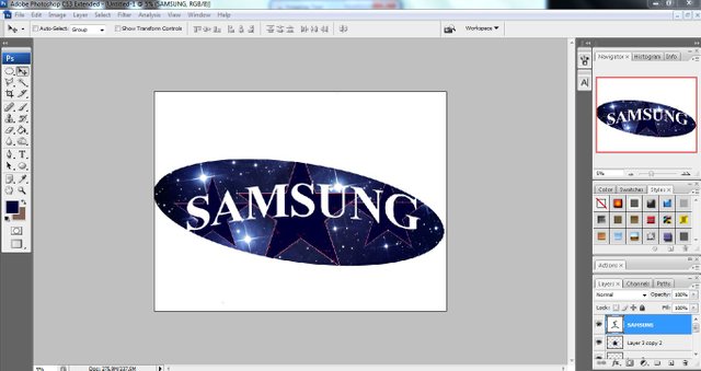
and this is the new samsung logo design I have created.

thanks, hopefully useful, successful greetings to all of us ...
@hendri.aceh
Posted on Utopian.io - Rewarding Open Source Contributors
The logo you suggested is fine...it looks a bit the same as the old one...but the idea of putting the star in the background is artistic and nice it really represent samsung and its meaning😊
thank you for making a positive comment for my work ... thanks again.
Your welcome sir😉
Good post.
Done..
Your contribution cannot be approved because it does not follow the Utopian Rules.
The repository is empty and it should be under suggestion category
You can contact us on Discord.
[utopian-moderator]