Understand and Implement Custom Views in Android - Part 2
Repository:
https://github.com/enyason/custom_view

Repository
https://github.com/enyason/custom_view
What Will I Learn?
- How custom views work
- How to extend a built-in view
- How to build a compound control
Requirements
- System Requirements: Java JDK, Android Studio
- OS Support for Java: Windows, Mac OS, Linux
- Required Knowledge: A fair knowledge of Java, OOP and Android Studio
Resources for Java and this tutorial
- Oracle Website - https://www.oracle.com/index.html
- Java Docs - http://www.oracle.com/technetwork/java/javase/documentation/api-jsp-136079.html
- Android Docs - https://developer.android.com/docs
Difficulty : Beginner
Tutorial Duration 25- 30 Minutes
Tutorial Content
In the first part of this tutorial series, we considered a custom view, what it means and how to implement it on android. We started off by extending a simple text view that displayed a custom icon and a text. For this second part of the series, we are going to implement a compound control.
What is a compound control?
- A group of views often with additional functionalities
- Modularize code into custom compound control with this, you can reuse the same functionality
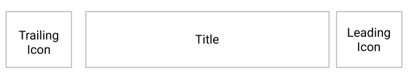
To delve further into compound control, we are going to implement a ListTile. The list tile will have 3 views: A trailing icon, A leading icon, and a title. see image below for clarity.
Step 1 : Create an XML layout
<?xml version="1.0" encoding="utf-8"?>
<RelativeLayout

    xmlns:android="http://schemas.android.com/apk/res/android"
    xmlns:app="http://schemas.android.com/apk/res-auto"
    xmlns:tools="http://schemas.android.com/tools"
    android:layout_width="match_parent"
    android:layout_height="wrap_content"
    >

<ImageView
        android:id="@+id/trailing"
        android:layout_width="wrap_content"
        android:layout_height="wrap_content"
        android:layout_alignParentLeft="true"
        android:layout_margin="5dp" />

    <TextView
        android:id="@+id/title"
        android:layout_width="wrap_content"
        android:layout_height="wrap_content"
        android:layout_centerVertical="true"
        android:layout_toRightOf="@id/trailing"
        android:textSize="18sp" />

    <ImageView
        android:id="@+id/leading"
        android:layout_width="wrap_content"
        android:layout_height="wrap_content"
        android:layout_alignParentRight="true"
        android:layout_margin="5dp" />


</RelativeLayout>
This XML code creates our ListTile layout as shown below. The image views for displaying the trailing and leading icons
Step 2: Define custom attributes for Listile
This attributes will be tied up to the listTile view so it can be referenced from XML
<?xml version="1.0" encoding="utf-8"?>
<resources>
    <declare-styleable name="ListTile">

        <attr name="title" format="string" />
        <attr name="leading" format="reference" />
        <attr name="trailing" format="reference" />

    </declare-styleable>

</resources>
We add the required attributes in the declare-styleable tag using the attr tag. The name property of the attr tag defines a label for the attribute while the format property defines the Type of the attribute. String format defines a Type for text while reference defines a Type for resource files e.g a drawable. Note: The name property of the declare-styleable tag should have a value equal to the custom view class name created.
Step 3 : Create a Java Class ListTile.java
public class ListTile extends RelativeLayout {
//define android views
private ImageView trailing,leading;
private TextView title;
public ListTile(Context context) {
super(context);
init(context,null);
}
public ListTile(Context context, AttributeSet attrs) {
super(context, attrs);
init(context,attrs);
}
public ListTile(Context context, AttributeSet attrs, int defStyleAttr) {
super(context, attrs, defStyleAttr);
init(context,attrs);
}
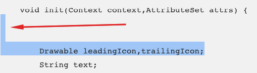
void init(Context context,AttributeSet attrs) {
Drawable leadingIcon,trailingIcon;
String text;
//check for if AttributeSet is null
if (attrs ==null) {
return;
}
//get attributes from attrs.xml into array
TypedArray typedArray = context.obtainStyledAttributes(attrs, R.styleable.ListTile);
//extract attributes from array into the variables
leadingIcon = typedArray.getDrawable(R.styleable.ListTile_leading);
trailingIcon = typedArray.getDrawable(R.styleable.ListTile_trailing);
text = typedArray.getString(R.styleable.ListTile_title);
//inflate layout
LayoutInflater inflater = LayoutInflater.from(getContext());
View tile= inflater.inflate(R.layout.list_tile,this);
tile.setBackground(getResources().getDrawable(R.drawable.background));
//find views
trailing = findViewById(R.id.trailing);
leading = findViewById(R.id.leading);
title = findViewById(R.id.title);
//set view properties
trailing.setImageDrawable(trailingIcon);
leading.setImageDrawable(leadingIcon);
title.setText(text);
invalidate(); // redraw ui
}
}
The ListTile extends a RelativeLayout and overrides 3 constructors, passing the current context and attributes to the
initfunctionWe get the attributes defined in our attrs.xml file and store in a TypedArray. A Typed array is a Container for an array of values that were retrieved from XML.
We inflate the layout we defined for our custom view that's list_tile.xml. This is done using the layout inflater. This is similar to when we call
setContentViewinonCreatemethod of an ActivityWe call
setBackgroundon the tile view and pass a drawable from XML to it. This drawable marks the Tile border with a specified color. see code snippet for code<?xml version="1.0" encoding="utf-8"?> <shape android:shape="rectangle" xmlns:android="http://schemas.android.com/apk/res/android"> <solid android:color="#fff"/> <stroke android:width="1dp" android:color="#cacaca"/> </shape>- Basically, I created an XML file in the drawable folder,
- Create a basic rectangular shape
- define the needed properties with the appropriate values
Get a reference to the views defined in the list_tile.xml
set view properties from the attributes specified in XML
call
invalidate();. This method call will redraw the UI to reflect changes made in XML immediately
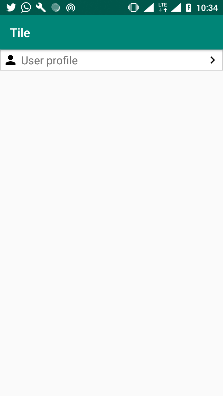
Step 4 : Use ListTile in MainActivity Layout file
With our ListTile ready, we can use it now in our XML.
<?xml version="1.0" encoding="utf-8"?>
<LinearLayout

    xmlns:android="http://schemas.android.com/apk/res/android"
    xmlns:app="http://schemas.android.com/apk/res-auto"
    xmlns:tools="http://schemas.android.com/tools"
    android:layout_width="match_parent"
    android:layout_height="match_parent"
    android:orientation="vertical"
    tools:context=".MainActivity">


    <com.enyason.custom_view_1.ListTile
        android:layout_width="match_parent"
        android:layout_height="wrap_content"
        app:leading="@drawable/ic_navigate_next"
        app:title="User profile"
        app:trailing="@drawable/ic_person" />


</LinearLayout>
The code snippet above shows the use of the custom view created in the activity_main.xml file. Running the app gives the output show in the image below.
Step 5 : Using the Merge Tag
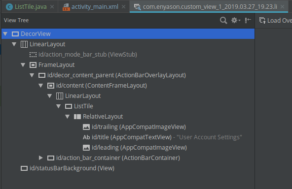
<merge/> is useful because it can get rid of unneeded ViewGroups. In our list_tile.xml file, we have the root element as RelativeLayout which is inflated in the Listile.java class. With this class extended the Relative layout, we now have a duplicate view group. To see this duplication we'll use the Android Layout Inspector
- Navigate to Layout Inspector from tools, from the tools bar
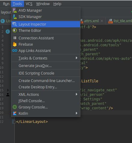
- Select the process from the device connected
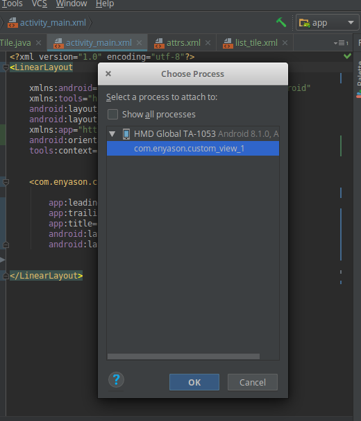
- From the image below you see we have a Listile view which is a RelativeLayout and another redundant Relative Layout
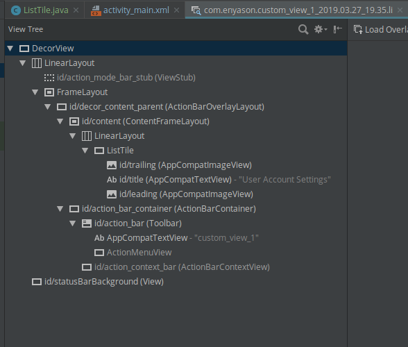
To get rid of the unneeded view group, use the merge tag in list_tile.xml as shown in the code snippet below
<?xml version="1.0" encoding="utf-8"?>
<merge
    xmlns:android="http://schemas.android.com/apk/res/android"
       >

<ImageView
        android:id="@+id/trailing"
        android:layout_width="wrap_content"
        android:layout_height="wrap_content"
        android:layout_alignParentLeft="true"
        android:layout_margin="5dp" />

    <TextView
        android:id="@+id/title"
        android:layout_width="wrap_content"
        android:layout_height="wrap_content"
        android:layout_centerVertical="true"
        android:layout_toRightOf="@id/trailing"
        android:textSize="18sp" />

    <ImageView
        android:id="@+id/leading"
        android:layout_width="wrap_content"
        android:layout_height="wrap_content"
        android:layout_alignParentRight="true"
        android:layout_margin="5dp" />


</merge>
- Checking the View hierarchy again, the redundant view group has been removed.
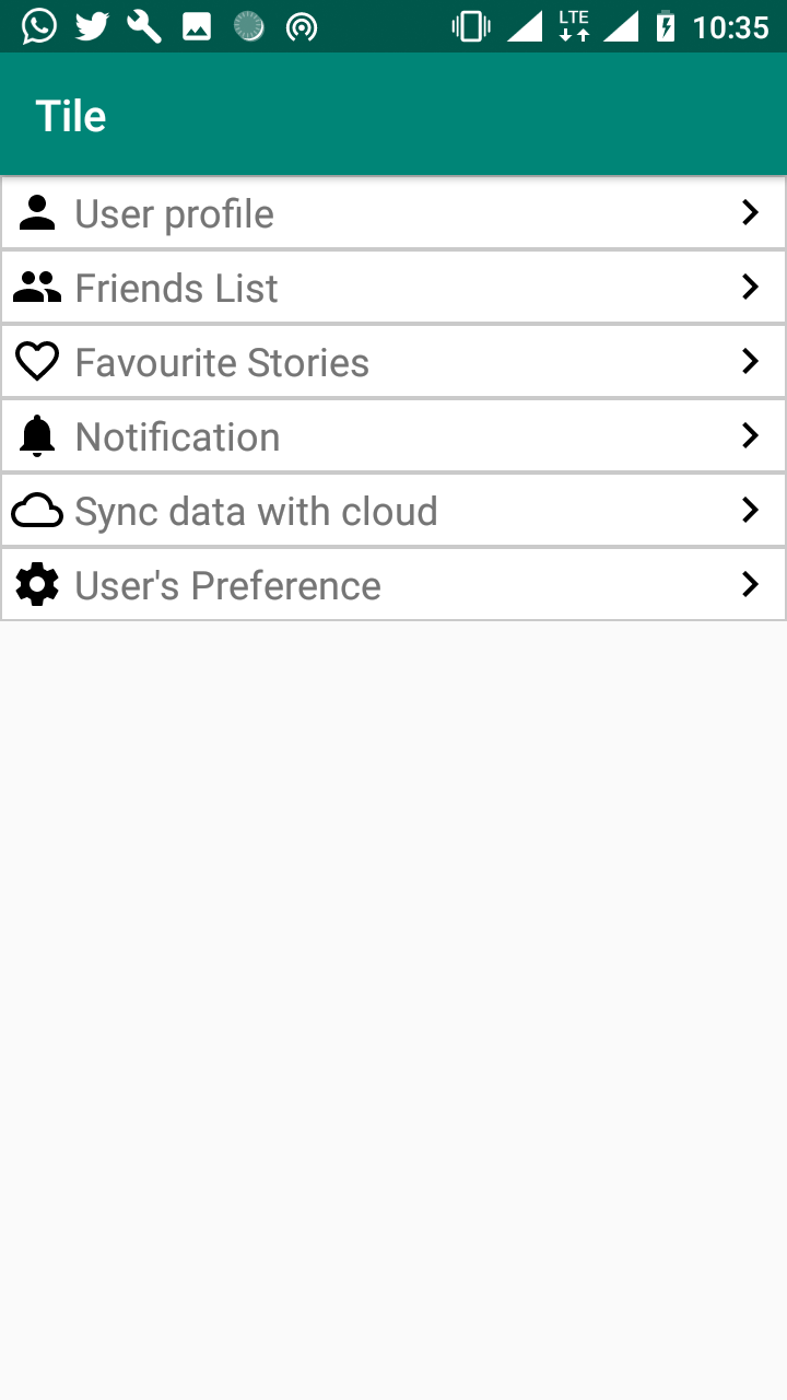
UseCase
With the Listile created we should be able to make screens such as one below easily
Curriculum
Proof of Work
The complete source code can be found on gitHub https://github.com/enyason/custom_view
Thank you for your contribution @ideba.
After reviewing your tutorial we suggest the following points listed below:
Your tutorial is quite short for a good tutorial. We recommend you aim for capturing at least 2-3 concepts.
Nice work on the explanations of your code, although adding a bit more comments to the code can be helpful as well.
The screenshots of your mobile phone are very large. Only place screenshot with content.
We suggest that you ident your code. It's not necessary to give many breaks of lines between the lines of your code.
Looking forward to your upcoming tutorials.
Your contribution has been evaluated according to Utopian policies and guidelines, as well as a predefined set of questions pertaining to the category.
To view those questions and the relevant answers related to your post, click here.
Need help? Chat with us on Discord.
[utopian-moderator]
Thank you for your review, @portugalcoin! Keep up the good work!
Congratulations @ideba! You have completed the following achievement on the Steem blockchain and have been rewarded with new badge(s) :
You can view your badges on your Steem Board and compare to others on the Steem Ranking
If you no longer want to receive notifications, reply to this comment with the word
STOPTo support your work, I also upvoted your post!
Do not miss the last post from @steemitboard:
Vote for @Steemitboard as a witness to get one more award and increased upvotes!
Hey, @ideba!
Thanks for contributing on Utopian.
We’re already looking forward to your next contribution!
Get higher incentives and support Utopian.io!
Simply set @utopian.pay as a 5% (or higher) payout beneficiary on your contribution post (via SteemPlus or Steeditor).
Want to chat? Join us on Discord https://discord.gg/h52nFrV.
Vote for Utopian Witness!
Hi, @ideba!
You just got a 0.67% upvote from SteemPlus!
To get higher upvotes, earn more SteemPlus Points (SPP). On your Steemit wallet, check your SPP balance and click on "How to earn SPP?" to find out all the ways to earn.
If you're not using SteemPlus yet, please check our last posts in here to see the many ways in which SteemPlus can improve your Steem experience on Steemit and Busy.