[Steemia] - Bug fixes, features added, suggestions added 😎
Introduction
Steemia is a social network app running over the Steem Blockchain. This app will provide the users an enriched user experience plus features commonly encountered in a casually used social media. The goal of this project is to give the community a mobile app where they can do their daily activity in the blockchain.
Bug Fixes
Fix edit comments in depth nested pages
In depth nested pages the edit comment page was not working due to a bad parameter being passed. This error was fixed by tracking the the origin of the page to determine the correct parameter.
Fix unvote button
After unvote, it was dispatched correctly but there was a weird issue because even if your vote is 0% is still shows as vote. To avoid this behavior, I modified the server side logic to remove voters with 0 weight from the "is voted" post checker. Also, to compensate this modification, the voters list was filter out to remove 0 weight votes as well.
Visual Changes
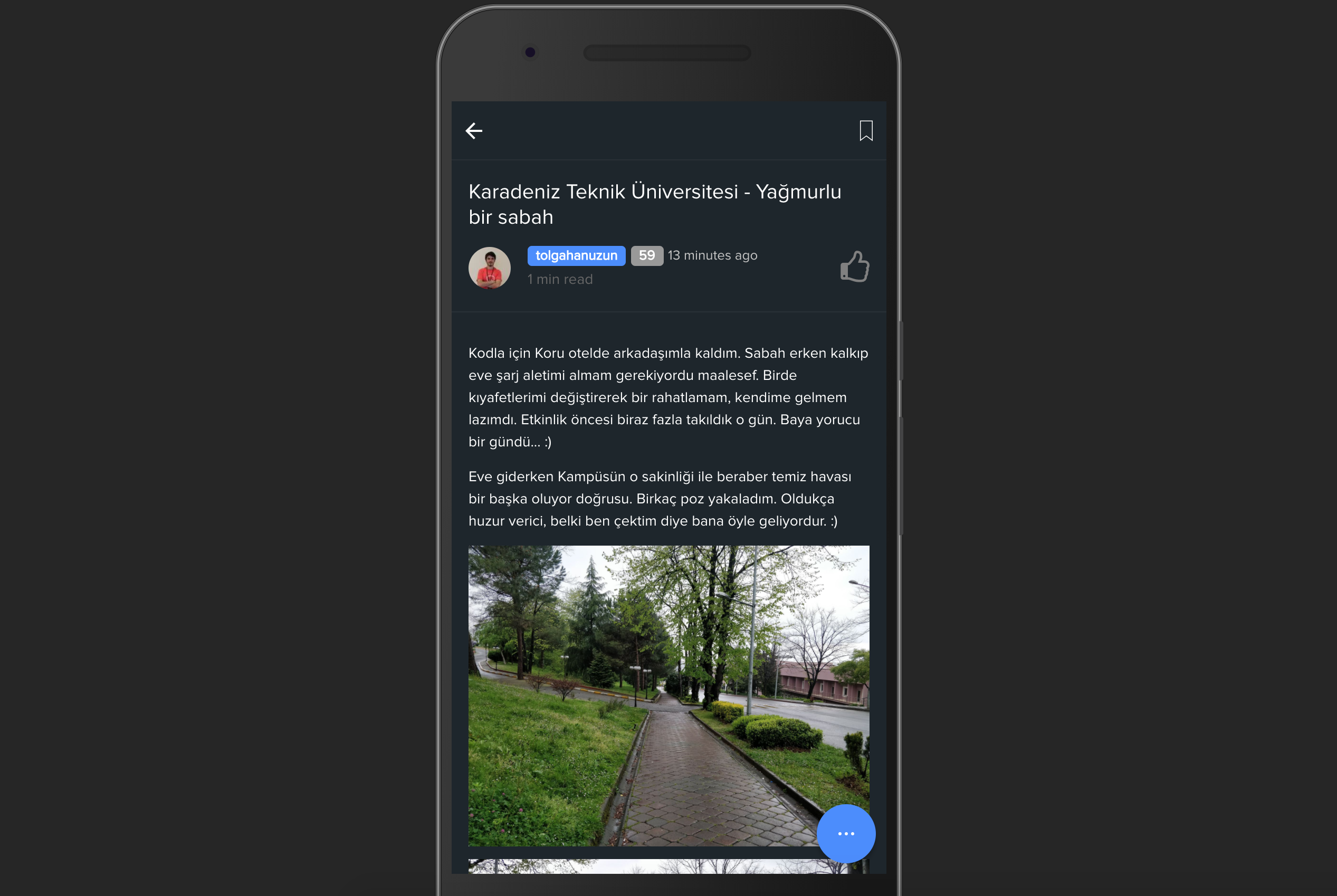
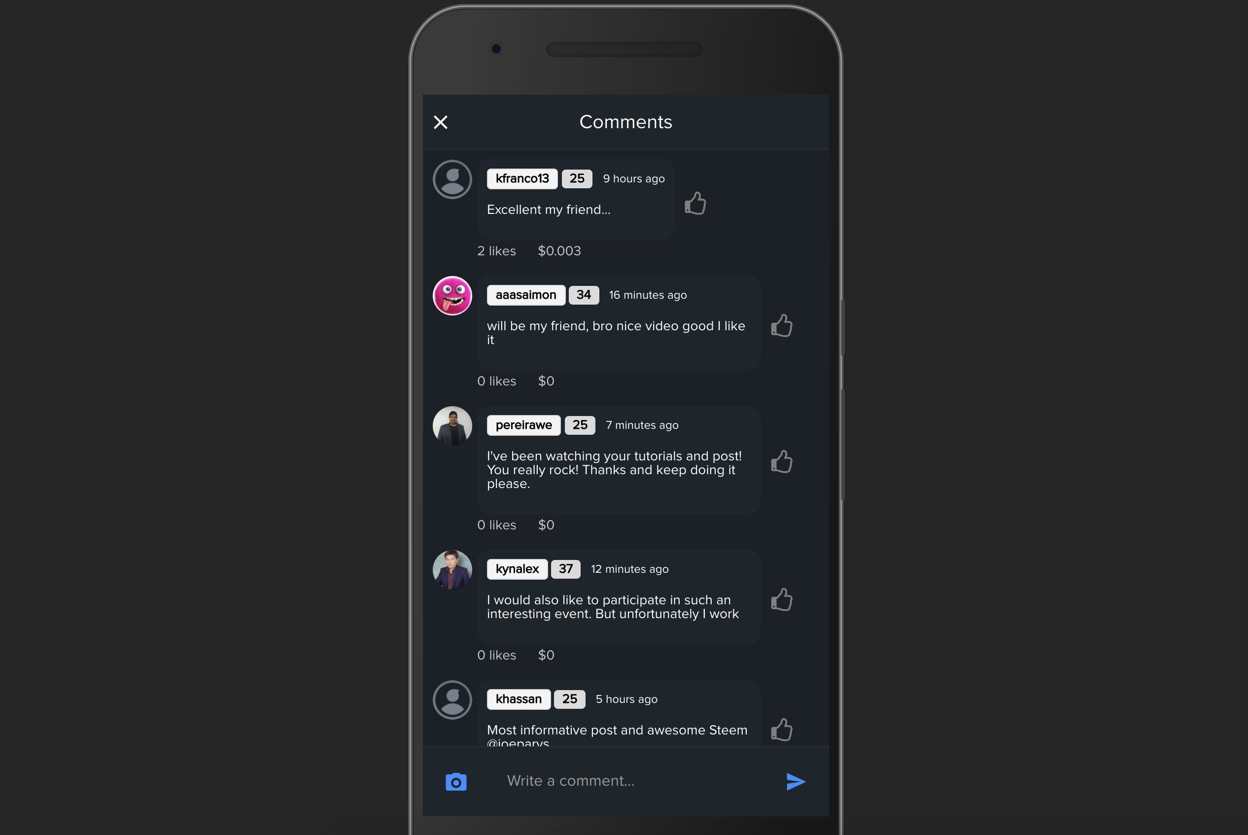
Say hello to the dark UI
After seeing the comments of various users in our introduction post, we determined that a dark UI was a must according to them. Hence, I decide to start working in the dark UI and here are the results:
Main Page
Wallet Page
Notifications Page
Post Single Page
Settings Page
Comments Modal
This UI can be activated through settings page.
Add message when the user does not have not bookmarks
Before, the bookmarks page was empty when there were not bookmarks. This can lead to confusion of the page not being loaded or a bug in the app. The following message was added to avoid any confusion:
New Features
Elastic textarea for comments
After seeing the comment of one of our users, I noticed that an elastic textarea was a must. Before, this user made a suggestion because it was so hard to edit a long post in an static textarea. Hence, I decide to implement the elastic one to allocate height dynamically based on the text.
Upload images from comments
There were not possibility of uploading a picture in comment box. However, thanks to one of our users, this is now possible.
Allow tags to be separated by space
Some users were confused on how to insert tags in our application. It clearly says that it should be separated by comma. However, most of the users are already accustomed to separate them by space like in Steemit and other Steem frontends. So, I decide to keep both ways so users that are accustomed to put the comma can still keep doing it in the same way.
Open profile from followers/following list
Some users though that it was a bug in our application. However, it was not implemented yet. Now, you can easily access your followers/following profiles within the list.
Remove save button in settings page
The save button in the settings page was making an extra step to the user. This data can be saved automatically on changes. Hence, I decide to eliminate this button and allow data to save automatically.
Other changes
Move image upload logic to a provider
Since we were writing the same code across page, I saw a good case for reusability of code. Thus, all the logic to capture photos, take photos from gallery, and upload image to server side were moving to a separated provider which can be called from any page. The usability of the provider is easy since all the methods return a promise with the url of the uploaded image.
Show toast instead of alert for bookmarks
When you save a bookmark, an alert was shown (which is annoying). What I did was replace this alert with a toast to avoid user action to dismiss the alert.
Auth guard for follow/unfollow actions
In the users search feature, we didn't have an auth guard to prevent dispatching actions if the user is not logged in. By default, we show the follow button for the results. When an user is not logged in, the button is still shown there. When you press this button, it changes to unfollow meaning that the action can be dispatched (even though it was not dispatched). To avoid this behavior, an alert is now shown to tell the user that this action requires you to be logged in.
What is next?
- Fix the way we are showing comments to give a better user experience.
- Fix the markdown parser to be par to Steemit.
- Start working on iOS candidate.
Contributions
Steemia is open source and it will always be 🙃. If you would like to contribute to this project, feel free to fork the Steemia repo and send us a Pull Request.
Posted on Utopian.io - Rewarding Open Source Contributors


Hey @jaysermendez! Thank you for the great work you've done!
We're already looking forward to your next contribution!
Fully Decentralized Rewards
We hope you will take the time to share your expertise and knowledge by rating contributions made by others on Utopian.io to help us reward the best contributions together.
Utopian Witness!
Vote for Utopian Witness! We are made of developers, system administrators, entrepreneurs, artists, content creators, thinkers. We embrace every nationality, mindset and belief.
Want to chat? Join us on Discord https://discord.me/utopian-io
Thanks for the contribution. It has been approved.
You did an amazing job on this contribution, it was a pleasure reviewing it! Keep up the good work!
Need help? Write a ticket on https://support.utopian.io.
Chat with us on Discord.
[utopian-moderator]
Thank you so much for your feedback :D :D You are always encouraging contributors to keep doing a good job :D
The voting value slider needs to include how much the upvote is worth.
I will take this in mind for my other iteration of modifications in the app :D Thank you.
excellent work! I am always looking forward to the IOS version .
Also it is good to learn through your Steemia to promote my MicroSteemit! :D
:D I wish I can test yours but I can't hehehe. Btw, thank you so much. I also see that u constantly post about yours which is great! I will be texting you tomorrow to ask how did you implemented the comments in a correct way because I am still trying to figure this out heheeh
actually you can test mine by downloading the wechat firstly.
the part of showing comments has taken lots of my time .tbh i have thought several ways but the current way is the fittest for my app because of the wechat restriction.
Congratulations! Your post has been selected as a daily Steemit truffle! It is listed on rank 22 of all contributions awarded today. You can find the TOP DAILY TRUFFLE PICKS HERE.
I upvoted your contribution because to my mind your post is at least 23 SBD worth and should receive 55 votes. It's now up to the lovely Steemit community to make this come true.
I am
TrufflePig, an Artificial Intelligence Bot that helps minnows and content curators using Machine Learning. If you are curious how I select content, you can find an explanation here!Have a nice day and sincerely yours,

TrufflePiga very useful post, this is very necessary for me, thanks for the conversation
a very useful comment, this is very necessary for me, thanks for the comment hahahaha
hahahahah I wanted to flag him but I don't want to waste my VP hahahahahah
excellent post friend. I follow you
looks good!
thanks man!
Really cool 😎 looking app. Love to see the iOS soon.
Do you need tester? Let me know.
For sure :D Feel free to go around our channel :D https://discord.gg/webyZPB