New Logo for Sistem Skripsi
Repository
https://github.com/mysilkyheart/sistem_skripsi
Details
Thesis process becomes more orderly and faster that is done online which can be accessed anywhere through the browser with the aim of saving time, effort and making it easier to get information about the thesis process online.
Submission of thesis title -> Submission of thesis proposal -> Thesis proposal seminar -> Research -> After writing is ready and completed, students present the results of their scientific work to the Examining Lecturer (final assignment session) -> Students whose thesis examination results are accepted with revisions, do the revision process in accordance with the input of the Testing Lecturer.
Logomark and Logo Result


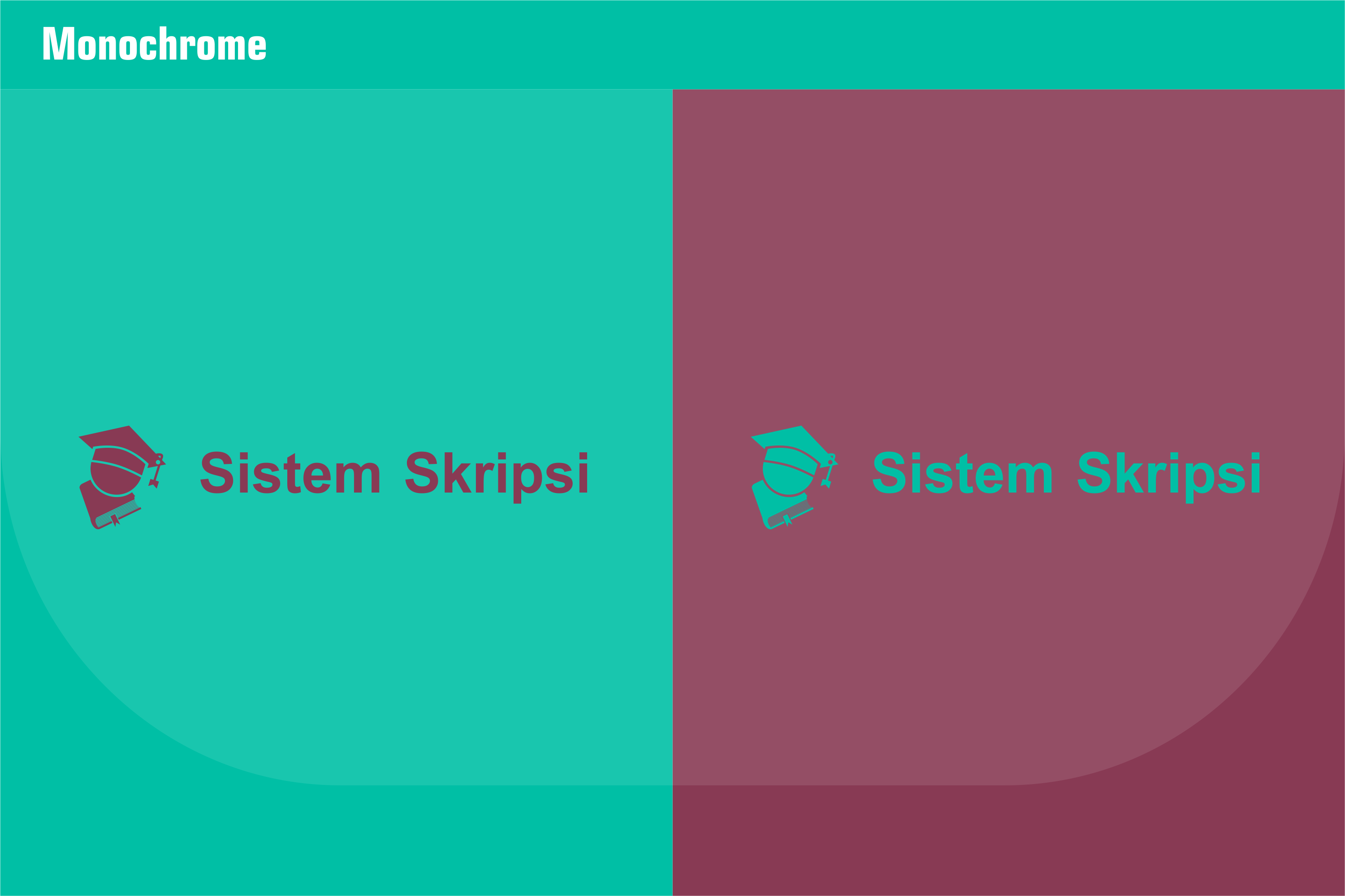
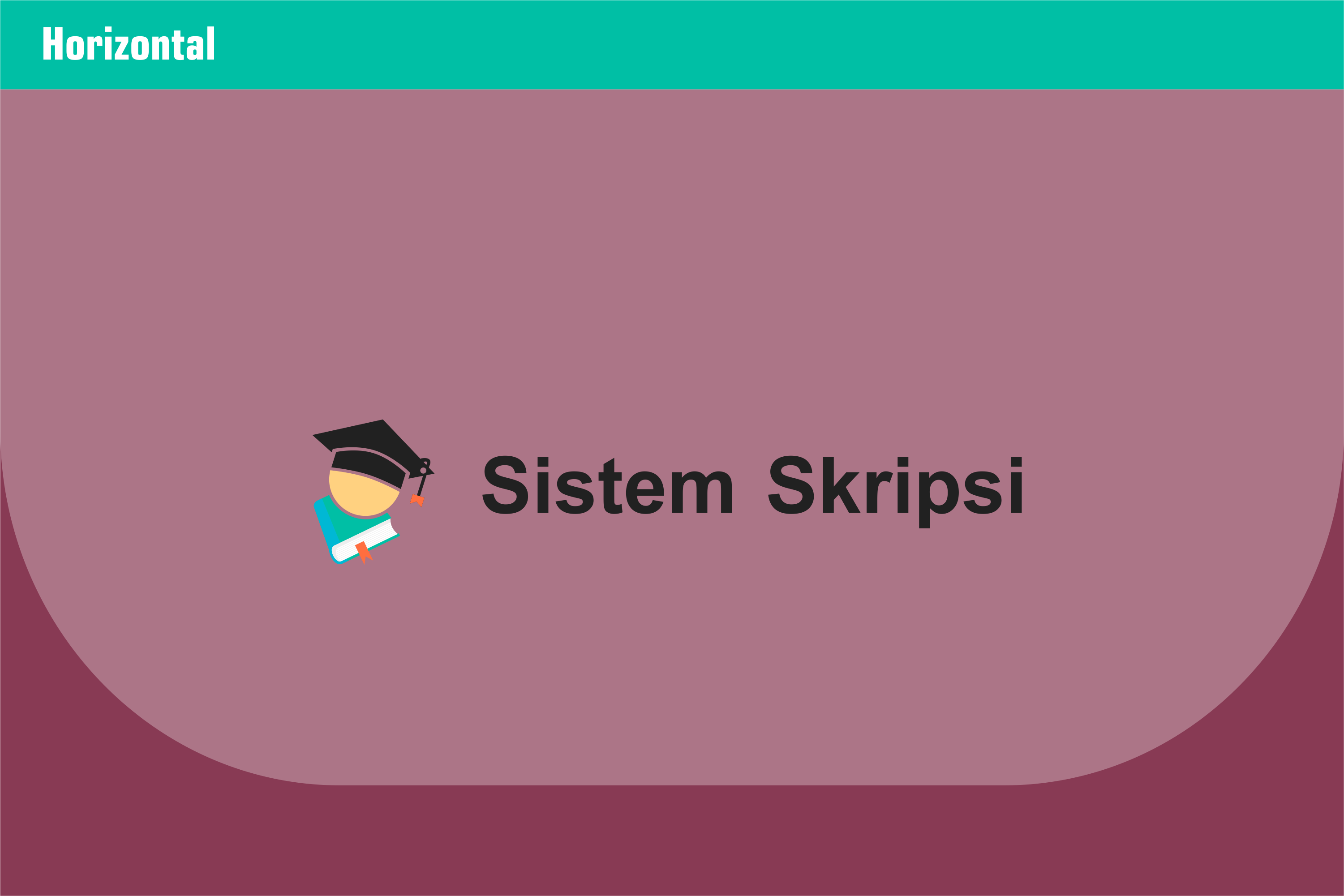
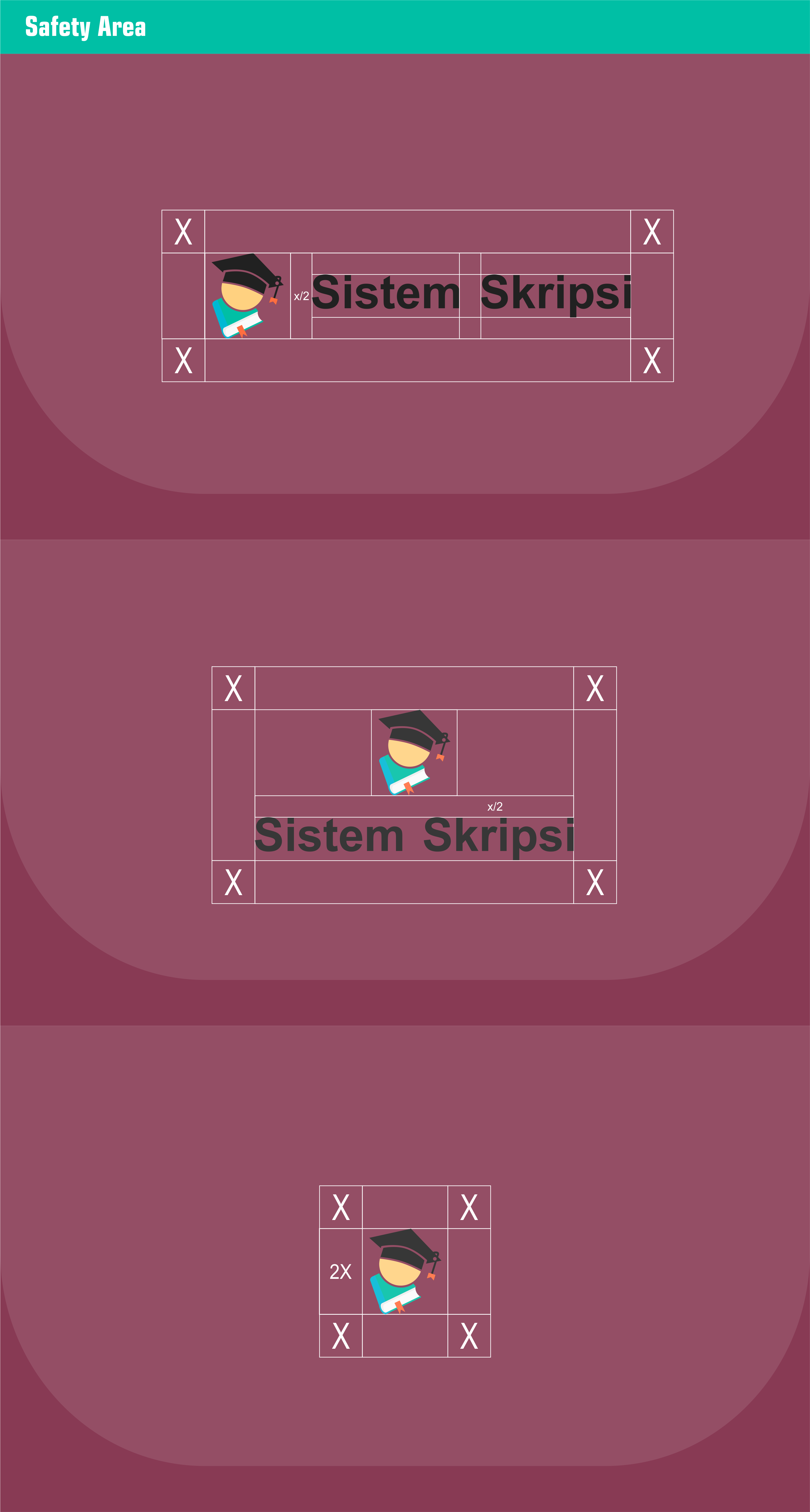
Logomark and Logotype Primary (Horizontal)
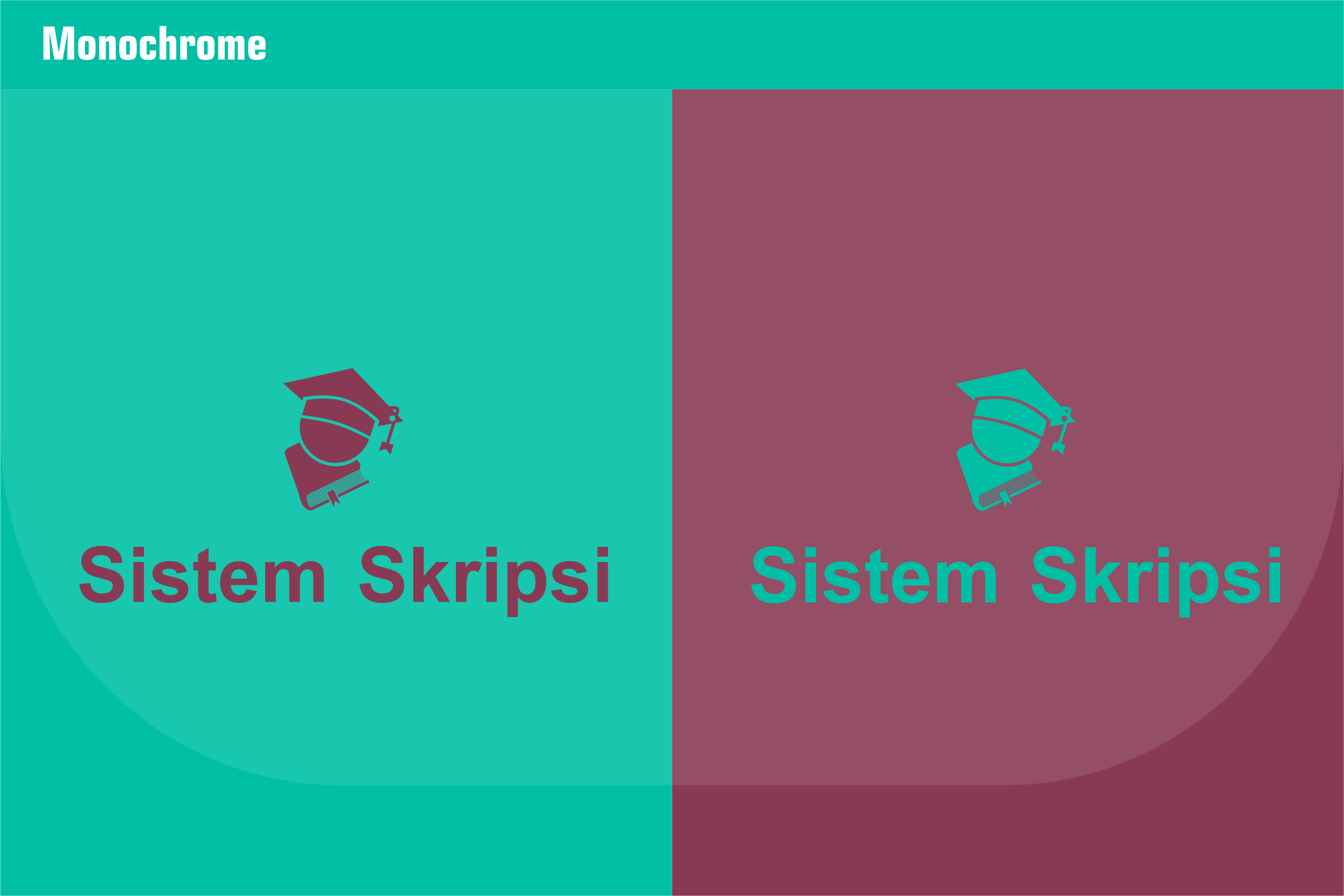
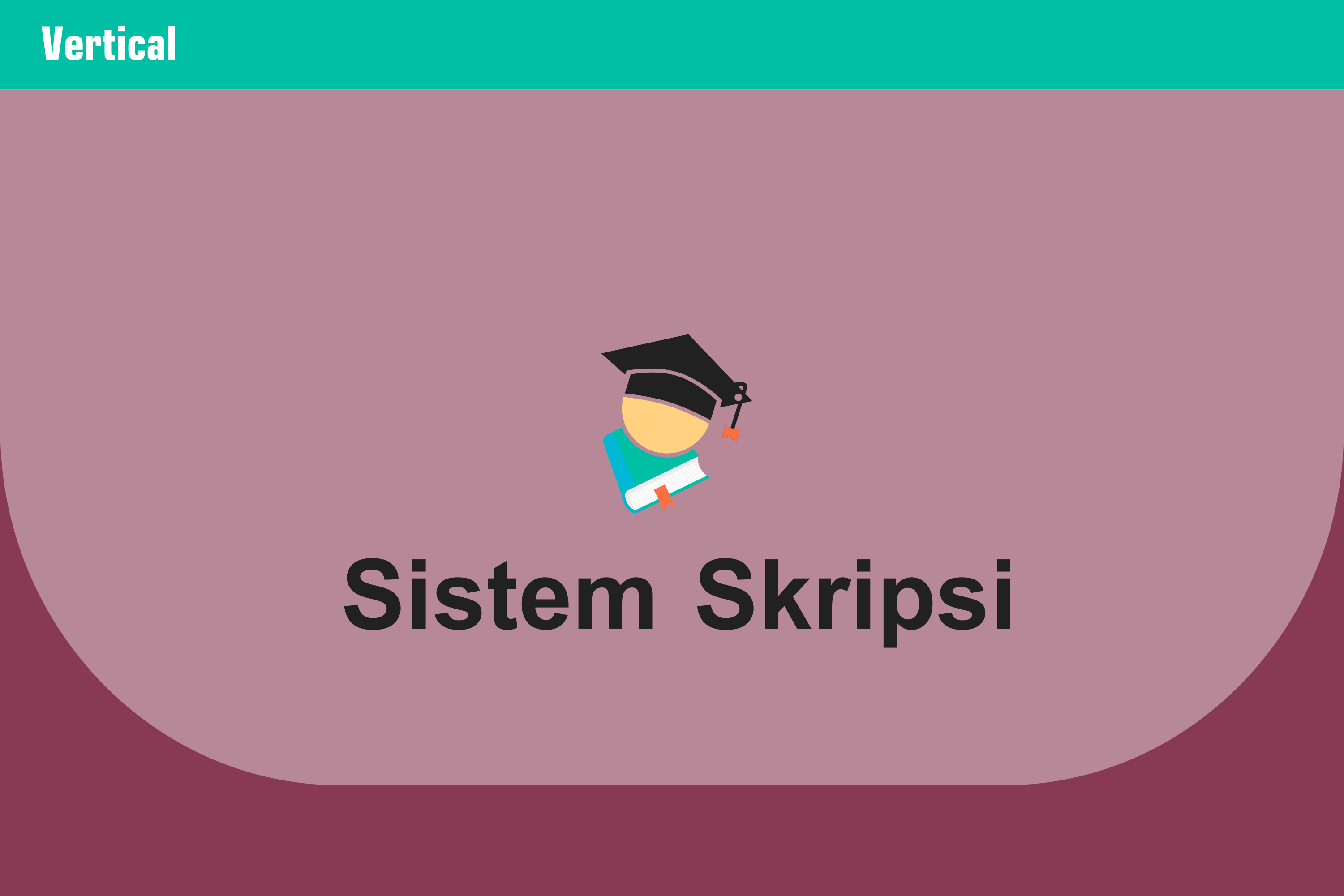
Logomark and Logotype Secondary (Vertical)


Benefits / Improvements
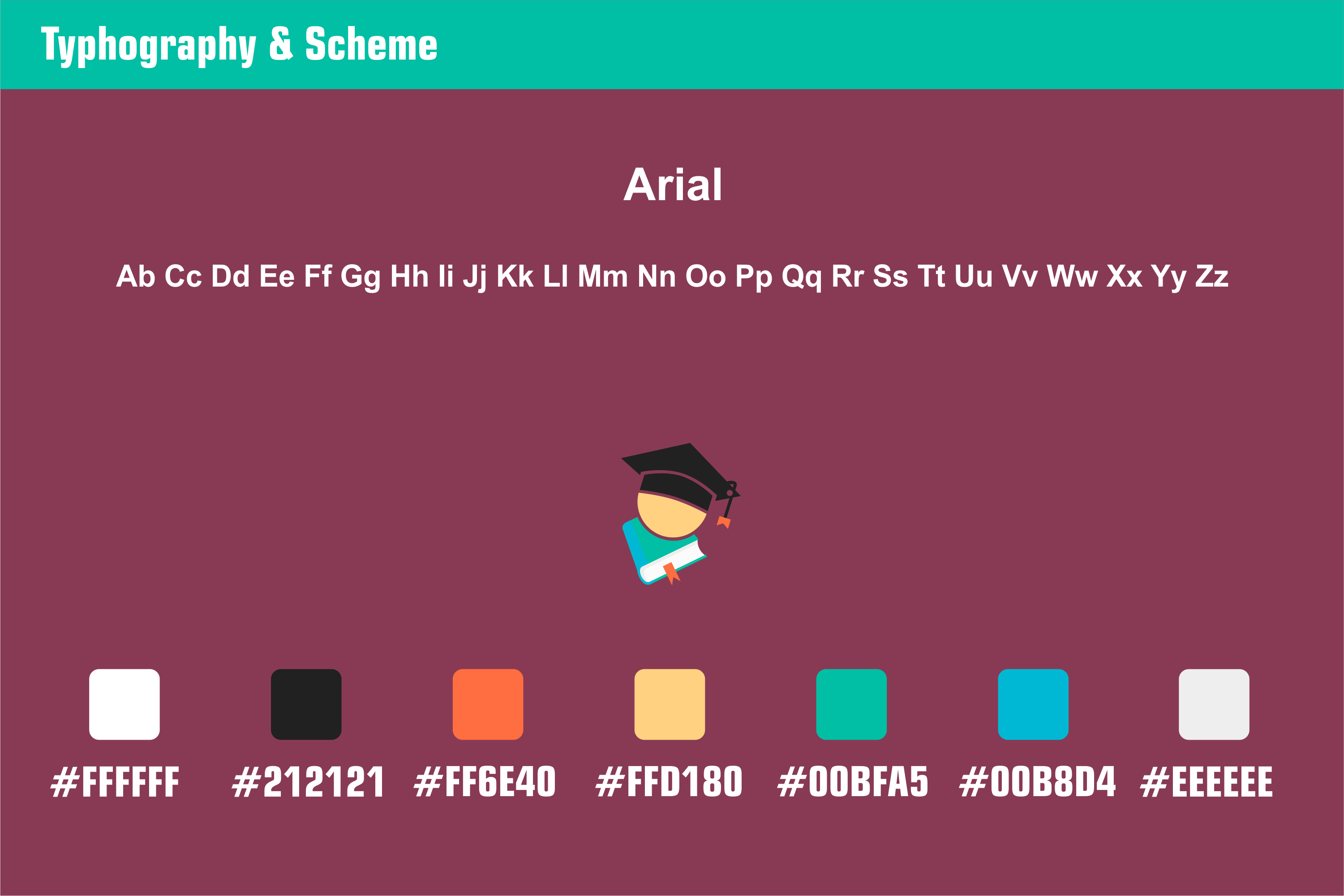
Hello, all. I have now reviewed this Project. and this thesis system project does not yet have a logo. so I offered to make an attractive logo in my opinion. I hope this is interesting for you too. This new logo looks interesting because in this design I use the graduation toga hat icon with a combination of a book icon underneath. the reason I use both of these icons is the graduation toga hat which signifies graduation from a school. and a school must make a final assignment such as a thesis to achieve graduation. so because this is the system for the process of graduating at school with the terms of the final assignment, I chose this icon to symbolize the system of this thesis. for my color using material colors. and Arial fonts.
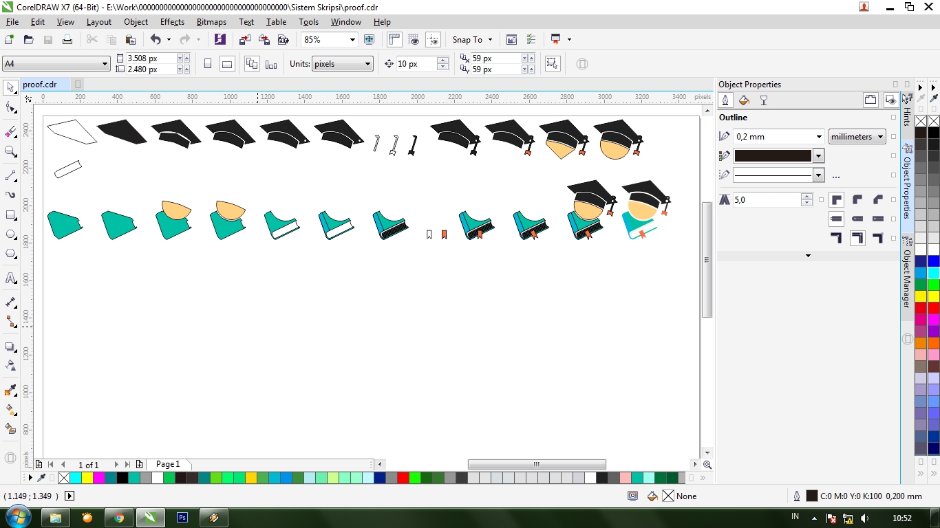
Proof of authorship
Tools
This design I use CorelDRAW Graphics suite X7
Original files
Drive Download
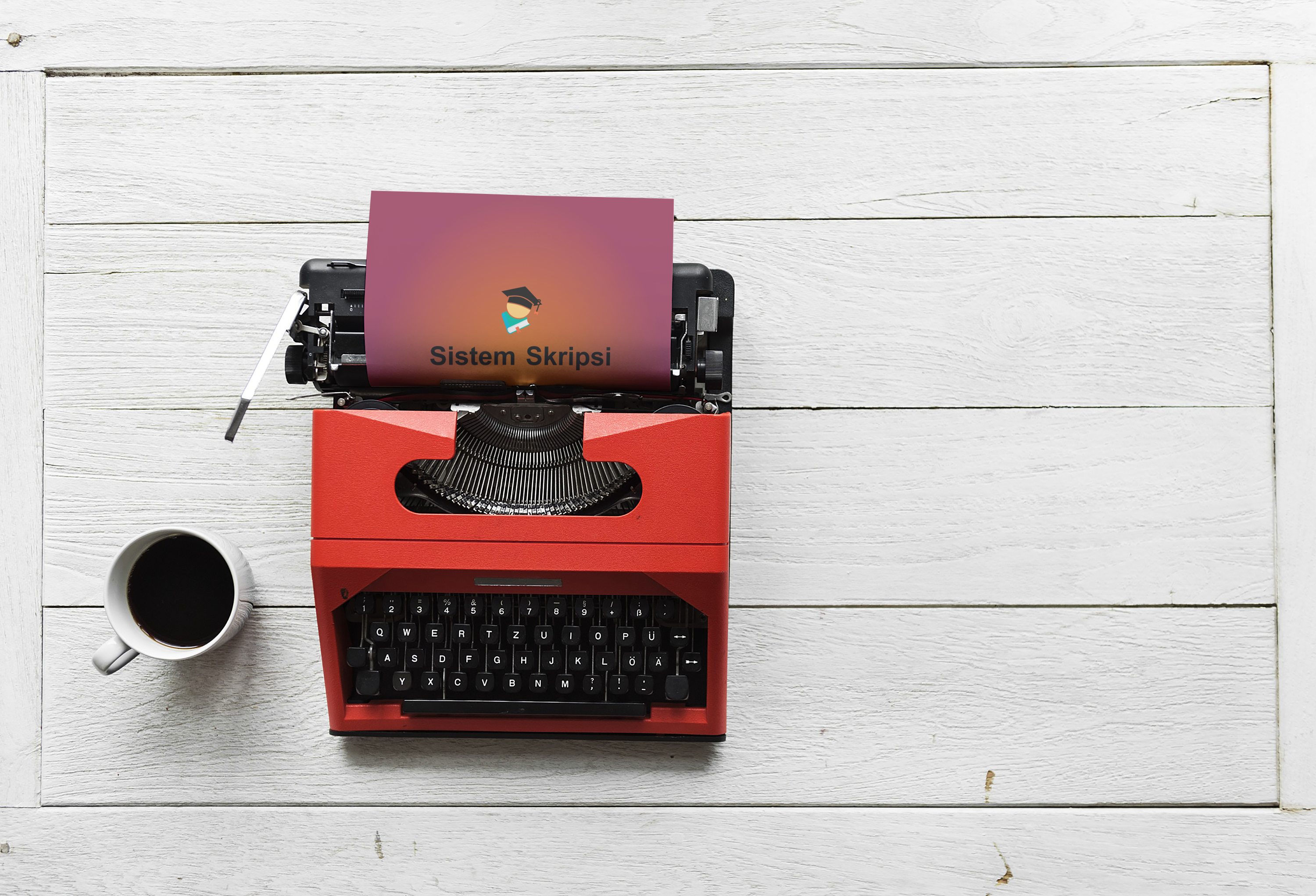
Mockup Download, Download
Font Download
Proof of Work Done
https://github.com/mansya/sistem_skripsi

This work is licensed under a Creative Commons Attribution 4.0 International License.
Hi @mansyaprime, thank you for your contribution.
Good logo concept, it suits very well with the project, even though the concept of graduation hat on top of a book is kinda generic. another thing i really like about the logo is it looks nice in one color variation as the shape of the book and hat still clearly vecognizeable.
About the wordmark/logotype, i find it very basic with the choosen font Arial. it feels like it lack identity maybe because Arial is the default font in your computer, it is not wrong of course but i think you can level up your logo by choosing a more appropriate font for this logo.
Few more things to note about the logo that you can see in the images bellow.
Your contribution has been evaluated according to Utopian policies and guidelines, as well as a predefined set of questions pertaining to the category.
To view those questions and the relevant answers related to your post, click here.
Need help? Chat with us on Discord.
[utopian-moderator]
Thank you for your review, @nilfanif! Keep up the good work!
Hi @mansyaprime!
Your post was upvoted by @steem-ua, new Steem dApp, using UserAuthority for algorithmic post curation!
Your post is eligible for our upvote, thanks to our collaboration with @utopian-io!
Feel free to join our @steem-ua Discord server
Hey, @mansyaprime!
Thanks for contributing on Utopian.
We’re already looking forward to your next contribution!
Get higher incentives and support Utopian.io!
Simply set @utopian.pay as a 5% (or higher) payout beneficiary on your contribution post (via SteemPlus or Steeditor).
Want to chat? Join us on Discord https://discord.gg/h52nFrV.
Vote for Utopian Witness!