Steemblr - new inner page screens [September update]
Repository
Details
Steemblr is a microblogging platform written in javascript. It allows user to post and explore content which is smaller and more frivolous in its nature. Currently app is in development stage and you can see every posts from steemit. In the future it will show posts relative to steemblr app.
After completing @snwolak's Task request he asked me to do some more inner space designs for him:
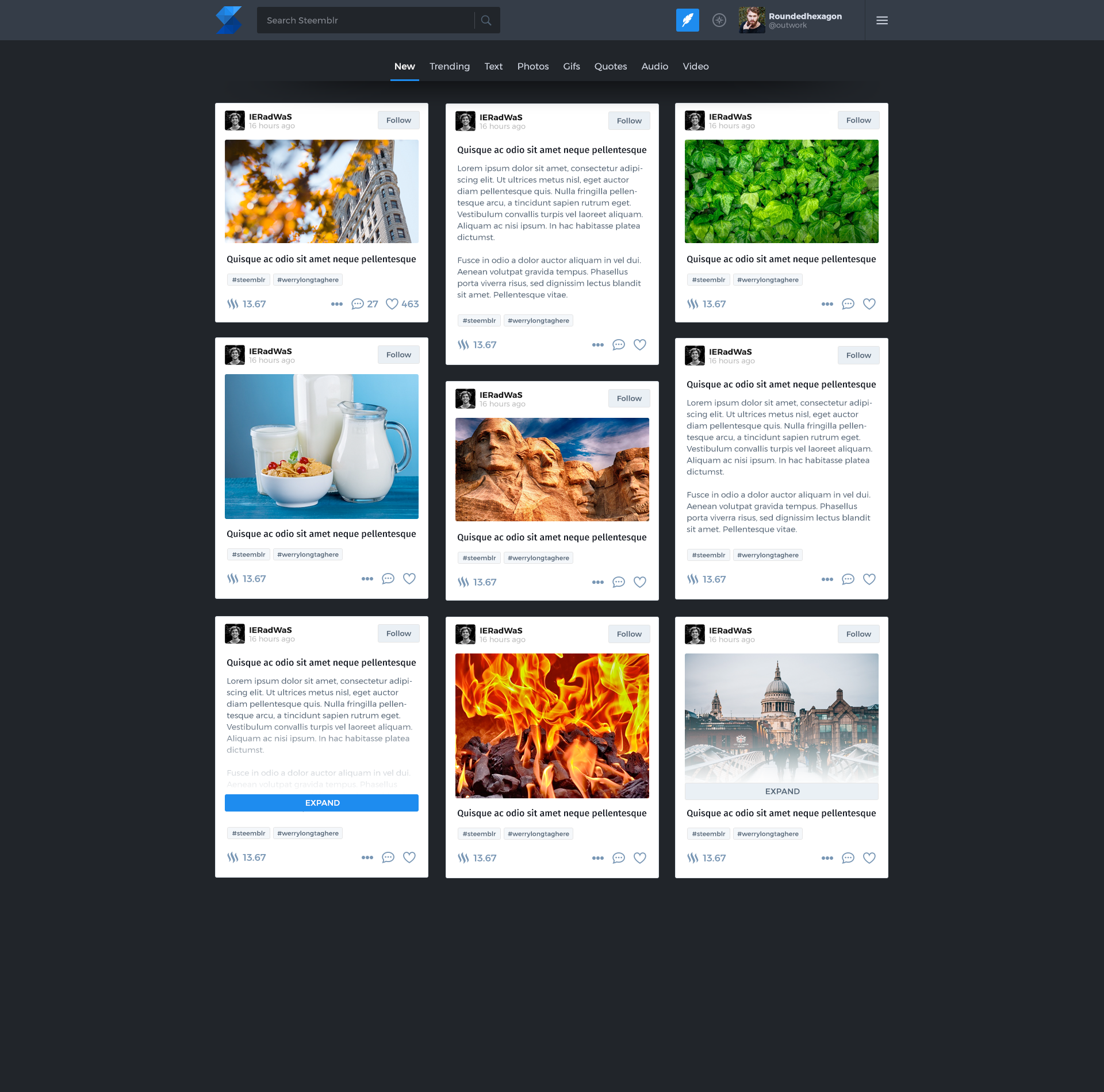
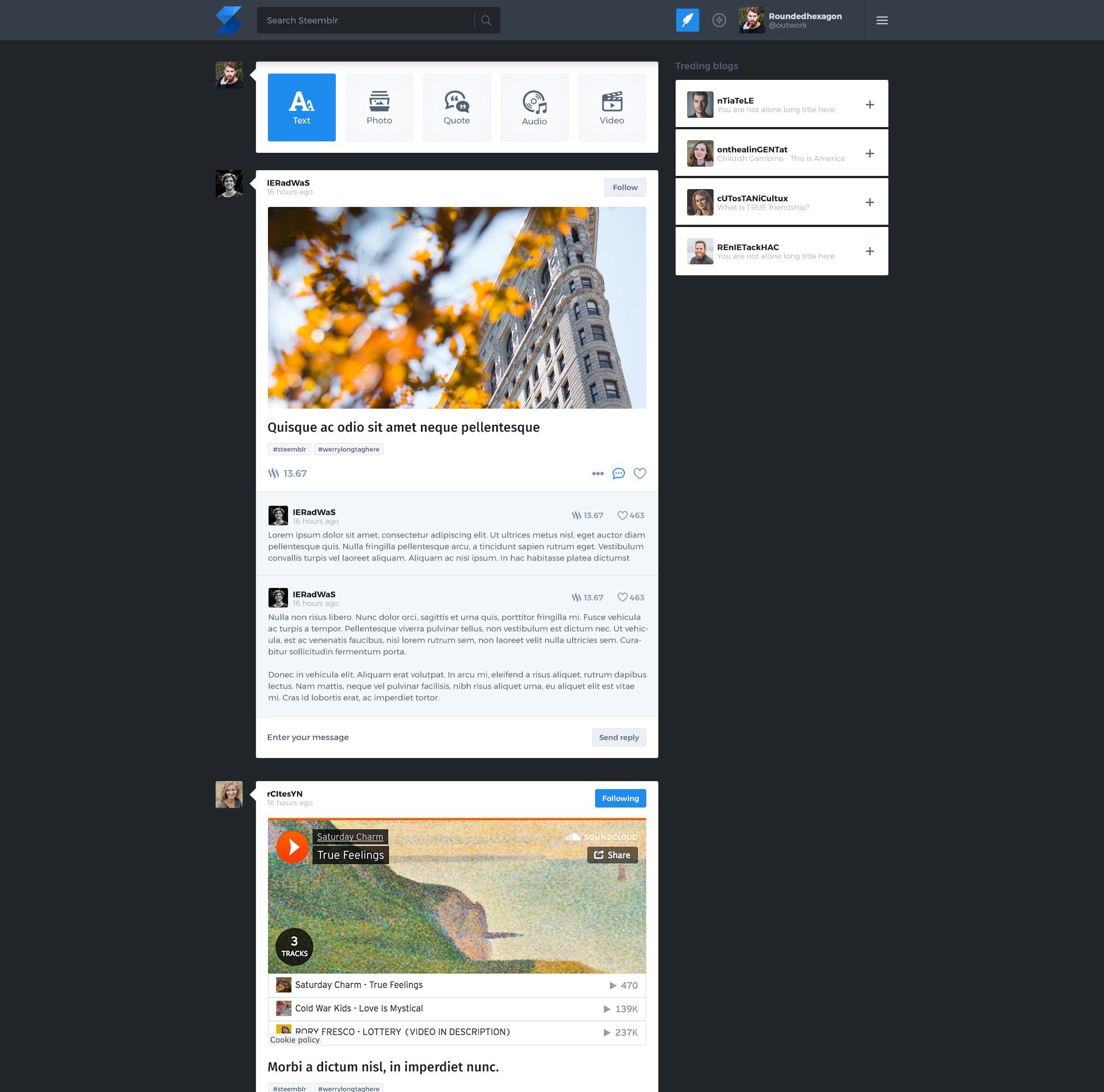
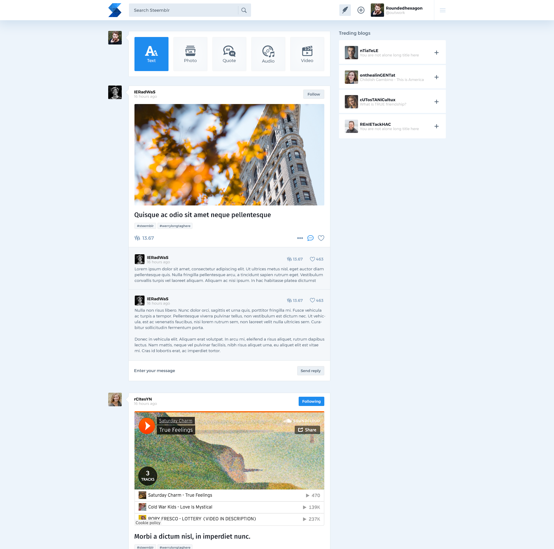
- Discover page - for finding new, interesting posts published on Steemblr
- Comments view - created the design for the comment dropdown
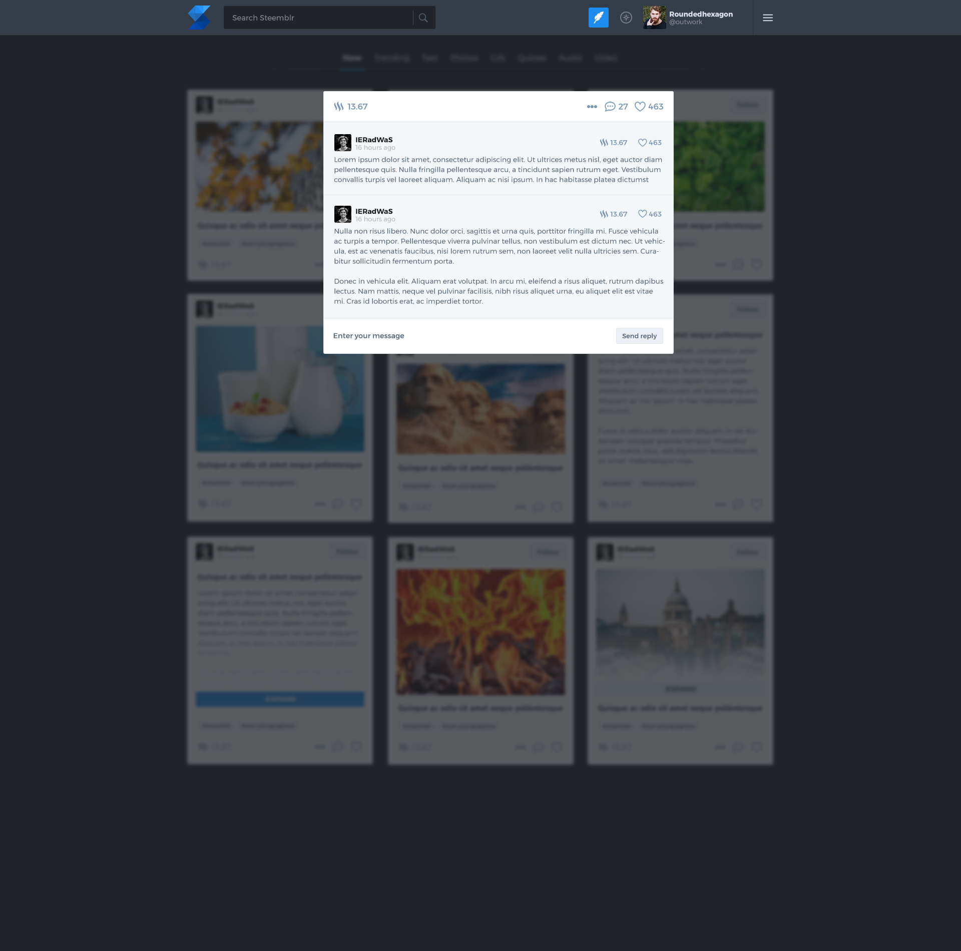
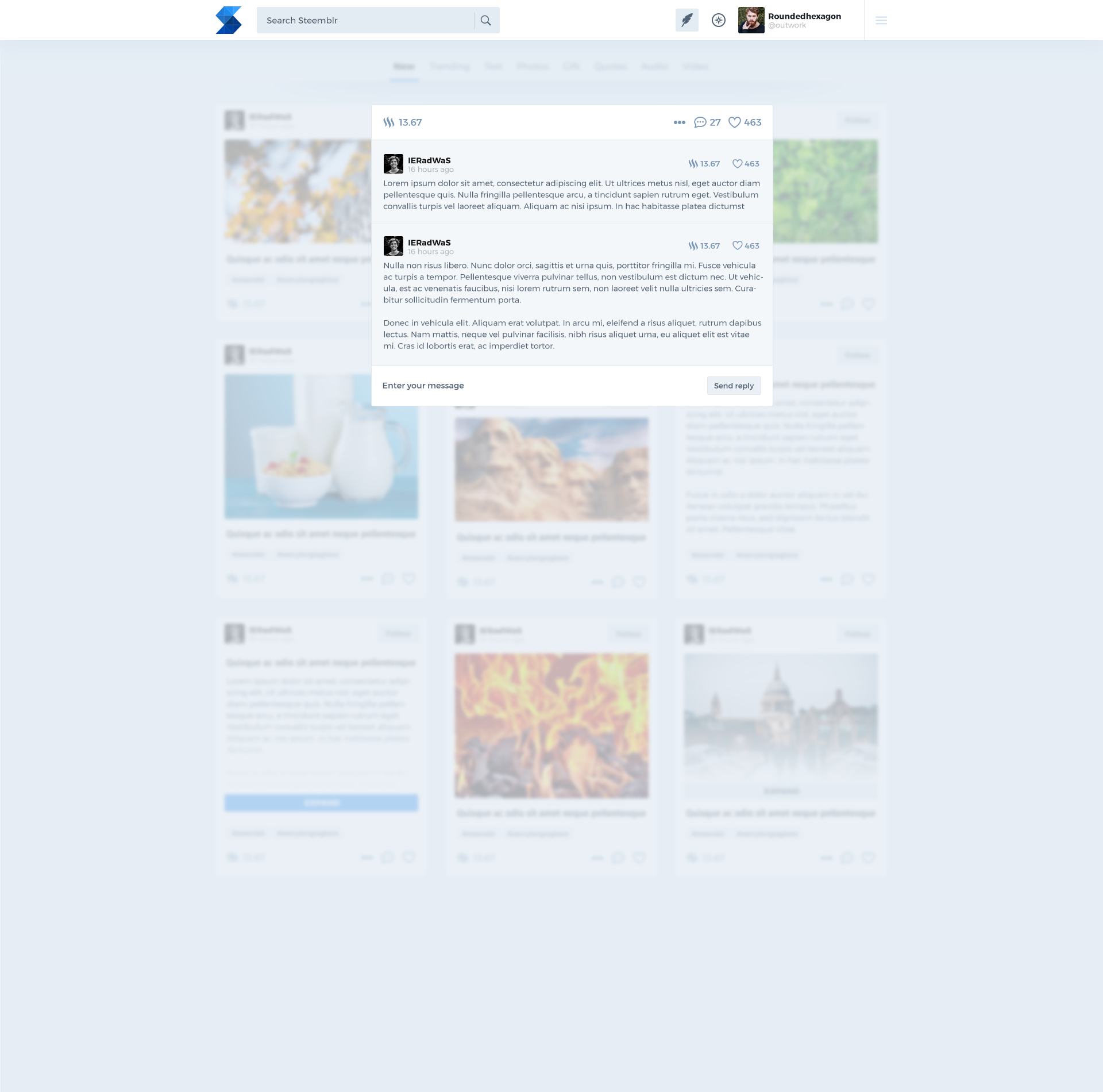
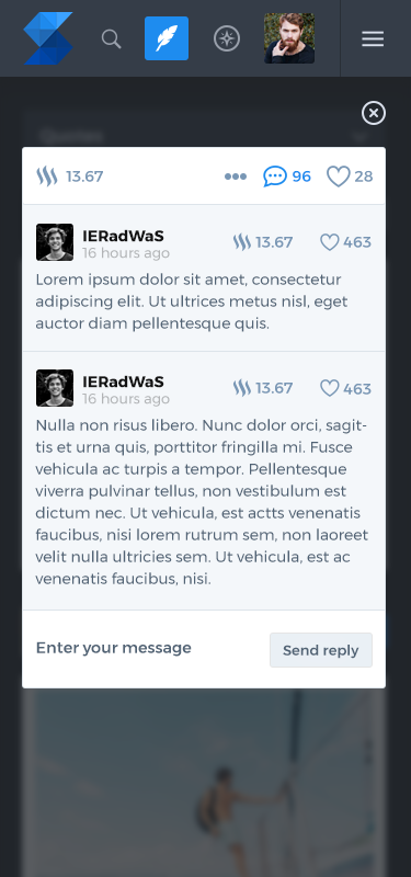
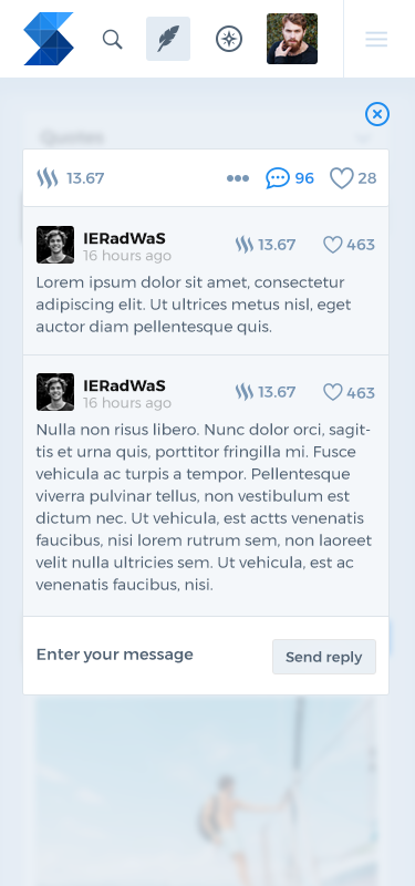
- Comments modal - on Discover page adding the comments as dropdowns makes the UI complicated so we decided to use modal window for viewing and adding comments.
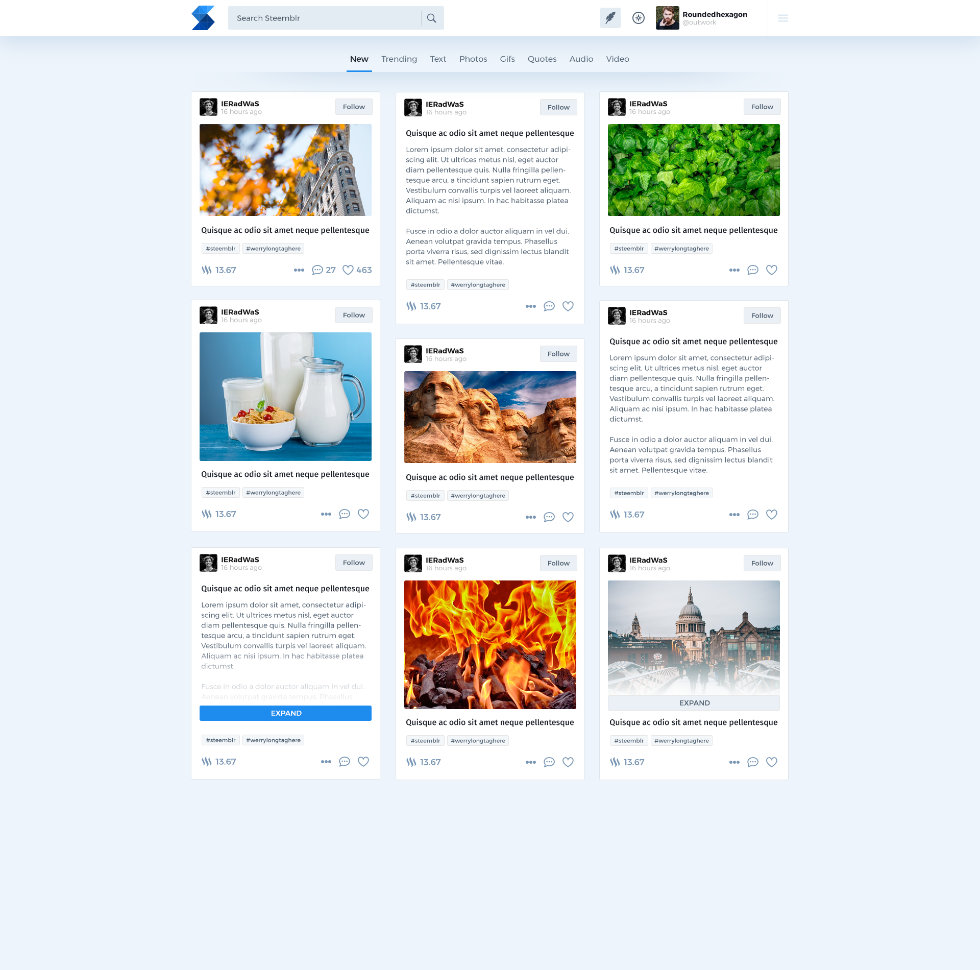
As previously i made dark and light version of this screens. My goal was to make the newly created screens, UI elements usable on mobile devices too, so i've created the mobile version too.
Benefits / Improvements
Redesigning simple UIs is pretty challenging in my opinion: there is not enough space to express creativity, ideas. As i have described my goal was to do something different this time. After a discussion with @snwolak realized he is looking for a really strong, brandable product design. My goal was to keep this on the inner pages of Steemblr.
In total I made 12 screen designs (Discover page, Comments view, Comments modal, dark and light version, also mobile and desktop version)
Screenshots
Desktop
Discover
Post comments dropdown
Discover - comments modal
Mobile
Discover
Post comments dropdown
Discover - comments modal
Proof of authorship
Tools
I have used Adobe Photoshop CC.
Original files
This work is licensed under Creative Commons Attribution 4.0 International License
Proof of Work Done
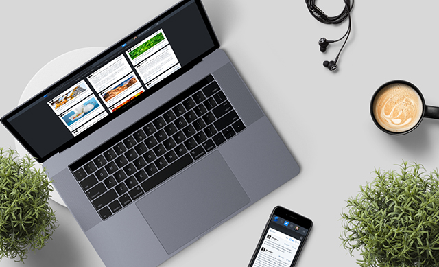
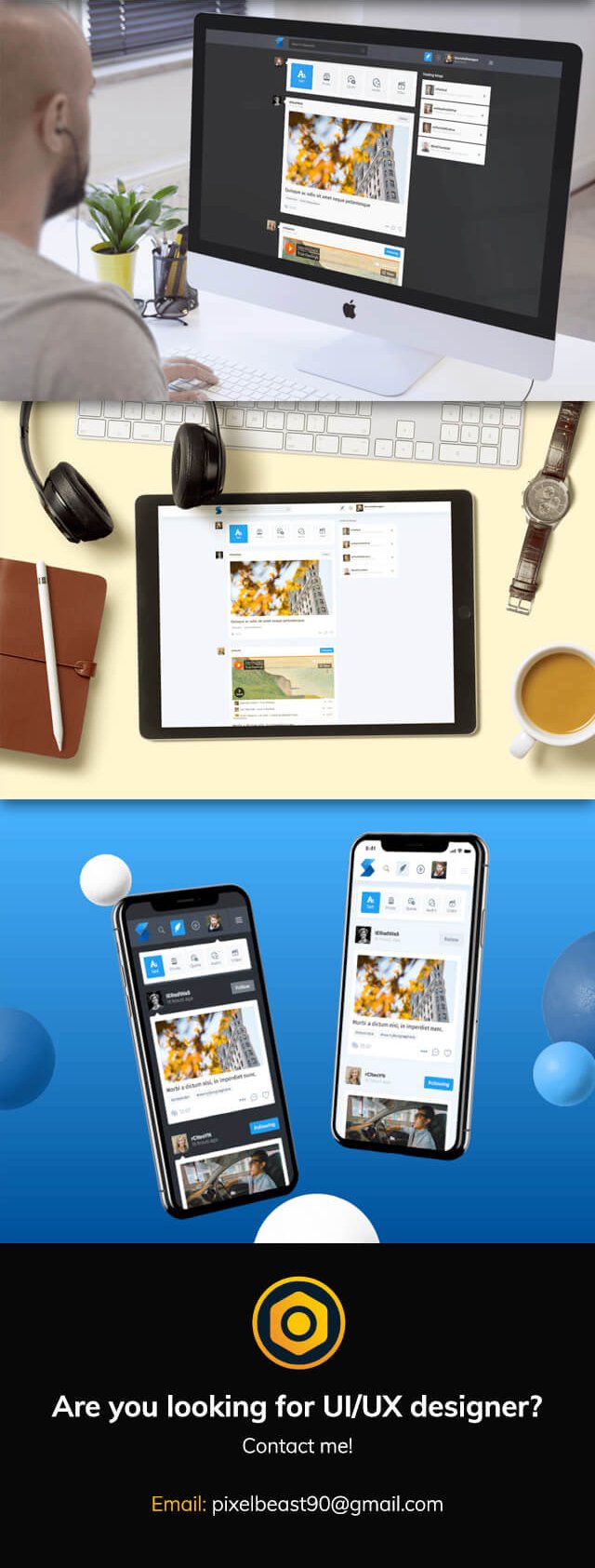
This awesome mockups are made using https://artboard.studio/



Hey, it is good to see that you still working with PO and improving your work.
I wanted to see all screens on mobile, it could be better if you provide mobile interface mock-ups for every single pages. However, according to mock-up on top of the presentation, texts seems visible. Sizes between the graphics and texts are well balanced. I appreciated your work. Modern,understandable and clean interface. Keep it up!
Your contribution has been evaluated according to Utopian policies and guidelines, as well as a predefined set of questions pertaining to the category.
To view those questions and the relevant answers related to your post, click here.
Need help? Write a ticket on https://support.utopian.io/.
Chat with us on Discord.
[utopian-moderator]
Great work again! I'm looking forward for more :)
Thank you! Feel free to message me on Discord.
Congratulations @outwork! You have completed the following achievement on the Steem blockchain and have been rewarded with new badge(s) :
Click on the badge to view your Board of Honor.
If you no longer want to receive notifications, reply to this comment with the word
STOPCongratulations! This post has been upvoted from the communal account, @minnowsupport, by snwolak from the Minnow Support Project. It's a witness project run by aggroed, ausbitbank, teamsteem, someguy123, neoxian, followbtcnews, and netuoso. The goal is to help Steemit grow by supporting Minnows. Please find us at the Peace, Abundance, and Liberty Network (PALnet) Discord Channel. It's a completely public and open space to all members of the Steemit community who voluntarily choose to be there.
If you would like to delegate to the Minnow Support Project you can do so by clicking on the following links: 50SP, 100SP, 250SP, 500SP, 1000SP, 5000SP.
Be sure to leave at least 50SP undelegated on your account.
Hi @outwork!
Your post was upvoted by @steem-ua, new Steem dApp, using UserAuthority for algorithmic post curation!
Your post is eligible for our upvote, thanks to our collaboration with @utopian-io!
Feel free to join our @steem-ua Discord server