Color Meanings and Symbolism for Branding

Color serves many purposes in marketing: It associates brands with broader sectors and industries, it drives emotion and creates emotional cues, it can even directly influence purchasing decisions. In fact, consumers make subconscious judgments about a product within the first 90 seconds, and 62–90 percent of that judgment is based on color.
In this handy guide, we’ll delve into various color meanings, color psychology, and color symbolism to underline best practices, what to watch out for, and ideal color combinations to get brands their desired effect. Read on for how red, orange, yellow, blue, green, purple, and black can influence consumers.
Why color meanings matter
One of the first explorations into the meaning of color was undertaken by Johann Wolfgang von Goethe, a famed German poet, playwright, novelist, and, oddly, mineral collector. At the time of his death in 1832, he held the largest mineral collection in Europe.
It was this 17,000-piece mineral collection — as well as his experience as an amateur botanist — that inspired his pursuit of the meaning of color.
His Theory of Colours, first published in 1810, is based on the idea that our perception of colors trigger certain emotions. As Goethe wrote: “Since colour occupies so important a place in the series of elementary phenomena […] we shall not be surprised to find that its effects are at all times decided and significant, and that they are immediately associated with the emotions of the mind.”
At the time of his writing, Goethe’s assertions were derided as bunk science that contradicted the work of Isaac Newton, a British scientist who used prisms to identify the rainbow color spectrum in the 1600s. Today, however, Goethe’s words seem prescient.
Color has become one of the most important components of advertising for the very reason Goethe pointed out: Colors have a major influence on our emotions and emotions often drive people to buy products.
Oft-cited research from the University of Loyola, Maryland suggests that color boosts brand recognition by up to 80 percent. Meanwhile, a 2011 Touro Law Review article noted that people make subconscious judgments about products within the first 90 seconds, and that “between 62–90 percent of that assessment is based on color alone.”
Whether it’s rich, earthy browns, regal amethysts, calming blue skies, or lovely red roses, the descriptions Goethe used to describe color in his seminal text continue to inform modern color theory. Read on for some of the defining characteristics associated with the most powerful colors in the spectrum.
- Red: Exciting, Passionate, sometimes Aggressive
Meaning of red
Red is a complicated color. On one end, it can seem natural and organic — for instance, a cardinal sitting on a tree branch, a blazing sunset, or the pure red of a ripe raspberry. On the other hand, it can seem dangerous, primal, and sexual. As Goethe noted, red “conveys an impression of gravity and dignity, and at the same time of grace and attractiveness.”
Examples
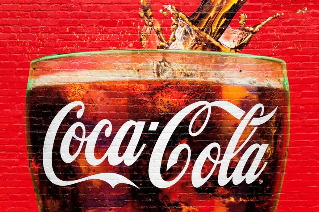
Coca-Cola — perhaps the brand with the most iconic use of red — told Business Insider in 2015 that its color of choice dates back to the beginning of the company when it painted its “syrup barrels so that tax agents could easily tell them apart from alcohol during transport.” Put simply, red was used to help the company stand out from the crowd. Or, as the company itself wrote: “There is no Pantone color for Coca-Cola red, but when you see it, you know it.”
Elsewhere, red is a common color on national flags; Time called red the most patriotic color. When it comes to symbolism, use of red on flags could mean power, wealth, and even revolution. These associations are replicated by brands. As brand-consultancy firm Wolff Olins wrote, its design for Bobby Shriver and Bono’s HIV/AIDS-awareness campaign, (RED) “inspires, connects, and gives consumers power.”
Tips
There is no room for subtlety when using red, so you may as well embrace the boldness and go big, as the London Design Festival has done. If you’d rather play it safe, perhaps a more playful shade of red like coral or even magenta could suit your needs. An even safer bet is using red as an accent or using red on an alternate logo, as popular lifestyle blog Refinery29 has done with its social-media avatars.

- Orange: Friendly, Adventurous, Casual
Meaning of orange
Whether it’s a juicy orange, a crisp carrot, or a summery Aperol Spritz, orange often conjures up the image of food and beverage — and by extension, health and refreshment. It can also convey messages of confidence, casualness, independence, affordability/accessibility, and adventurousness.
Examples
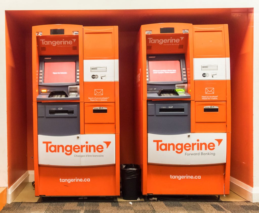
It’s no wonder why a bank like Tangerine, which offers no-fee banking, would choose a vibrant shade of orange to get its message across. This color gives customers — particularly young ones — the confidence to take a chance on a fresh and friendly banking alternative. Tangerine’s orange has even greater symbolism, though; it’s a nod to its previous life as ING Direct, which itself has origins in the Netherlands’ House of Orange–Nassau. Other brands that use orange in their logos include Harley-Davidson Motorcycles, Payless ShoeSource, Amazon, and Firefox — the latter of which mentions “reliability” and “quality” in its branding description.
Tips
Orange could play the happy medium between exciting red and lighthearted yellow, but businesses considering orange in their branding should take heed:
While it can convey a sense of adventure or confidence, it can also easily remind people of Halloween — which is to say, seasonal, a little hokey, and even cheap.
The more muted oranges should not be discounted. On the lighter side, peach is often seen as a friendly, soft, elegant color; on the darker end, burnt orange or terracotta could be a source of comfort. When it comes to color combinations, ColorMatters.com writes, “Orange is an excellent example of this design rule: There are no bad colors; only bad color combinations.” Blue is considered complementary to orange. Meanwhile, orange’s ideal triad color scheme pairs it with green and purple — three colors that, when combined, are reminiscent of Mardi Gras festivities.
- Yellow: Cheerful, Warm, Serene
Meaning of yellow
Historically, yellow has had conflicting meanings. It’s been the color of royalty, of finance, of religious exclusion (e.g. the Star of David badge), of jaundice, and of cowardice.
But in its purest form — the gold of a fresh egg yolk, the clear and vibrant yellow of a bouquet of daffodils, or the soft glow of the late-afternoon sun — yellow represents warmth, happiness, and serenity. Yellow is the color we notice fastest, especially in our peripheral vision, which explains why it is used for tennis balls, police tape, security vests, road signs, and school buses.
Examples
When you think yellow, Best Buy, Subway, Hertz, or McDonald’s may come to mind. Each of those company logos sport simple, non-serif fonts (minus the S and Y on Subway). Additionally, the yellow in the logos is usually bordered by another color to help define the edges of the characters and add to the impact of the color choice.
.jpg)
Tips
When it comes to branding, yellow can be an effective color because it is so easily noticed, but it can also be perceived as a cheap ploy to attract eyes.
Consider using yellow as an attention-grabbing accent or flourish, rather than the core component of a design.
And whatever design you do settle on, make sure it’s a clean, uncomplicated one.
- Blue: Peaceful, Trustworthy, Honest
Meaning of blue
Is there anything as peaceful and calming as a clear blue sky or a sparkling ocean? Or an item of clothing as universally embraced as blue jeans? Blue is the number-one favorite color on the planet — which means most people have positive associations with it. Trustworthy, dependable, and strong are commonly used to describe blue’s symbolism. However, as Goethe wrote, it can also be perceived as cold, shady, or melancholy.
Examples
Some of the world’s most famous brands sport blue color schemes, from Oreo to American Express to IBM. Facebook creator Mark Zuckerberg has said he chose blue branding for one practical reason: He is red-green colorblind.

Tips
Blue branding can impart a sense of professionalism, loyalty, and honesty. Its popularity, however, means that it’s difficult to stand out from the sea of blue.
Smart color combinations can help it pop.
Blue pairs nicely with white, yellow, and red, as proven by IKEA, Pepsi, and Southwest Airlines. You may also consider using more turquoise shades to shake things up.

- Green: Natural, Safe, Permissive
Meaning of green
Green is the color of lush jungles, productive vegetable gardens, and sprawling meadows. As such, it instills feelings of growth, renewal, and safety. It’s a truly versatile color; the human eye is more sensitive to green (specifically chartreuse) than any other color, and there are likely more shades of green than we’ll ever be able to count.
Examples
Whole Foods has an extensive selection of ecological products, so it makes sense that the grocery chain chose a dark shade of green to communicate its “unshakeable commitment to sustainable agriculture.” The association between farm-machinery maker John Deere and its green logo is equally obvious. Meanwhile, Starbucks’ green logo gives the brand a feeling of freshness and prosperity, while also subtly associating itself with coffee’s natural origins.
When Spotify changed its logo slightly from a “broccoli” shade to a more neon green in 2015, it was met with criticism. As a Spotify designer wrote at the time, the new color choice was part of a brand refresh: “The new green has a little more ‘pop’ […] It not only looks more fresh and modern but also feels more easy on the eye, especially when applying it fullscreen.”
Tips
Purple is a low-arousal color, so it could be useful to advertise something that is meant to give people a sense of peace (e.g. a yoga studio) or impart a sense of luxury or privilege,
as with chocolate, makeup, or purveyors of lavender-scented products. Virgin Airlines’ use of purple cabin lighting denotes creativity and calm — or at least a mysterious allure.

- Black: Luxurious, Elegant, Powerful
Meaning of black
Black, for all intents and purposes, is not a color, but we would be remiss not to include it. “Without light everything is black,” writes creative studio Fat Rabbit Creative. “However, when thinking about color in terms of physical pigments […] white is not considered a color while black is the presence of all colors.”
Black is mysterious, meaning that it can be manipulated to represent almost anything depending on what other colors it is combined with. On its own, black is heavy, powerful, serious, authoritative. It can also exhibit strength, elegance, boldness, and sensuality.
Examples
The nature of black means it can only exist in combination with other colors; otherwise we wouldn’t be able to see anything. That gives us some leeway on assigning it any particular symbolism or meaning. Black and white is the most common pairing, a combination that can give off an air of elegance, artistry, and even neutrality. Uber, Ralph Lauren (particularly its Black Label line), and Apple’s black-and-white branding emit a sense of power, sleekness, and sophistication. The New York Times’ iconic black-on-white banner, written in Old English typography, gives off an authoritative impression.
A wonderful post. Continue in the same spirit. I like and thanks
good read.picked up some good info from this!
a nice post , thanks for your sharing !
Congratulations @monjiahmed! You have completed some achievement on Steemit and have been rewarded with new badge(s) :
Click on any badge to view your own Board of Honor on SteemitBoard.
For more information about SteemitBoard, click here
If you no longer want to receive notifications, reply to this comment with the word
STOPbuen post, espero tu apoyo