SEC20/WK2: Colour Theory and Application
This is my homework post for Steemit Engagement Challenge Season 20 Week 2 assignment of Professor @lhorgic’s class, Colour Theory and Application.

Note :
- I performed this task on Windows 10 PC, Google Chrome.
- I use Web Canva, https://www.canva.com/.
Task 1 - Discuss Colour Theory according to the way you understand it
Graphic design is something that seems to be inseparable from human life, perhaps since ancient times, it has experienced developments in theory and application. The following is what I concluded from my findings after reading several articles on the internet, some of which I mentioned in the reading list at the bottom of the post.
Color Theory is one of the most fundamental parts of the graphic design world. In the study of Color Theory, the interaction between colors is studied. A sufficient understanding of this makes a graphic designer will be able to use color combinations effectively in their designs so that with high aesthetic value, the message to be conveyed will easily stick in the viewer's mind.
Color Theory also explains the nature and perception of color, so that a design will find the most appropriate color that suits the information it conveys as well as the effect it wants to achieve on the viewer on a psychological and emotional level.
Furthermore, the study in Color Theory includes:
- Color Wheel
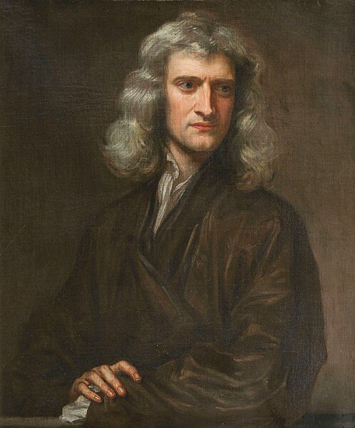
Although the study of color has a long history, the Color Wheel theory was proposed by Sir Isaac Newton FRS (25 December 1642 - 20 March 1726/27). In 1672 Newton published New Theory About Light And Colors in Philosophical Transactions which has become one of Newton's most popular works that fundamentally changed the understanding of light and color in his time. Newton wrote this following his findings after experimenting with using a prism to break up the color white which disproved the theory that white light was a pure form of light. Newton's experiments with prisms showed that white light consists of a spectrum of various colors. Netwon’s New Theory About Light And Colors text in pdf form can be read here.
.jpg)
Portrait of Sir Isaac Newton at his 46, 1689, as seen on Wikipedia, license can be seen here
In the Color Wheel theory, a visual tool is used to classify colors based on the relationship between them. With the Color Wheel, a graphic designer will understand how colors interact so that they can produce a harmonious play of colors in design.

RYB Color Wheel. Source.
The Color Wheel divides colors into 3 color groups:- Primary Colors, which are basic colors that cannot be made with a mixture of other colors, mixing primary colors is the forerunner to the existence of other colors. There are 3 primary colors, namely: Red, Blue, and Yellow.
- Secondary Colors, which are colors that result from mixing two primary colors, for example orange color obtained as a result of mixing red and yellow colors.
- Tertiary colors, which are colors that are a mixture of primary and secondary colors.
- Complementary Colors
Complementary Colors are colors that are opposite to each other on the Color Wheel. Opposite colors are located opposite each other in the Color Wheel. Opposite colors will create a high contrast when used together in a design. This can be useful for balancing a design. When two opposite colors are mixed, a neutral color such as gray or brown will result. - Analogous Colors
Analogous Colors are groups of colors that consist of 3 adjacent colors in the Color Wheel. - Color Temperature
Color is also associated with temperature. There are two types of color temperature, namely- Warm Colors: red, orange, yellow.
- Cold Colors: purple, green, blue.
- Tonal Value
Tonal Value is the degree of brightness or darkness of a color. Tonal Value has 4 broad categories: Hue, Tint, Shade, and Tone. - Color Schemes
Popular Color Schemes include:- Monochromatic, using a one-color composition.
- Triadic, using three equally spaced colors on the color wheel.
- Split-Complementary, similar to complementary, but uses two colors that are around the original complementary color, so the contrast is still very strong but not as striking.
- Color Psychology
Each color is thought to represent a certain emotional feeling and can affect the viewer's psychological state, mood, and even reaction. Some colors and their psychological properties:- Green: Health, growth, or harmony.
- Red: Energy, passion, or danger.
- Yellow: Joy, optimism, or thoughtfulness.
.jpg)


Task 2 - Choose "Two" from the colour scheme discussed, briefly talk about it and demonstrate with two examples each showing how to combine colours using that scheme
Complementary Colors
Complementary Colors are colors that are located opposite each other in the Color Wheel. When used together in a design, they create a striking contrast to their counterpart. Let's take a look at the following Color Wheel (original image from britannica.com).

The stark contrast between two Complementary Colors when used in a design will help make the visualization stand out. Here is an example of using Complementary Colors in design. I use blue and orange colors.
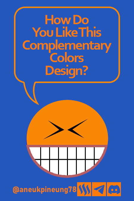
The design above shows how the orange color creates a sharp contrast to the blue background. In more complex designs this can be utilized to emphasize the information that takes precedence in the design.
Analogous Colors
Analogous Colors are three colors that are located close together in the Color Wheel. Because of its close position, the Analogus Color will not have a high sharpness contrast but creates a comfortable and calm gradation effect. Let’s take a look at the picture below.

To create a design example based on Analogous Colors, I will use the colors as shown in the image below.

The result:

The colors in the Analogous Colors scheme have a low level of contrast so the placement between colors must also be done carefully so as not to obscure each other in the design.
Task 3 - Demonstrate how to get your colour Hex from external object using your Canva design app
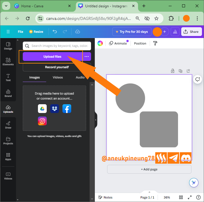
- The scenario is, I have two elements (circle and rounded square) in gray on a square canvas (1080x1080 px) in white. I want to replace the color with certain colors from the Color Wheel, the Color Wheel image is in my computer library. I press [
Uploads] button to bring the image from PC library to Canva library.

- In the dialog window that appeared later I pressed the [
Upload files] button.

- I searched for and selected the file I wanted on my PC. I hit [
Open] button to import it to Canva.

- Now the image was included in the Canva library. I clicked on it to insert it to canvas.

- The image was inserted to the canvas.

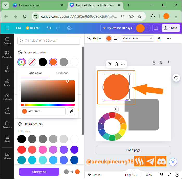
- I adjusted the size and location of the Color Wheel image so that it would not interfere with the work on the canvas (1). Next I will change the color of the circle, for which I activate the circle by clicking on it (2). I then pressed the [
Color] button to activate the Color Library (3).

- Setelah jendela Color Library terbuka, saya menekan tombol [
Add a new color].

- Inside the Add a new color window I press the [``Color picker```] button.

- With the color picker active, I clicked on top of one of the colors in the Color Wheel, choosing orange.

- The color of the circle has turned orange.

- Using the same method, I changed the color of the rounded square and canvas.


Task 4 - Finally demonstrate how to get the colours behind the hex codes below.
a. #f3ca20
b. #000000
c. #ef9d10
- This time I have three elements on the canvas and I want to color them using colors that have a specific hexadecimal (Hex) code, namely a rounded square with color
#f3ca20, a circle with color#000000, and a triangle with color#ef9d10. First I will change the color of the square, I click on it (1) and then press the [Color] button.

- In the color library window, I pressed the [
Add a new color] button.

- I filled in the Hex code field with my intended color code, as directed by Professor Lhorgic, which was
#f3ca20.

- In the same way, I then replaced the color of the circle with the hex code
#000000.

- And the triangle I filled with the hex color code
#ef9d10.


Readings
- https://royalsociety.org/blog/2021/11/colour-wheel/
- https://www.hgtv.com/design/decorating/design-101/color-wheel-primer
- https://www.earlymoderntexts.com/assets/pdfs/newton1671.pdf
- https://www.britannica.com/science/color-wheel
- https://www.canva.com/colors/color-wheel/
- https://color.adobe.com/create/color-wheel
- https://www.sessions.edu/color-calculator/
- https://www.interaction-design.org/literature/topics/complementary-colors
- https://en.wikipedia.org/wiki/Complementary_colors
- https://www.thesprucecrafts.com/definition-of-complementary-colors-2577513
- https://www.britannica.com/science/complementary-color
Thanks
Thanks Professor @lhorgic for the lesson. I hereby inviting @rayfa, @dhisky and @dikimon to join.
Pictures Sources
- The editorial picture was created by me.
- Unless otherwise stated, all another pictures were screenshoots and were edited with Adobe Photoshop 2021.


Hello @aneukpineung78 thank you for participating in this week's lesson. We have assessed your entry and we present the result of our assessment below.
Feedback:
• You have clearly defined Colour theory the way you best understand it and I appreciate the remarkable effort you put into it.
• Your selection on colour scheme. Good to see that you clearly demonstrated how much you understand the use of those scheme by combining your colours appropriately...which is quite commendable.
• Finally, Your practical looks really nice in it presentation, looking very organized and comprehensive. In all, you did a good job. I hope you keep it up. Weldone.
Regards
@lhorgic❤️
Thanks, Professor. I enjoyed the class.
X : https://x.com/aneukpineung78/status/1837172875285201152
A well-written post on colour theory. It seems you gave time and effort to participate here and tried to make it unique. No doubt you are good at colour using. I like your detailed presentation. I tried to access your provided link but couldn’t. I don’t know the reason it shows an error. Best wishes to you.
I tried to access your provided link but couldn’t.
It has been fixed. Thanks for correcting, @pea07. I wish you the best as well.
Thanks for everything bang @aneukpineung
Apakah bang @dhisky tertarik mengikuti ini?
Saya akan mencoba untuk mengikutinya, namun sebelumnya akan saya pelajari lebih dulu
Iya memang harus demikian agar kita tahu apa yang kita lakukan dan tidak tersesat di dalam proses. Oke, semangat bang @dhisky. Apakah semua baik-baik saja di akhir pekan ini?
¡Holaaa amigo!🤗
El color es un factor muy importante en nuestro diseño gráfico y, a pesar de que hemos llegado a pesar que es sencillo dominarlo, la realidad es que necesitamos estudiar principios y psicología del mismo ya que, cada tonalidad tiene una influencia específico.
Te deseo mucho éxito en la dinámica... Un fuerte abrazo💚
Yes. it is indeed not easy and have to be learned. 😃😃
TEAM 4
Congratulations! Your post has been upvoted through steemcurator06. Good post here should be..Thanks, team-4.
Produksi barang-barang saat ini contohnya produk fashion sangat kaya perpaduan warna dan dinamai dengan nama-nama baru seperti denim, dusty pink, pink fuschia, sage green, dusty blue, floral green dll
Alfanumerik Warna
Iya, ada banyak sekali warna turunan. Menurut teori Color Wheel, warna primer hanya ada 3: merah, kuning, dan biru. Warna primer adalah warna yang tidak bisa dihasilkan dengan pencampuran warna-warna lain. Selain warna primer, adalah warna yang dihasilkan dari percampuran warna-warna, baik antar warna primer atau perpaduan lainnya. Begitu banyaknya warna dan begitu rendahnya kemampuan mata untuk membedakan warna-warna yang sangat mirip, misal biru dan gradasi-gradasinya yang berdekatan, membuat orang kadang susah menyebutkan nama untuk warna tertentu, dalam dunia desain grafis, di sini lah kode hexadecimal warna sangat berpengaruh.
Berikut ini adalah tiga warna berbeda yang mungkin sebagian orang akan sulit membedakannya dan sebenarnya dalam kasus-kasus tertentu juga tidak membawa perbedaan besar ketika digunakan dalam desain. Dan orang pasti akan menyebut ketiga warna ini dengan nama "oranye" baik ketika disodorkan secara bersamaan maupun terpisah.
Tetapi ketika ditanyakan kepada komputer maka jawabannya akan bersifat numerik atau alfanumerik sesuai dengan pilihan sistem warna yang dijadikan acuan.
Walaupun dalam teori Color Wheel, ada 3 warna primer yang sistemnya kemudian dinamai RYB (Red, Yellow, Blue), namun menarik mencermati kenapa dalam aplikasi-aplikasi desain grafis major, dua sistem warna yang populer adalah RGB (Red Green Blue) untuk keperluan desain non cetak, misal untuk website atau presentasi via display elektronik, dan CMYK (Cyan, Magenta, Yellow, Black*) untuk desain yang akan dicetak karena umumnya mesin pencetak desain memiliki sisten tinta ini (4 tabung tinta CMYK), dan tidak RYB. Menarik, bukan? Mungkin ini akan dibahas pada kesempatan lain.
*Dalam sistem CMYK, warna Black dikodekan dengan K dan bukan B karena B sudah diasosiasikan dengan Blue pada sistem RGB.
Iya.. Menarik, bisa jadi satu artikel tersendiri membahas turunan warna ini
Still on the waiting list?
Team True Colours - @wakeupkitty
You have no idea ....
source
I saw you waiting at different spots...
Need to get creative with this waiting.
That bus in the middle of nowhere won't arrive. Perhaps showing a pie or a huge bar of chocolate helps? Let me know if you found the surprise.
Your writing gives new perspective on colors. Makes you wonder how it can be applied in real life! Good luck for the contest.
@max-pro,, what is the image processing application of your choice? Do you use Adobe Illustrator?
I likes Canva.
Very nice choice. Is it mobile version or web version?