Graphic Design made Simple (G101) #lesson 3
 |
|---|
Hello friends...still finding it a bit difficult to address you as students, lols. Don't mind me, I will surely get use to it as time goes on. Welcome once again to our beginner's graphic class. I trust you have been getting value from the lessons.
I actually promised myself not to waste your time by dishing out content of low quality. I am here to help out via my area of expertise. So today we are going much deeper into the lessons. We want to start discussing concepts and practical approach to them. So...let's dive in.
- Introduction
- What is Typography
- Terms in Typography
- Understanding Typeface and font.
- Combination and usage of Typefaces
Typography is an integral part of graphic design, some designers actually see it as the heart of a design. Although a layman thinks typography is all about text or fonts but it goes beyond just font and text. Big brands out there know what this concept is and leverage on it. What then are we talking about here, what is typography?
 |
|---|
Typography is a skillful art of arranging typeface in such a way that your message, communicated via text in a design work can be legible, readable, well presented and appealing to viewers. This is achieved by choosing the right typeface, line length, size, weight (bold, semi bold, thin, light etc) line spacing and letter spacing.
The goal of typography is to drive home the message you have articulated using text. It makes it look attractive and aesthetic.
Have you seen fliers, posters, brochure, magazine and other kind of publication with nice captions that looks very appealing? The typography (skillful arrangement) must have made it come out well.
Brand also leverage on the use to typeface to stand out. The typeface used by Colacola is not the one used by Pepsi. They both have their unique typeface which they use consistently. It has become part of their brand property.
In this section, we will be looking at some terms and elements that makes up this subject. By now, we understand that typography simply means the systematic or skillful arrangement of typeface or text in a well presentable and appealing form.
We need to know what makes up the text / letters which is to be arranged. Having a better understanding of this will help us with our arrangement which in turn will add beauty to ours design. Let's explore.
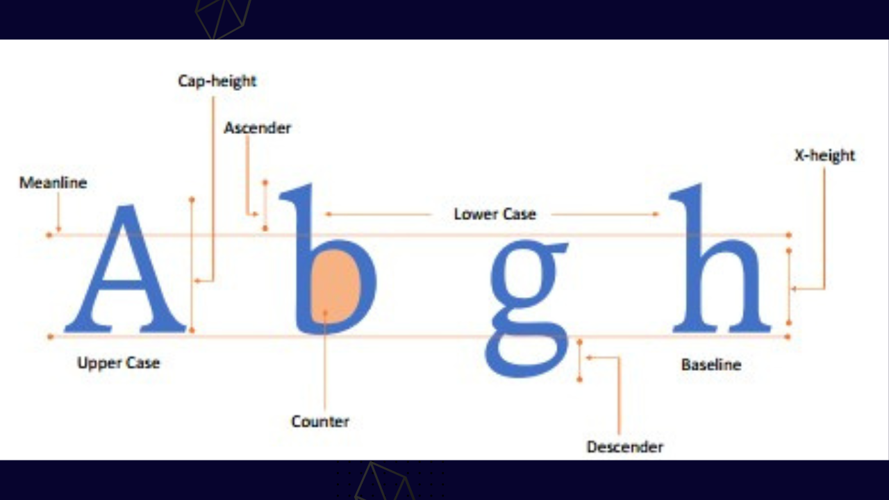
Baseline: This refers to a line where a letter rest on, or better put, where the bottom of a letter rest on just as captured in the image above. The way your lines are positioned in your regular note book is no different from this.
Descender: This is the part of a letter that falls below the baseline. A letter that falls into this category is the letter **"y" , "p"
Ascender: this is peculiar to lowercase letters. This is the part of a lower case letters that goes beyond the x-height. Just like the literal meaning of the word ascend, to rise or go up...
Stem: Just picture the stem of a tree to get this term, it's nothing different from it. This is a vertical line in letters like "I", "t" and "r". They give a clear picture of what a stem is.
X-height: This is used to describe the Midway point of the total length of a typeface.
Cap height: this is peculiar to uppercase letters. It's the length of an uppercase letter.
 |
|---|
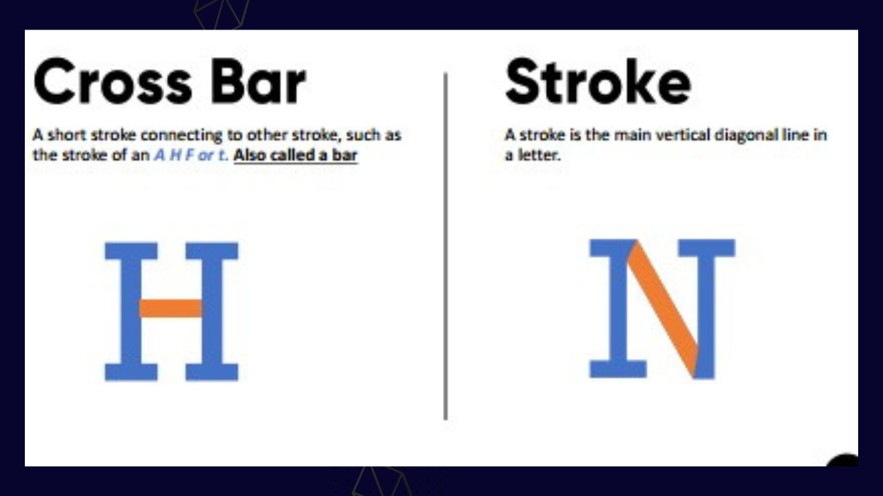
Cross bar: this is used to describe a stroke connecting one stroke to the other just as seen in letter "H"
Stroke: this can be referred to as the main vertical diagonal like in a letter just as seen in "N"
 |
|---|
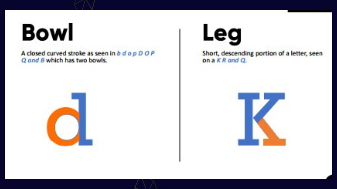
Bowl: this is used to describe letters with closed curved strokes just as seen in "b", "o" , "P", "Q" "B"
Leg: this is peculiar to letters like "K", "R", "Q". It is characterized with a shot descending extensions which looks somewhat like leg in the real sense.
There are still other terms I didn't capture in this post, you can do your little research to unravel the other aspect not captured. Well some of it includes "terminal" as seen in the curled end of f and J, crossbar, ear etc.
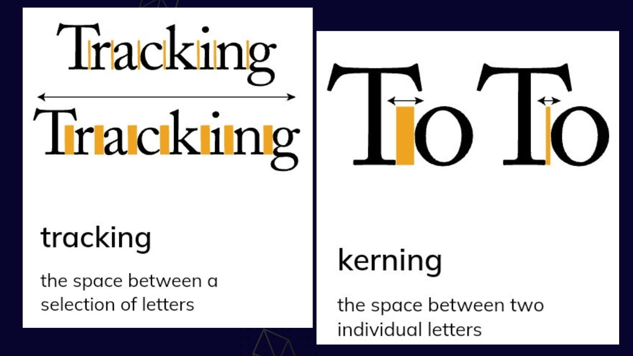
Kerning and tracking are also important terms I deemed fit to add to this lecture. The term and it meaning is capture in the images below. It has to do with letter spacing and adjustments for better presentation.
 |
|---|
I think it expedient for me to bring clarity to this two terms. They are often used interchangeably which is wrong. They are distinct.
- Typefaces
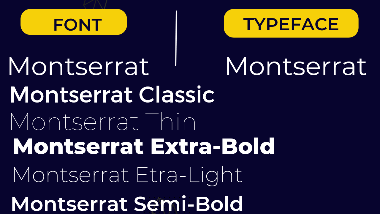
A typeface can be referred to as a family of fonts that are closely related . While fonts refers to the expression of a typeface in terms of weight, widths, height and style.
Let me make this explanation more comprehensive and practical.
Mr.Willson Edward has a family comprising of a wife and 4 children. Together they are all called the Edwards because they belong to the family. This can be likened to typeface.
 |
|---|
- Font
Font on the other hand is used to describe their individual differences in spite of the fact that they are all Edward and belong to one family. Now the first child can be chubby than the other three, the second child might just be skinny and taller than the others and then the third and fourth also have their peculiarities.
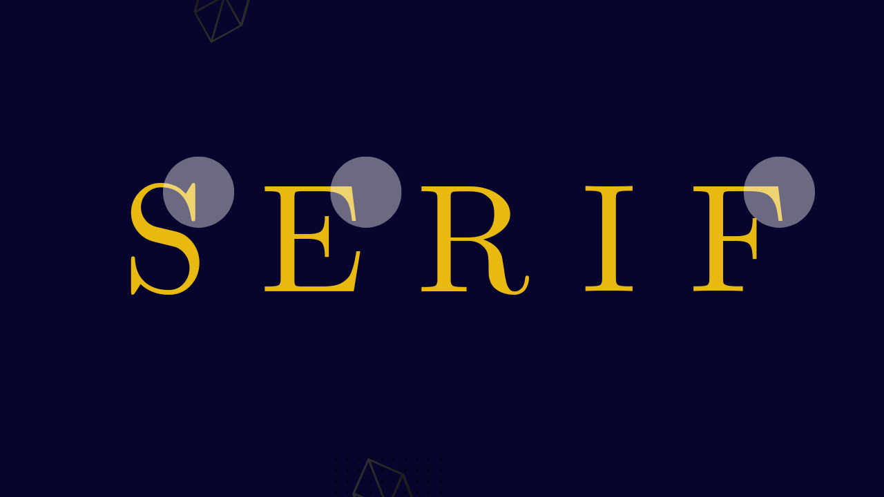
Serifs
 |
|---|
Simply put, serif are typefaces with small extension at the edge of the letters, this make the typeface unique, it has been highlighted in the image above. Examples of these typefaces includes
- Time New Roman
- Georgia
- Cambria
- Book antiqua
Sans-serif
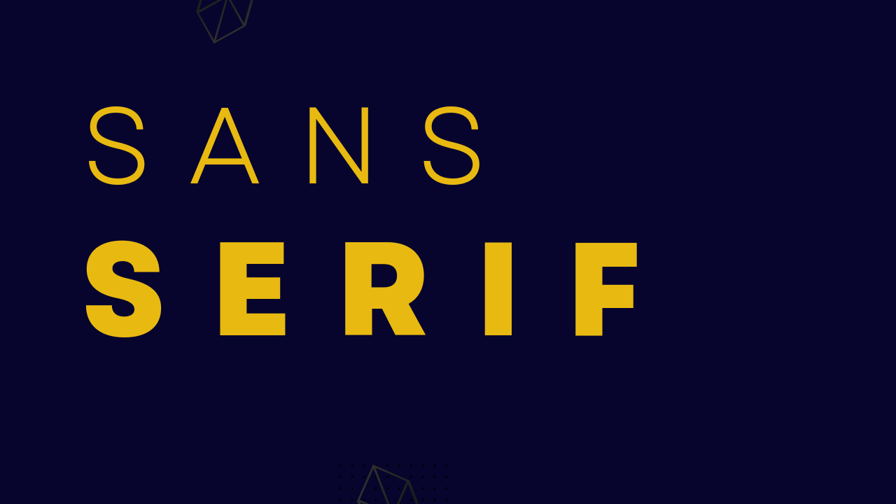
"Sans" is a French word which means without. In other words, it means there are no extension in typeface that belong to this category. It's the direct opposit of serifs. Examples are;
- Calibria
- Verdana
- Primer
- Bauhaus93
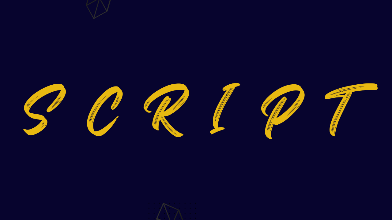
Script
 |
|---|
These are typesfaces that looks more like human handwriting. They seem to be more flexible in nature. Example include;
- Alex brush
- Scriptina
- Vivaldi halie
- Billy ohio
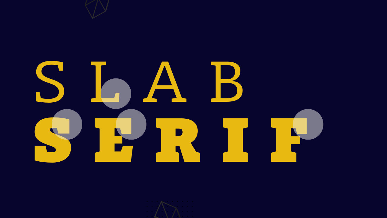
Slab serif
 |
|---|
These are typefaces that has extensions as well but the extension here is made of solid rectangular shape at the end of it letter. It has been highlighted in the image above. Examples are:
- Mueseo
- Roboto
- Bree
- Chaparral
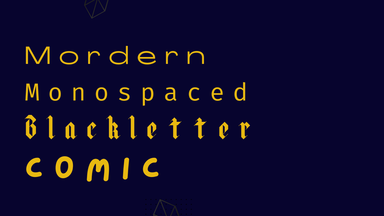
Other caretogries includes
 |
|---|
- Blackletter
- Decorative
- Cursive
- Modern
- Monospaced
There are certain things we should understand about fonts. Fonts have role they play in graphic work.
You do not use a funky or comic font for a design that is to be used for corporate business. Comic font will just be fine for publications that has to do with fun, children's and the likes.
Generally serifs are professional font that are used for any serious minded publications. Sans serif are cool fonts used for social media promotions, infographics and the likes. Slab serifs are used to grab attentions, they function well as headers while script is unprofessional, it's for showcase.
You should also be careful when combining font. It's difficult especially when you're new to graphic design. To be on a safer side as a newbie, use fonts in the same family which usually comes in variety, weight and styles. Example of fonts with family includes
- Helvetica
- Montserrat
- Poppins
- Roboto etc.
This is where I will be wrapping it up for this lesson. I really appreciate you for coming this far with me. I trust you got value from this post. Feel free to share with me your thought on today's lesson, I am more than ready to read your views.
Special mention:@franyeligonzalez @fonjougiresse
@ruthjoe @xkool24 @sahmie @chukwu10
Did you miss the previous lessons? You can check them out here.
| G101 introduction post | Lesson 1 | Lesson 2 |
|---|
Graphic Instructor
@lhorgic♥️
Cc: @ubongudofot.
An interesting class. It seems incredible but the design has many details that we do not know.
And reading them here has been very good, because it allows little by little to understand that design is related to many things.
What has caught your attention the most about what you have explained? something particular to highlight?
Upvote already
Thanks for going through the lesson and for the support.
For me every part is important, this is the reason why I had to break the lessons into sections. If am to summarize I would say your typeface choice largely depends on the kind of design you're working on i.e social media design,business/coperate design, promotional designs etc. Also to be on a safer side as a beginner, use typeface with family to aid smooth combination of fonts, that is if there is a need to combine. I hope this answers the question
Wow I knew font characters was important but as detailed as you did. .
It permitted me to know the exact fonts to use in situations. Very interesting sir @lhorgic.
I have a suggestion. Just like the crypto-Academy, many people learned about crypto currency and some became traders.
If we associate theory with practice here it will be a good Idea. We start with the simplest graphic designing app.
What do you think about it?
Wao! This is a beautiful idea @fonjourgiresse. I was trying to move into practicals fully after theories but then this suggestion is welcomed,our next lecture will be theory+practical where we will practically work things using a design app... I hope we can start with canva, many users on this platform use canva app for designs.
Great you welcome the idea. Is true most of my cover pages are designed with canva.
When we will finish the assignment, we post in the comment section of the post for the mentors to verify.
Of course if you have a colleague whi can help you it will be better because of the work load.
Smiles, well I don't have for now but I know with time those who follow these lectures will become good graphic instructors. Maybe you are our next graphics teacher 😃
😅😅😅yes, if in case I meet the standards. An I am good as you are for now I am an amateur trying to learn.
Wow,what a great lesson, graphics design is really deep than I just expected,at least I have gained some little knowledge from this lesson.
Thanks @ihorgic for this great lesson.
You're welcome thanks for going through this lessons. Hopefully we will have some practicals in our next class.
Wow,can't really wait for it, God will reward you abondantly for this great lesson.
Feel free to address is as your students..
This is really a serious topic, sir thank you for putting do much effort to make this class a reality. Am sure going to take my time to read through it again.
Smiles, thanks for going through the lesson, am even happier because you said you would go through the lesson again.
Thanks once again.
Yes boss I will..
TEAM 5 CURATORS:
This post has been upvoted through steemcurator08. We support quality posts anywhere and with any tags.
Curated by: @goodybest
Thanks @goodybest. Your support is much appreciated.