🎨 Mobile Navigation Design Patterns: #proposal-86 Update
Following my last update, there was unanimous support for using the left sidebar for navigation - which for larger screen users, is a familiar implementation.
How Popular Sites (Twitter & Facebook) Handle Navigation

The often referred to Twitter is a prime example - the Primary Navigation being pinned to the left with secondary options appearing above the content in the form of tabs. The left navigation remaining consistent throughout the site and top tabs changing to the context.
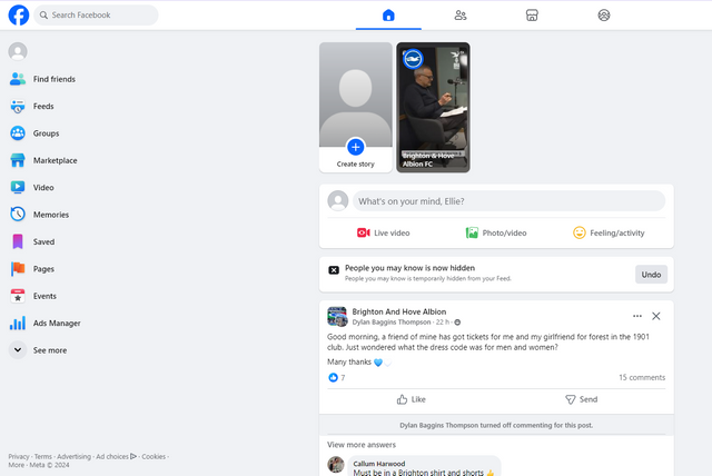
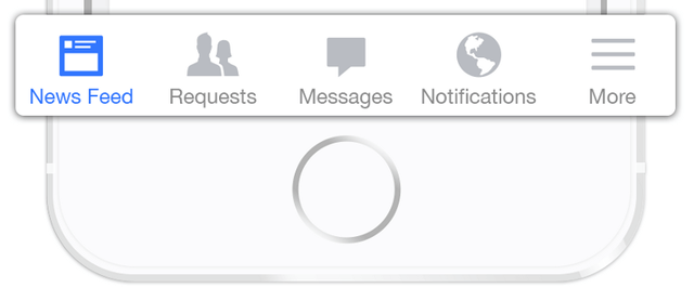
Another popular Social Media platform, Facebook, have implemented a similar, but different solution. Whilst their Primary Navigation appears to also be on the left, their most important menu items appear across the top as icons (i.e. tabs). The top navigation remaining permanent throughout the site and therefore being their primary navigation, and the left navigation changing to become contextually relevant.
As you can see, 2 of the most popular Social Media sites implement contrasting solutions - with similar differences seen on their mobile views.
Mobile View
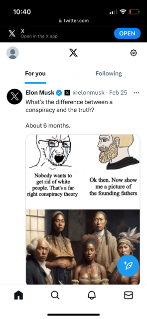
Once again, starting with Twitter - For mobiles, Twitter has followed Facebook's lead and chosen which of their Primary Navigation options are the most important and displayed these as icons. Differing to Facebook, Twitter have decided to pin these across the bottom, making them semi-transparent as you scroll down. As with their desktop interface, they have kept their sub-menu items at the top of the screen.
The remainder of the main navigation items are hidden behind the avatar, which upon clicking, expands across the screen.
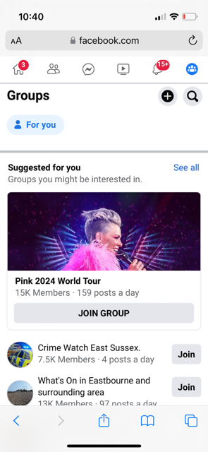
Facebook have been consistent with the primary navigation, placing it at the top of the screen. Unlike many other mobile websites, this disappears when you scroll, only reappearing once you reach the top of the screen.
Like their desktop view, they have chosen their preferred Primary Navigation options and displayed them as icons. The remainder of these Navigation options are hidden behind the burger menu in the top right of their interface, becoming a full view screen navigation portal when selected.

Applying This to #proposal-86
So as you can see, we've got top, left and bottom position for the Key, Primary Navigation items on 2 of the world's most popular sites. Primary navigation on desktop is made more concise on mobile in both instances.
Relating this back to steemit.com, one part of a reply to my last post stuck in my mind as I worked on designing the optimal solution:
We also have to think about mobile and having a top navbar is clearly a no go for it.
As you should know already, I spend time listening to the feedback shared, I spend time considering it and then I spend time exploring and finding solutions to it. So I've spent an inordinate amount of time researching mobile design patterns, each of which I'll detail here, as well as relate it to steemit.com and why I believe that the best solution for steemit.com's mobile implementation, includes a top navbar.
Content Hierarchy / Information Architecture
Whilst researching solutions, one piece of feedback regarding the chosen patterns was related to Information Architecture (IA)... i.e. if you need to use (x) solution, or if (x) solution is not appropriate, you need to revisit your IA.
So I'll start by sharing my assumptions about steemit.com's IA which I invite you to support or challenge.
Primary Functions
These are the overarching feature requirements of the site. These are the fundamental, high-level things that if you are asked: "What do you want to do on a paid blogging platform?", would be your answer. And to me, it's:
- Explore Content
- Create Content
- Personalisation
- Earnings
1. Content Exploration
To me, this is all of the content on the site that is produced by others... that users spend their time exploring, reading and interacting with. It's the Feeds (My Friends, Trending, Created, etc.), it's the communities, it's exploration of other users' content.
2. Create Content
I'm on a blogging platform and I'm here to share my world view. Being able to do this needs to be straightforward.
3. Personalisation (My Profile)
The third one is all of the content that I've contributed, as well as my calls to action. My contributions are items that I've posted, resteemed, my comments, my subscriptions... they're all things that I do, things that I've "created" on the platform. My calls to action are things like my replies, my notifications... all things that others have done to me. It's all about me.
4. Earnings (My Wallet)
This 4th item is one that's unique to paid blogging platforms and I've included it as fundamental because a primary reason that people join Steemit is to earn money. $100 per day, simply through blogging.
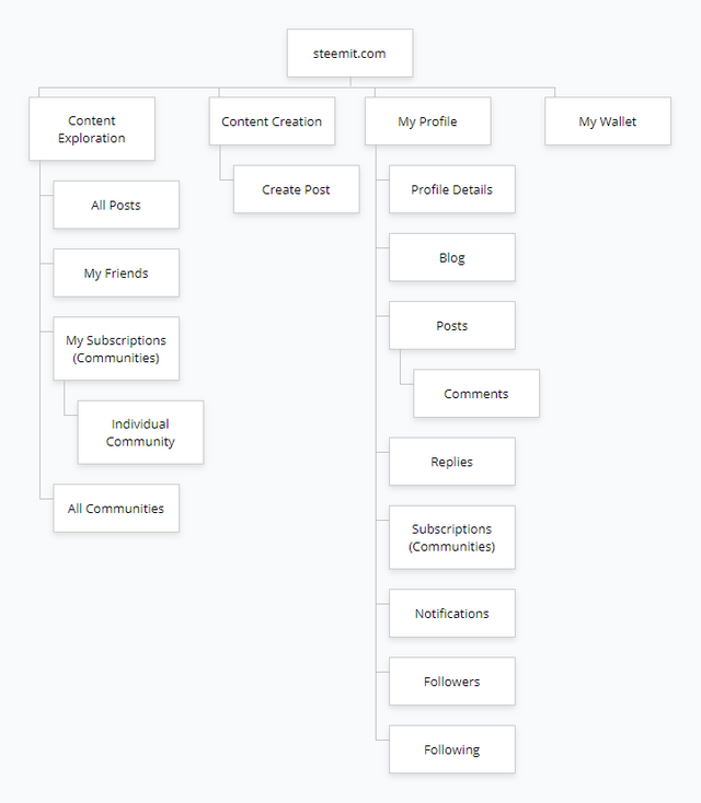
With these fundamental needs in mind, we've essentially identified our top level navigation elements. These are the sticky items that Twitter and Facebook deemed important enough to be permanent across the site.
Sub Items
Within each of these fundamentals, we've got existing sub items which are relevant to their parents...
- Content Exploration: All posts (various sorting), My Friends, My Subscriptions (Communities), Other Users
- Content Creation
- My Profile: Blog, Posts (inc. Comments), Replies, Subscriptions (Communities), Notifications, Settings
- Wallet: Balances, Delegations, Keys, etc. (an external domain that I won't be updating).
And this leads us to our Primary Information Architecture (this excludes the burger menu dumping ground in the top right) which will influence the choice of design pattern for mobile users.
Mobile Navigation Design Patterns
If you do a search for Mobile Navigation Design Patterns, you'll find hundreds of answers and plenty of extreme opinions - "You should NEVER use Hamburger Menus" being one that crops up the most.
Like almost everything in life, the most appropriate solution will always start with "It depends"...
If you're thinking that your site's primary navigation should be hidden from view behind a hamburger menu, then you've probably got some learning to do.
If you're thinking that you'll put a load of unimportant information that you don't mind users searching for behind a hamburger menu, then you're probably correct.
So having talked about Hamburger Menus, I'll write about this one first. And will also cover:
- Tab Bar
- Top
- Floating Action
I won't be covering a Tinder Style "Gesture Navigation", "Cards", "Full Screen" or Apple Style "3D Touch" - these implementations contain the disadvantages of those discussed.
I've read too many articles on this subject to cite them all. Amongst the best are:
- Smashing Magazine - Basic Patterns For Mobile Navigation: Pros And Cons
- Justinmind - Mobile navigation: patterns and examples
- The next web - UX designers: Side drawer navigation could be costing you half your user engagement
- UX Planet - The Ultimate Guide to the Hamburger Menu and Its Alternatives
- Smashing magazine - The Golden Rules Of Bottom Navigation Design
- Smashing magazine - Bottom Navigation Pattern On Mobile Web Pages: A Better Alternative?
- UX Planet - Tabs for Mobile UX Design
Reminder: This is for Mobile Devices in the context of steemit.com
Hamburger Menus
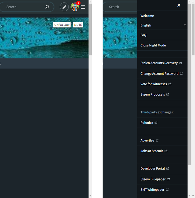
As mentioned above, this is the form of navigation that evokes the strongest reaction amongst user experience designers...
Advantages
- Saves Space / Clean Design: By hiding these options behind the hamburger icon, designers avoid overwhelming users with too many options.
- Loads of options: The main advantage of the navigation menu is that it can accommodate a fairly large number of navigation options in a tiny space. Source
Disadvantages
- Low Discoverability:
(1) When navigation is hidden, users are less likely to use navigation.
(2) If people use hidden navigation, they do so later in the task than if it were visible. (Research by Nielson Normann Group) - Poor Usability: Hidden navigation provides a worse user experience than visible or partially visible navigation does, in both mobile phones and desktop user interfaces. This finding holds true across multiple UX metrics including users’ assessment of task difficulty, time spent on task, and task success. (Research by Nielson Normann Group)
- Hides Context: The hamburger menu doesn’t communicate the current location at a glance: Surfacing information about the current location is harder because it’s only visible when the person clicks on the hamburger icon. Source
- Additional Taps (clicks): Every use of the navigation will require 2 steps - open menu, choose option.
Thoughts for steemit.com
Whilst I've only referenced Nielson Normann Group, they have been recognised as the leaders in User research for as long as I can remember, alongside Steve Krug's 2000 book "Don't make me think".
The consensus amongst Designers is very much that a Hamburger Menu shouldn't be used for Primary Navigation under any circumstances (and this is where they'll often reference an IA problem if it's required). The advantages are based around things looking pretty but this is consistently at the expense of usability.
Taking this one step further, any navigation items that have any importance shouldn't be hidden.
A little Test
I've only tested on a handful of users, looking at steemit.com's existing burger menu. I asked them to name 3 items that appear in steemit's burger menu. A potential bias being that they read my content and are therefore more likely to remember some that I've spoken about. These are generally experienced users, having joined between May 2017 and May 2021 and posted between approximately 3,800 and 40,000 posts and comments.
Of the 17 possible options they could have chosen, only one person could correctly name 3 items - a user who regularly shares the "Welcome" guide to new users.
"Witnesses" was the most memorable item, followed by "Jobs" (suggesting that my content's probably influenced their answer) and "Welcome".
Tab Navigation Bar
It usually contains relatively few destinations, and those destinations are of similar importance and require direct access from anywhere in the app. Source
Advantages
- Perfectly positioned for mobile users ("Thumb-Driven Design").
- Easily communicates the current location.
- Persistence: The user has clear visibility of all the main app views and has single-click access to them.
- Importance: It signals importance, and will drive users to discover the features.
Disadvantages
- Limited to 5 options
Thoughts for steemit.com
This appears to be a suitable approach for the Primary Navigation Items considered within the IA. As I've discussed before, switching between a "Content Exploration" and "My Profile" view requires knowledge that the logo and avatar are clickable and this solution solves this problem.
Top Navigation
Advantages
- Easily communicates the current location.
- Persistence: The user has clear visibility of all the main app views and has single-click access to them.
- Importance: It signals importance, and will drive users to discover the features.
Disadvantages
- Limited number of options
- Buttons are more difficult to reach
Thoughts for steemit.com
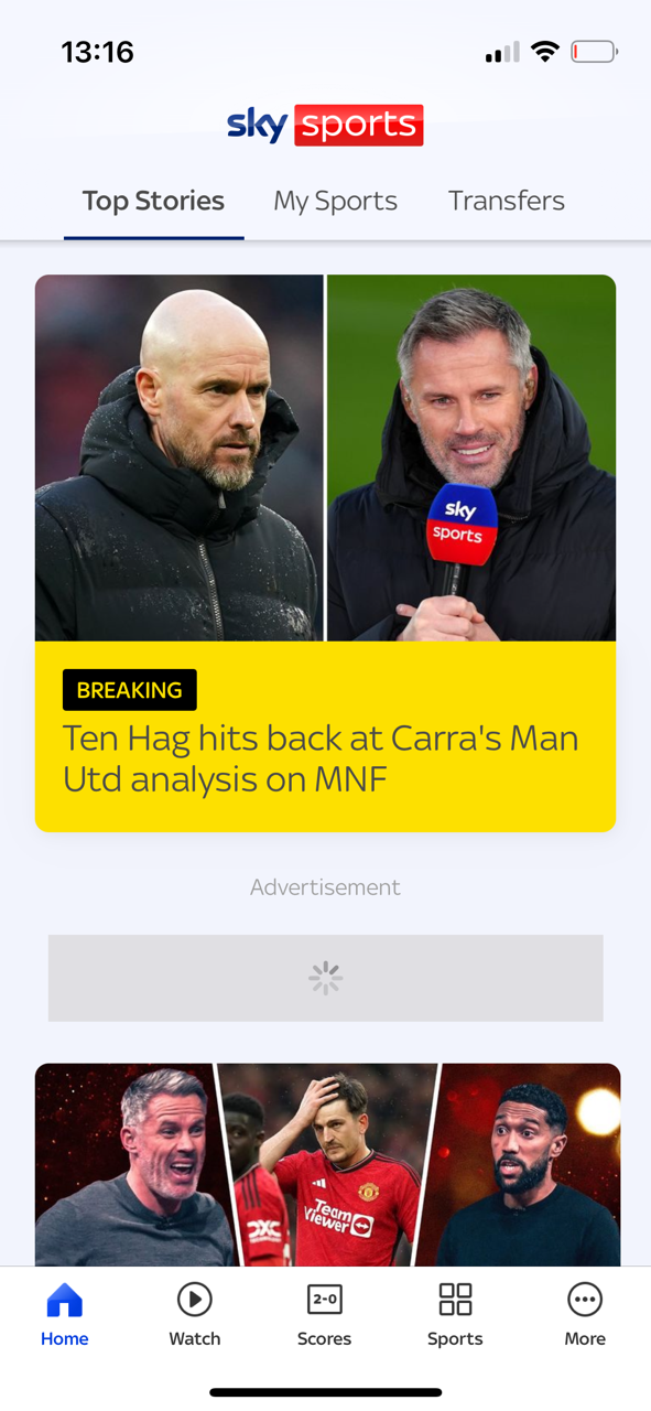
The top menu is predominantly used in conjunction with another form of navigation - as you can see in my Sky Sports example to the right, the primary navigation is tabbed across the bottom and secondary navigation is tabs across the top. This is a commonly used approach to navigation.
The main difficulty in implementing something like this on steemit.com could be space. With Profile Details, Followers and Following currently sitting within the Header, there are 5 remaining options (6 if you include settings which I forgot in my above image) which is the limit.
There is a popular solution of being able to scroll the tabs but the visibility disadvantage reappears with the oft-mentioned notion of "out of sight, out of mind".
Floating Action
This approach is generally used when there's a specific action that you want the user to do next (e.g. play a song) and its prominence in the design indicates that its contents have some importance.
Advantages
- Importance: Ideal for highlighting a single action that you want the user to take next.
- Screen Space: It doesn't require much space on the screen.
Disadvantages
- Distracting: Since it's positioned within the page, it could distract the user from the content - it's designed to stand out.
- Blocks content: Similar to the above, it would overlay content on the page.
- Icon only: Not designed to have text accompanying it.
- Additional Taps (clicks): Every use of the navigation will require 2 steps - open menu, choose option.
Thoughts for steemit.com
The obtrusive nature of this approach doesn't feel appropriate. To hide 5 or 6 menu options behind this as suggested in the example to the right isn't intuitive. The disadvantages mirror those for the Hamburger menu with the additional downside of its intrusiveness.
The Solution?
So far, no perfect solution has presented itself. With the nature of the Information Architecture and the importance of both the Primary and Secondary Navigation Menus, visibility (and therefore usability) must take precedence over a nice looking screen. For example, on the existing Profile page, users can navigate through the options with 1 click. Introduction of another Hamburger Menu or Floating action would hinder this.
One solution that I explored was a hybrid hamburger/tab bar, like the Samsung example in this post
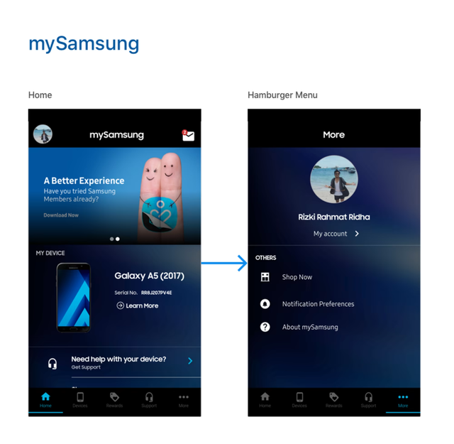
This appeared to be the perfect solution until I wanted to scroll through a user's profile and it was twice as many clicks as it currently is. Every Screen required "Open menu, Click Option" which very quickly became annoying since I know that it's unnecessary.
This leads me to believe that the optimal implementation for mobile users is to follow the Sky Sports Example. Introducing a tab bar along the bottom to switch between the significantly different areas of the site, and then tabs across the top to switch between contextually similar screens.
This would also be familiar to Twitter users which has implemented the same solution (with the addition of a burger menu for less important "Top level" features - a challenge that we don't have at the top level).
This is a somewhat longer than expected update because I wanted you to understand the effort undertaken and thinking behind the mobile design.
I've already implemented a tabbed navigation as well as a "Samsung" style hybrid which is what's led me to the conclusion that the 2nd level navigation should definitely not be hidden and that the top navigation should be maintained.
My next step is to work on how to modernise the top navigation and ensure that it doesn't demand or consume as much of the page as it currently does - The existing mobile implementation consumes 3 rows of tabs which is excessive.
As always, please share your thoughts along with any designs that I haven't mentioned. Whilst I feel like I've exhausted all options, I certainly haven't written about them so please ask about any that I haven't covered.
A sidetrack, before I comment on navigation.
Maybe I missed it, or maybe it was never openly discussed, but I am presuming the work you are doing goes towards what might eventually be implemented via an eventual softfork/hardfork following consensus among the witnesses? Or is this a free-standing application, like the old SteemPeak which lived on its own domain and pulled from the chain?
UX design is definitely a tricky business, without significant consensus as to "what works best." Based on the idea that Steemit is in desperate need of attracting new users, the models that make most sense are those that substantially draw from the shrinking pool of people who have only recently become web users.
Even though this is an English-language base, we draw heavily from parts of the world where mobile is likely a person's only point of access, so getting it right matters.
I still think PeakD does a decent job with their mobile version... although their separation of "information" and "actions" could be better. eBay does a decent job, too although it's an irritant that they keep forcing "log in or create account" on users with virtually every move. But once you're logged in, it's decent... a relevant example, because eBay is very information heavy, like Steemit.
Thank you for documenting the design process in detail. I agree with your choice of going with the Sky Sports example. It is the most user-friendly among all other options you shared.
There's obviously the struggle of keeping the secondary navigation concise and practical. I'm no design expert but maybe less-priority options can be grouped together with similar options in drop down menus.
P.S. I'd want to see Notifications in the bottom Primary navbar - one tap away.
I think that's probably the best approach to take - which is also consistent with how Facebook and Twitter approach their menus, showing the most important and "hiding" items of lesser importance behind a "More..." tab. I think this could be appropriate for Steemit.
Along these lines, could you please reply to my question when the post eventually appears - https://steemit.com/hive-151113/@the-gorilla/quick-question-profile-usage
It is certainly tough to figure out how to do navigation that will look good across all platforms. Seems like people understand what to do when they see the hamburger but I also wonder if some people don't know that is navigation at this point. I'm not really sure.
Also in reference to what another user was saying if Steemit INC doesn't approve your changes to Steemit.com since they control it are you going to deploy the site on another domain as an alternative interface?
Also how did you submit a proposal to the DAO? It is like the submission forms were removed a long time ago and I'm not seeing any other interface to submit.
I've found it difficult to unravel what's best for steemit.com. From a design point of view, everybody wants a nice, clean interface and whilst I'm familiar with the concept of the Hamburger Menu, it's something that's only seen online and generally only on mobile devices.
From a usability point of view though, it's been demonstrated that a visible navigation garners more interaction... therefore increasing the probability of the site becoming "sticky".
So I believe it makes sense to choose "visibility" over "aesthetics" without making the site look worse.
This will have to be a "wait and see". Steemit Inc don't communicate any more - unless you've used the burnsteem hashtag without a delegation to null. There are options beyond Steemit Inc accepting the changes but we'll give them the chance first.
I submitted mine through this - https://steemproposals.com/ - with the repeated caveat about submitting keys and changing them after submission 🙂
I also liked the most how the navigation in Sky Sports was implemented. I think this is the best solution.
Regarding the burger menu. All points placed there are not necessary for daily navigation of the site. I think it was deliberately made in such a way as to hide all this, but so that experienced users could use it if necessary. Some of these points are completely irrelevant. Are they needed in the mobile version? They definitely do not need to be given such importance that they take up space on the screen. I think all this can be hidden behind the More button or something like that.
You’ve read my mind and that’s the route I was considering so I’m pleased you’ve suggested it - that was the reason behind the testing post so that my assumptions align with others’ usage habits 😊
This post has been featured in the latest edition of Steem News...