Problem With Relying on Financial Charts

Source: streetwisereports.com
Let me begin by saying that I have followed Clive Maund for years and I find him to be an excellent technical forecaster. This post is not meant to malign Clive or any technical analyst.
That being made clear, I take a position that to rely solely on forecasting by charts is flawed. The main reason exists in that the tape is painted to exhibit what they want it to show. Therefore it is not a true expos'e of what is actually occurring in the market.
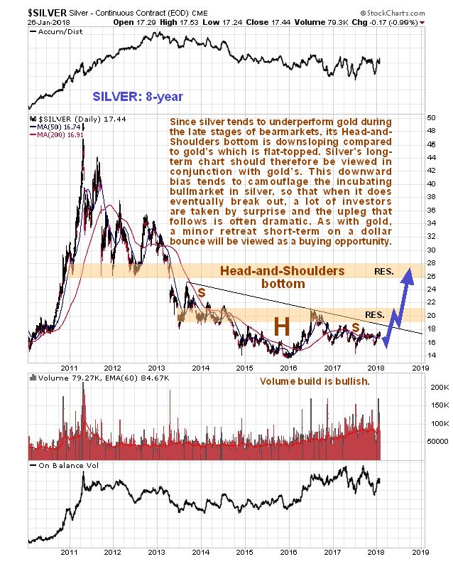
On Friday, Feb. 2, silver was smashed by about 80 cents. Mr. Maund reported his forecast on Jan. 29, showing his reasoning why silver should be heading higher. Looking at the chart shown in this post, you can identify the head and shoulders pattern he is referring to. It clearly shows why he laid out his forecast. But Friday, due to them (market manipulators) wanting to end the week with silver below the $17 resistance level, silver was smashed. If you look at the volume, this is the red colored chart, you can see the high spikes corresponding to the dips in the value. These spikes show the manipulators dumping paper silver on to the market.
One further point I'd like to express is that even without manipulation, forecasting with charts is not an accurate science. They just indicate trends and trends don't necessarily go they way you'd expect, there is a margin of error. This is due to the trend is based on human emotions. It is like them forecasting the likelihood of booming sales of the iPhone X. When they initially announced it the pundits were saying that it would be a successful launch. If you look at what is actually happening to the iPhone sales, they are tanking to the point where Apple has scaled back production. The reason I used the iPhone as an example is because I doubt that the iPhone market is not hounded by manipulators. Forecasting is based on your best educated guess.
Source: streetwisereports.com


Technical analysis has to be applied on top of fundamental analysis, use both to identify better trading opportunities. I have had several conversations with Clive on skype and emails, he is a good technical chartist. Even the chart above shows a slight down move first in the blue arrow before rising significantly. Its hard to predict when the bullion banks and the London Fix will slam gold and silver, they do like to do it at key points.
Once this move down is complete (probably this week), the next move is most likely up and needs to break above the downtrend line identified above. I mentioned the same trading pattern in a recent blog, here is my chart on Gold.
I do respect Clive that is why I started my post with a mention that I have followed Clive for years and find him to been a good analyst. That being said I follow your point to use the technical in conjunction with the fundamental but still the chart is call it deformed by the manipulation. I don't know a way to filter out the paper trades from the chart. One idea is to chart using a longer time base. I think if you expand the time it will dilute the time when heavy manipulation occurred and include more data when there was less manipulation.
There is a way I can see but it is not a feasible option. This is to do away with paper contracts unless they are fully backed by the physical. Also stop allowing HFT by algorithms. In response to your point that 'it's hard to predict when the bullion bank (commercials) and the London Fix with smash the precious metals, I agree that you can't predict the exact timing but you can get darn close. Watch about 10AM (eastern time) and if they are going slam it, it will normal occur around then.
I appreciate your insightful comment and I will check out your post. I am always looking for other (intelligent) viewpoints.