You are viewing a single comment's thread from:
RE: Task Request - StemQ Logo Design (UPDATED)
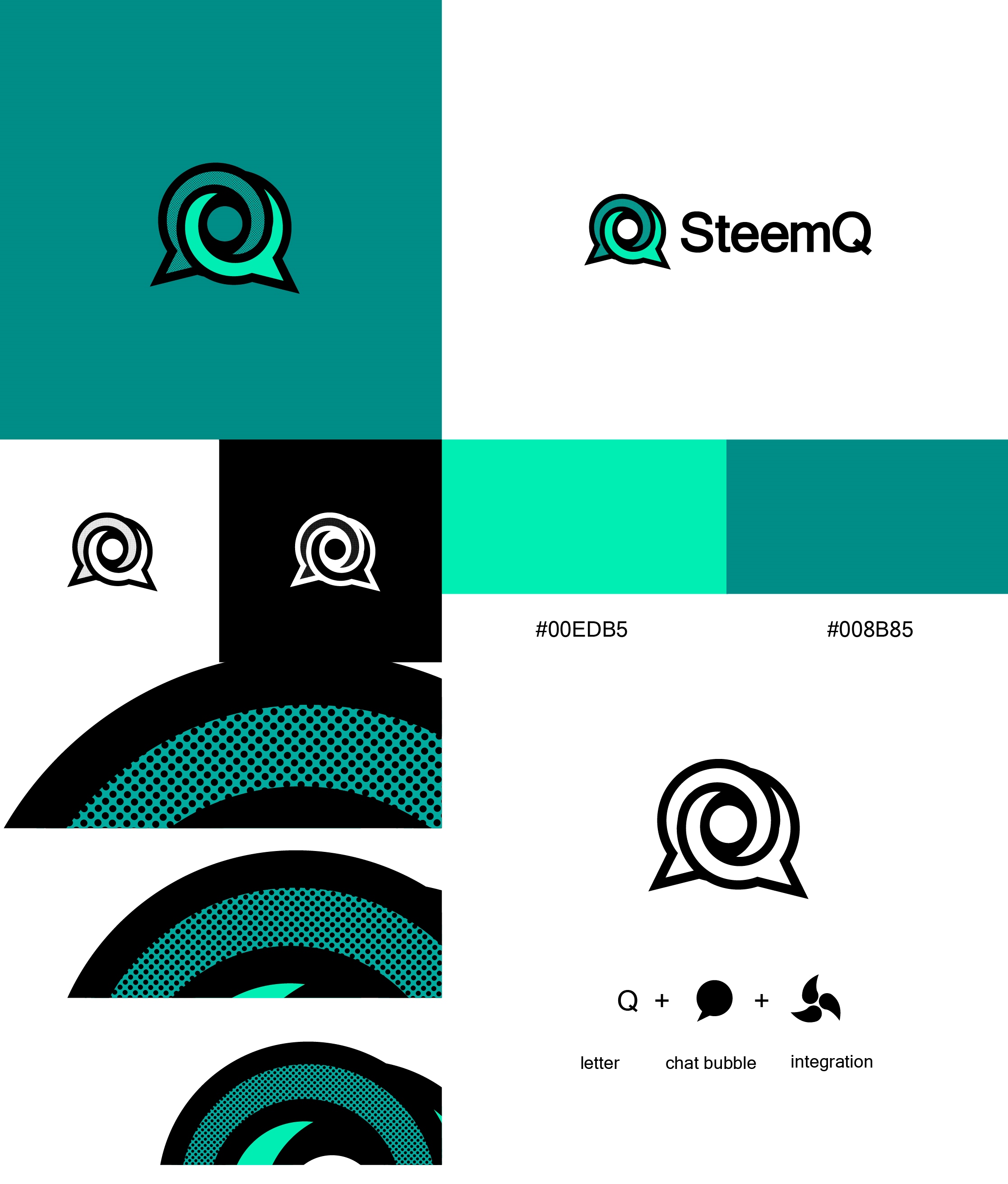
Hello @irelandscape, this is my proposal. In the proposal I try to represent the main functions of the platform, creativity, thought, questions, answers, were some of the words with which I worked. I hope you like it. :)

Hello @ggabogarcia,
moderators team has decided your work is of highenough quality to be officially reviewed as well. Please make full official post. Thank you.
Hi @ggabogarcia, thank you very much for your contribution.
I like the symmetry and the simplicity of the shape.
The combination of the Q letter and the chat bubble works quite well in my opinion.
What might be interesting is to see the logo with different color themes and see what it looks like on a white and a black background.
For example, what would it look like with a combination of primary colors (e.g. blue + yellow), or in shades of different colors (e.g. 2 shades of blue).
Also, what would the logo look like when using color gradients rather than solid colors?
A good entry in my opinion.
Thanks!
Link to the files, SVG and EPS.
https://drive.google.com/drive/folders/1ROHce7bcZSY51citv2Ih2Wi_Arj8JNjF?usp=sharing
Thank you!
Hi @ggabogarcia,
Once again thank you for your submission.
The StemQ team has decided to go for @naufal's logo in the end.
I hope that you won't be too disappointed.
Cheers,
Olivier