Task Request - StemQ Logo Design (UPDATED)
Repository
https://github.com/irelandscape/quearn
Please checkout the develop branch.
Details
We are looking for a cool new logo for our new StemQ application!
StemQ is a new application powered by Quearn, a Question & Answer engine using the Steem blockchain.
StemQ will be similar to Quora and other similar Q&A applications, but will not feature obtrusive advertisements and will reward contributors in Steem.
StemQ will allow any Steemian to post questions related to the S.T.E.M (Science, Technology, Engineering and Mathematics) subjects and/or provide answers to those questions.
As this app encompasses many concepts (the 4 STEM subjects, questions, answers), it may not be practical to represent all of these in a single logo.
For this reason, an abstract logo based on simple but strong shapes may be more suitable, though any concept is welcome to be presented.
The logo must resize well to small sizes (down to 50x50 pixels) and still be recognizable as a favicon in a browser tab.
The logo should also standout clearly on a black or white background.
The finished logo must be provided in SVG format with a couple of sample bitmap files (e.g. PNG format).
As my resources are very limited, I can only afford a reward of 20 Steem for the winning author but this is a chance for designers to have their artwork featuring in a new and exciting Steem project.
The new logo will be credited on the SteemQ web site and related applications.
Components
The logo will feature on the StemQ web site and StemQ applications for Android, iOS, Linux and Windows.
It will also feature on external digital media such as Steem posts, Facebook page, Twitter, etc.
Deadline
All logo concepts must be submitted before Friday 19th of October 2018.
StemQ is expected to launch early November 2018.
Communication
You can submit your logo proposal in a comment below this post.
All participants can also contact us on our Discord #stemq-logo channel:
https://discord.gg/NVrya7b
This task request is now open for contributions.
Information for contributors:
Information for the requester:
Your contribution has been evaluated according to Utopian policies and guidelines, as well as a predefined set of questions pertaining to the category.
To view those questions and the relevant answers related to your post, click here.
Need help? Write a ticket on https://support.utopian.io/.
Chat with us on Discord.
[utopian-moderator]
Thank you for your review, @andrejcibik!
So far this week you've reviewed 1 contributions. Keep up the good work!
Hello @irelandscape these are my logo proposals for your project, I had a lot of ideas, so I made them all
I hope you like it.
If you want to make some changes, just tell me.
I don't think it's necessary to describe the concept behind each proposal because of how obvious they are.
Hello @camiloferrua,
moderators team has decided your work is of highenough quality to be officially reviewed as well. Please make full official post. Thank you.
Thanks @andrejcibik, I will post it :)
Hi @camiloferrua, thank you very much for your submission.
Of all your suggestions I like your last one the best.
Your logos will be considered for selection after this Friday's deadline.
Cheers.
Hello @irelandscape and @andrejcibik, I would like to know if I can make my official publication for the project and if so, with which of my proposals do I make it? the last proposal?
Hey :) @camiloferrua
https://steemit.com/utopian-io/@irelandscape/re-irelandscape-task-request---stemq-logo-design-20181020t100128488z
Gracias mi pana
Hi @camiloferrua,
I have just announced the winning proposal which is @naufal's logo.
I hope that you are not too disappointed.
I really appreciate the efforts put into the task by all participants.
Many thanks for your contribution.
Cheers,
@irelandscape
It's ok @irelandscape, that's the way these task request works. No problem at all, I like to contribute every time I can. @andrejcibik I would like to know if my work could be consider to be rewarded as a quality contribution.
Hi @irelandscape, I made this logo for you, hope you like it. And you can see on your discord server for logo detail.
Thank you :)
Hi @naufal,
Thank you for your submission.
Your logo looks good and meets all the requirements.
It will be considered in the next couple of days for selection.
Cheers!
Hi @naufal,
I am delighted to let you know that the StemQ team has selected your logo proposal!
Congratulations on winning the TR!
Cheers,
@irelandscape
Thanks for choosing my work, cheers! 🍻
Hi @irelandscape. This is my design logo proposal for StemQ.
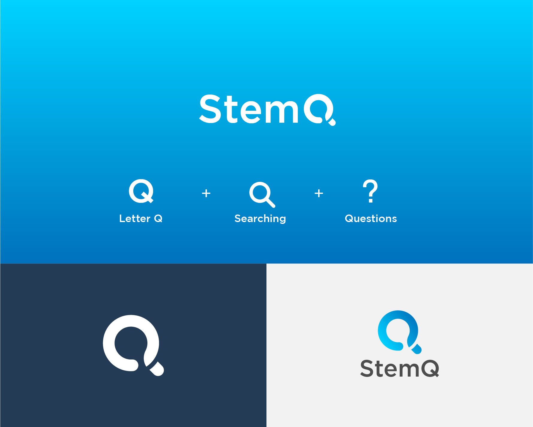
Logo 1
Logo 2
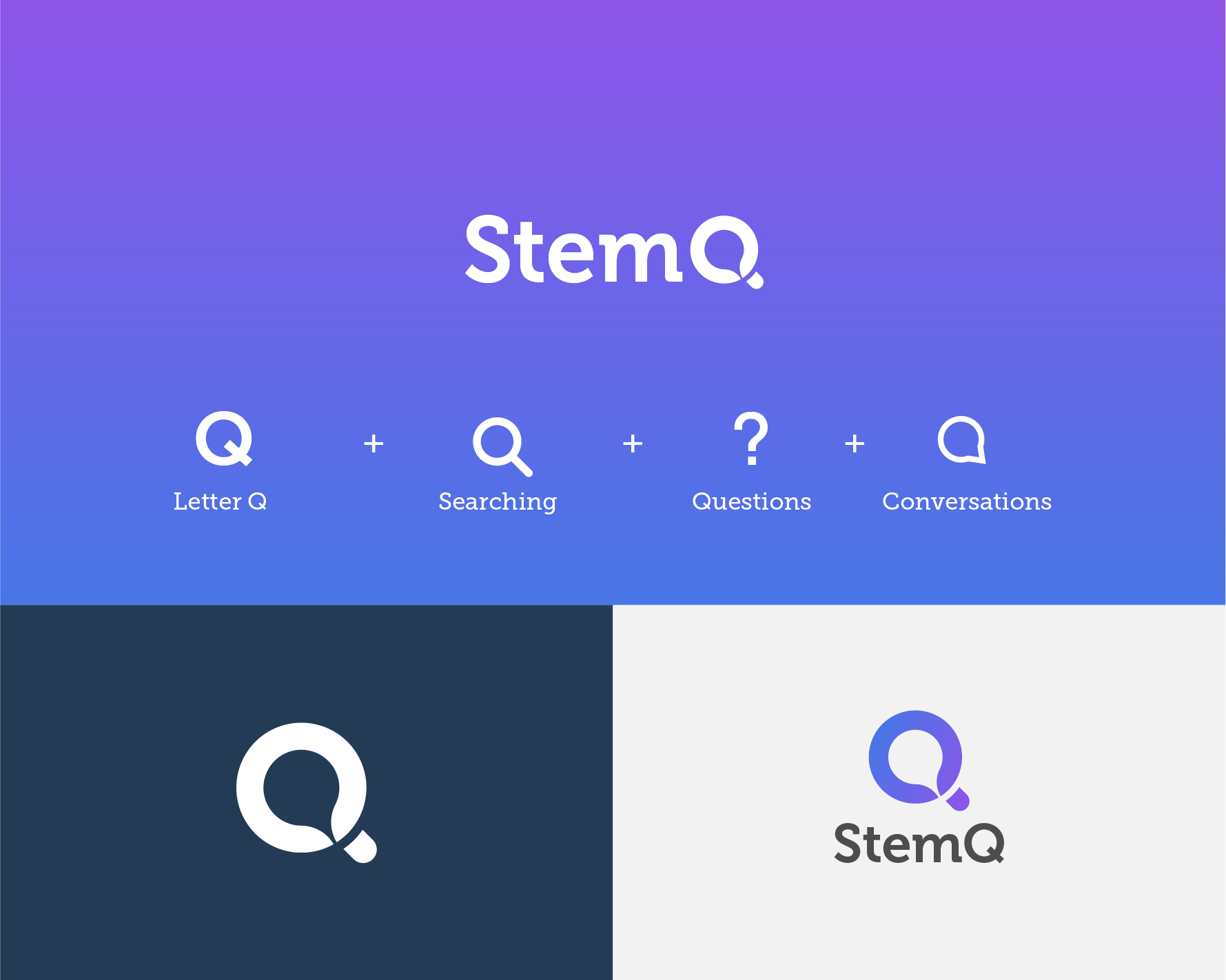
Best Regard
Munadi Kiehl
Hi @munadikiehl, thank you for your submission. I like the logo.
Hi,
Thank you once again for your submission to this TR.
The StemQ team has decided to go with @naufal's proposal in the end.
I hope that you won't be too disappointed.
Cheers,
@irelandscape
Hello @irelandscape, this is my proposal. In the proposal I try to represent the main functions of the platform, creativity, thought, questions, answers, were some of the words with which I worked. I hope you like it. :)
Hello @ggabogarcia,
moderators team has decided your work is of highenough quality to be officially reviewed as well. Please make full official post. Thank you.
Hi @ggabogarcia, thank you very much for your contribution.
I like the symmetry and the simplicity of the shape.
The combination of the Q letter and the chat bubble works quite well in my opinion.
What might be interesting is to see the logo with different color themes and see what it looks like on a white and a black background.
For example, what would it look like with a combination of primary colors (e.g. blue + yellow), or in shades of different colors (e.g. 2 shades of blue).
Also, what would the logo look like when using color gradients rather than solid colors?
A good entry in my opinion.
Thanks!
Link to the files, SVG and EPS.
https://drive.google.com/drive/folders/1ROHce7bcZSY51citv2Ih2Wi_Arj8JNjF?usp=sharing
Thank you!
Hi @ggabogarcia,
Once again thank you for your submission.
The StemQ team has decided to go for @naufal's logo in the end.
I hope that you won't be too disappointed.
Cheers,
Olivier
Hi Everyone,
Thank you all for your logo submissions.
Entries will be reviewed over the weekend and I will announce the winner on Monday.
Cheers,
@irelandscape
Hi, @irelandscape here is my proposal, i made the logo fit perfectly for Windows, Linux, Ios and Android.
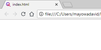
The logo was made in a simple and modern way that people can easily be identified and recognised with StemQ.
Hi, thank you for your submission.
The logo is simple and meets the requirements so I think we can accept it for the next phase.
Stay tuned!
Am glad it meet up with the requirement.
Waiting for the next phase...
Hi @mayowadavid,
Thank you again for your logo proposal.
In the end we decided to go for @naufal's submission.
I hope you won't be too disappointed.
Cheers,
@irelandscape
hi irelandscape, this is my entry
thanks
Hi @ivannewgate89, thank you for your submission.
I like the ideas behind your logo concept especially the color scheme which I think works well against a dark or light background.
The logo seems to meet the requirements of the TR. Can you confirm that you could provide SVG files?
The "expanded" logo with the broken lines and the 4 topic icons looks cool and could be used for introductory posts about StemQ.
I would replace the atom icon for "engineering" with something else, maybe a computer chip or some other circuitry?
I would also remove the "4" from under the root symbol for mathematics.
As discussed on the Discord channel could you increase a little bit the curvature of the inner corners of the "Q" to match better the outer radii?
I'm still undecided about the exact position of the 4 little squares relative to each other.
The best might be to "play" a little bit with their position until it looks right. In restrospect making a perfect cross with the 4 squares looks a little bit too symmetrical.
The gap between the broken "Q" and the colorful squares looks good to me.
Finally I'm not so sure about the font used for the "Q" in the word "StemQ".
Somehow I feel like it should match a little bit better the main "Q" of the logo.
Thank you for the hard work.
Your logo is suitable and will be considered along with other suitable submissions for the final selection.
Cheers,
@irelandscape
Thank you sir, we can fix later, cheers
Hi @ivannewgate89,
Your logo proposal was interesting and was discussed during the selection process.
In the end we decided to go for @naufal's proposal.
I hope that won't come too much as a disappointment for you.
Thanks again,
@irelandscape
Hi sir, here is my submission, hope you'll like it!
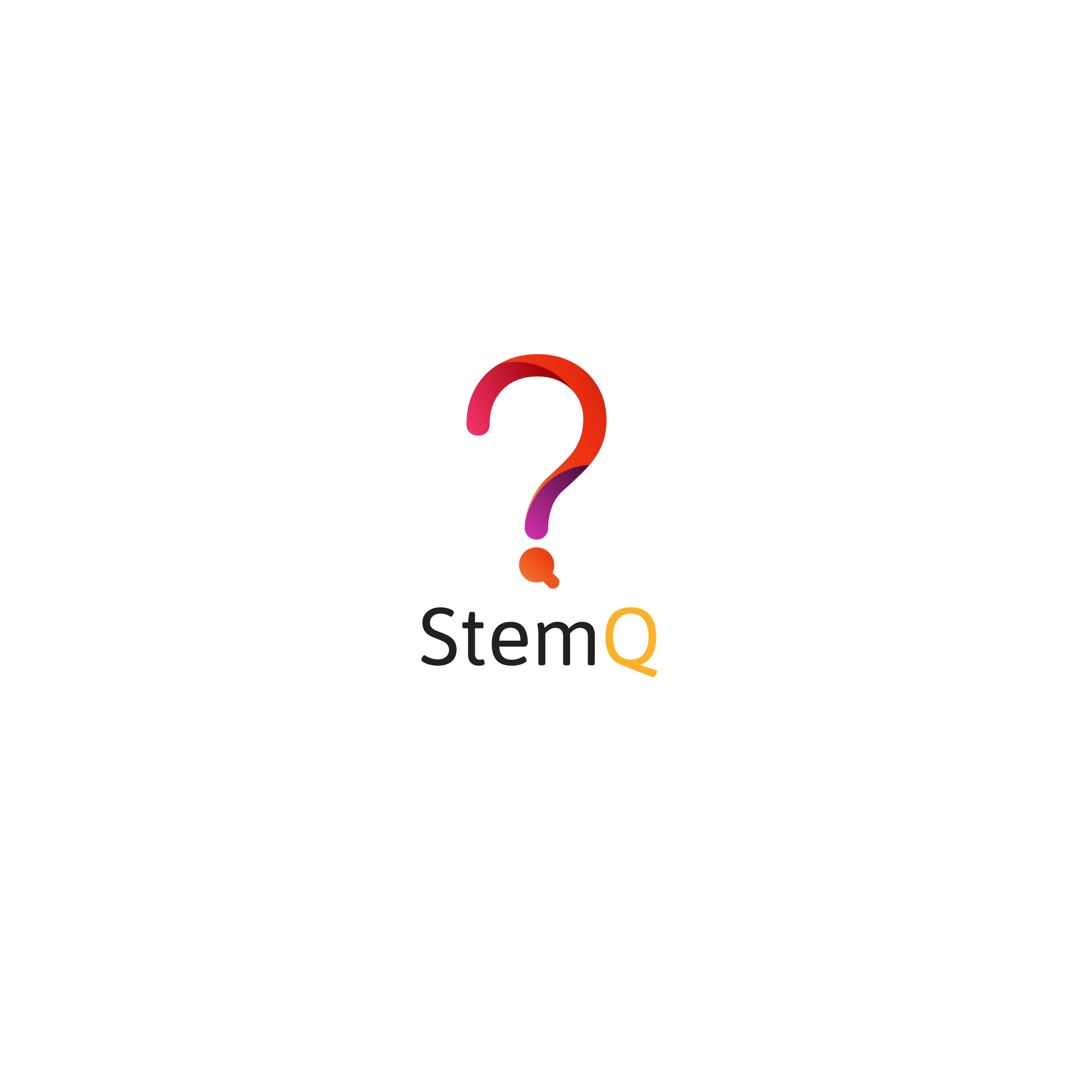
Brief Description:
The four colors in the logo symbolize the four subjects. Q is incorporated into the question mark in the shape of magnifying glass, representing searching (for answer).
Hi @mecj, thank you for your submission.
I like the fact that the logo has simple shapes and look 'clean'.
On the other hand I think the question mark is too thin and as a result will probably not resize well to a small size.
There may not be enough tonal contrast between the different colours but that problem might be alleviated if the logo is made thicker.
I'm not sure about the question mark idea. Though at first it makes sense since this a Q&A app, it's reminding me a lot about a quizz somehow.
The other thing is that many languages don't use question marks for questions. That would be the case for most Asian languages.
Hopefully this doesn't sound too harsh.
Cheers.
Hi @mecj,
Thanks once again for your proposal.
We selected @naufal's logo proposal in the end.
I hope that's OK with you.
Cheers,
@irelandscape
Hi Everybody,
I would like to congratulate @naufal for winning the logo task request.
StemQ liked in particular the shape simplicity and the fact that the logo can be resized to very small scales.
Many thanks to all participants for all the effort put into this task!
Regards,
@irelandscape
Yeeaayy! Thank you :D
You back. Congratz bro :D
Yeaahh Im back! Eh eh eh